Categories
Uncategorized

Week 32

Jakub

Topic:
I associate sounds with music. And this is what I explored this week. Well… week 41 can be a difficult one for me (Topic: music)!

Data gathering:
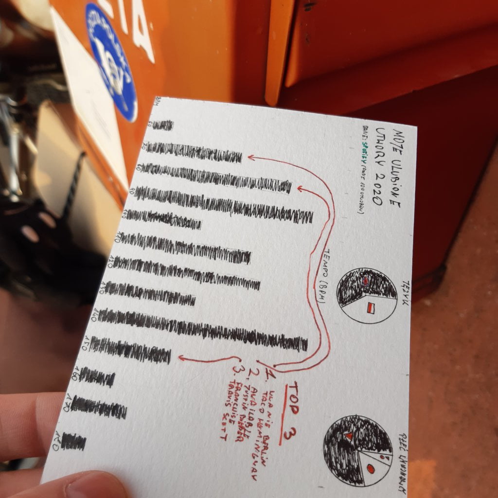
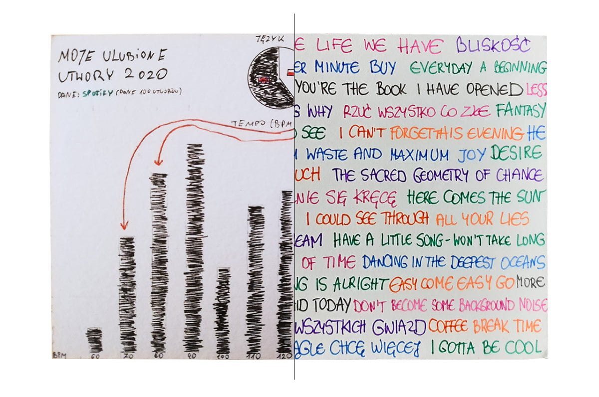
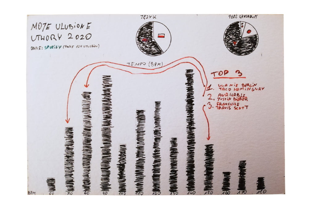
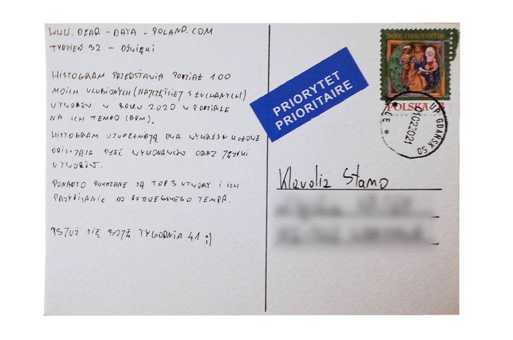
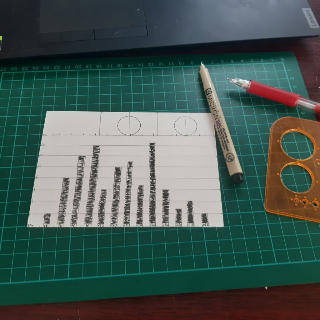
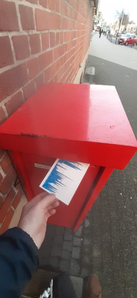
I like to use data that is collected involuntarily. Even though I am pedantic about collecting data, I know that systems do it better. My database for this week was Spotify’s list of my favorite songs of 2020. I exported it to Excel and started… playing with the data. I have analyzed my 100 favorite songs in many different ways, e.g.: the artist’s gender, the song’s language and beats per minute (BPM). 

I thought I listened to more women than men.

Data drawing:
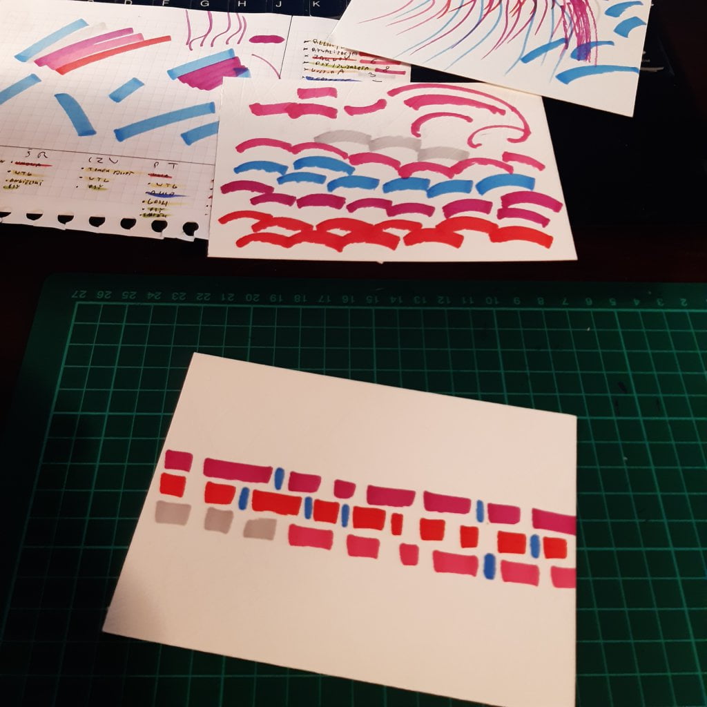
After my recent unsuccessful attempts to get inspiration from artists (week 31), I am going back to the basics: minimum of colors and chart simplicity. I only experimented with the styling that was supposed to resemble sound waves.

Klaudia’s postcard:

I liked Klaudia’s postcard as soon as I saw it in the mailbox. I appreciate that Klaudia approached the topic in a non-obvious way. The postcard gives an interesting insight into Klaudia’s personality.

The process:


Klaudia

Topic:
Initially I thought about the sounds of the city, such as the rustle of trees, the siren of a passing ambulance or the singing of birds. However, I had a hard week at work ahead of me, so I chose the simplest solution: music. At the beginning of the week I made sure that it was possible to download data from the Spotify application and… I forgot about collecting data until Sunday. Imagine my horror when it turned out on Sunday evening that Spotify could send me the data, but… within 30 days. I had to improvise, Jakub is waiting for a postcard!

Data gathering:
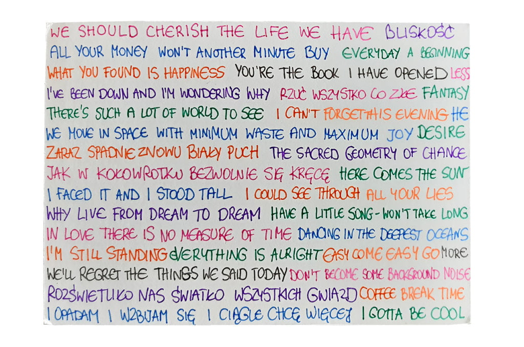
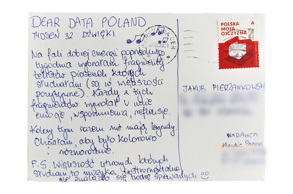
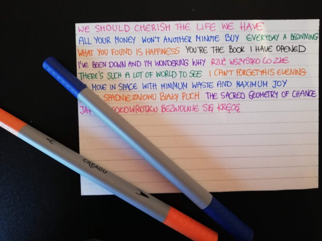
There was no way out. I had to approach this week in a qualitative (not quantitative) way. I came up with an idea. I estimated that every week I listen to all my favorite songs at least once. I decided to take a look at this long list and analyze the lyrics of non-instrumental pieces. I was very excited about the idea, because I usually don’t pay attention to the lyrics so it was a good opportunity to get to know the bottom of the songs I listen to. I created an empty Google Doc and started pasting there one positive or emotional sentence / word from each song on my favorites’ list.

Data drawing:
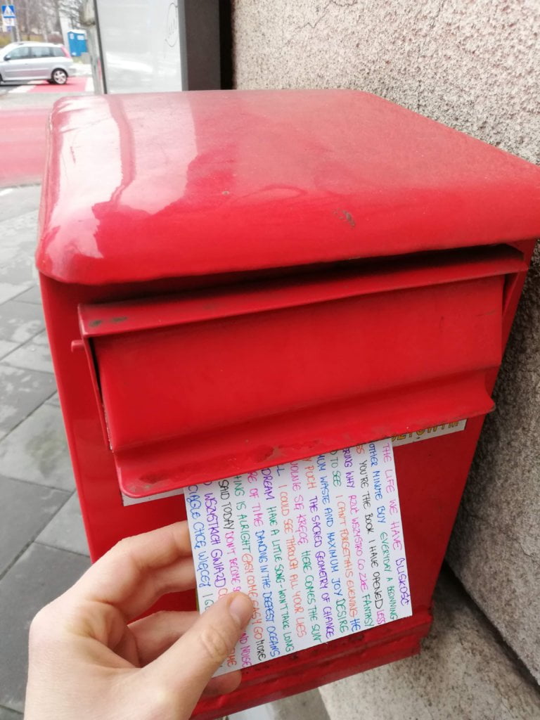
The lyrics of my favorite songs turned out to be so diverse and interesting that I had no choice but to put (almost) all of them on my postcard. Putting one sentence after another in different colors seemed to me a visually simple and attractive solution

Jakub’s postcard:

A very, very interesting approach to analyzing one’s favorite music. I would never think of it in my life, and that’s why I love this project – I’m learning something on a weekly basis 🙂

The process:
Categories
Uncategorized

Week 31

Jakub

Topic:
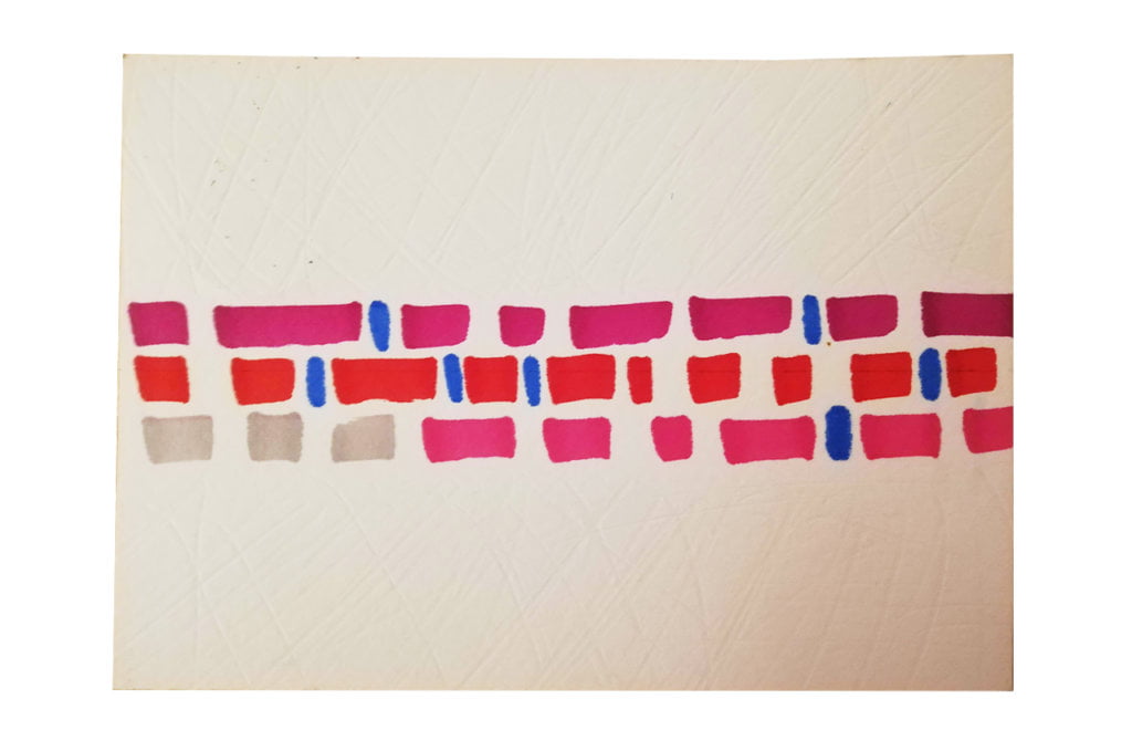
I’m an optimist. Even in my personal failures and tragedies, I always try to see the bright side. I am a cheerful person and I found this topic very interesting.

Data gathering:
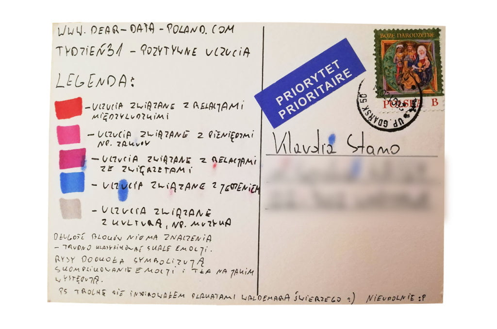
Each day before going to bed I wrote down all the positive feelings that accompanied me on a given day. I tried to do it very carefully and to catch even the least significant moments, such as a nice “good morning” heard at work.

Data drawing:
Practically from the very beginning of the project, I wanted to make at least one of the postcards similar to the works of the Polish poster designer Waldemar Świerzy. I’ve been working on this postcard for several hours. The final version is probably my 10th attempt. With each subsequent attempt I was more and more disappointed. Paradoxically, working on this positive topic frustrated me the most. I wanted to approach the subject too artistically. I got lost and the postcard is not a good data visualization. I learned a lesson for the future.

Klaudia’s postcard:

Klaudia approached the data collection in a similar way. She certainly showed the data in a much better way. The charts are clear and understandable, once again proving that simplicity is the virtue of data visualization.

The process:


Klaudia

Topic:
I am a lucky girl and I truly enjoy my life. Each day brings me many positive moments – related to work, family, sports, and my interests. This week only confirmed my conviction that I should be grateful for what I’ve got. 

Data gathering:
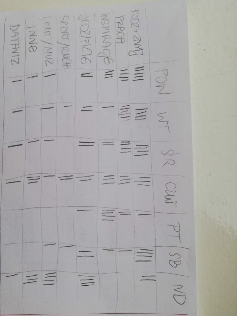
This is one of the few topics on which I have regularly collected data before. For about half a year, I have been writing down in my journal a minimum of 2-3 positive things that happened to me on the passing day. These can be very simple things, such as a good coffee, a fruitful meeting with colleagues or a sunny walk. I knew that this week I would not change my approach, but only expand the evening list with all the positive moments and feelings that I could remember. This is how my “database” was created. 

Data drawing:
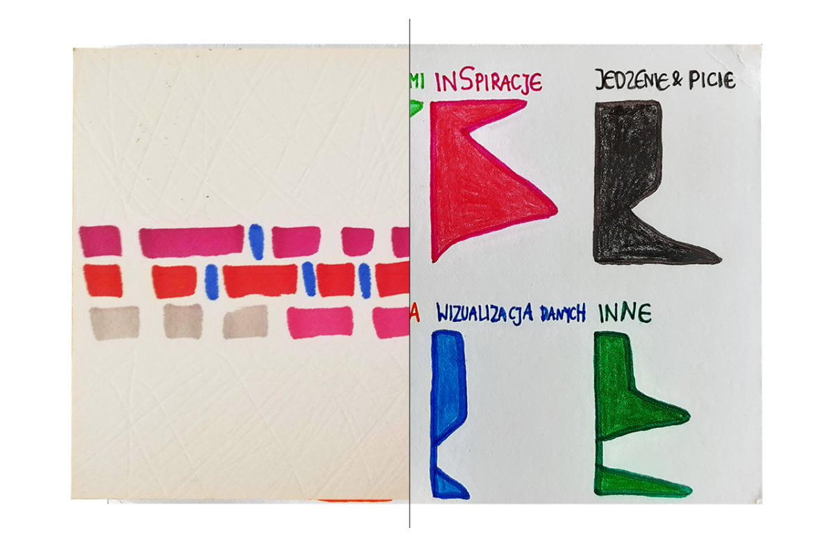
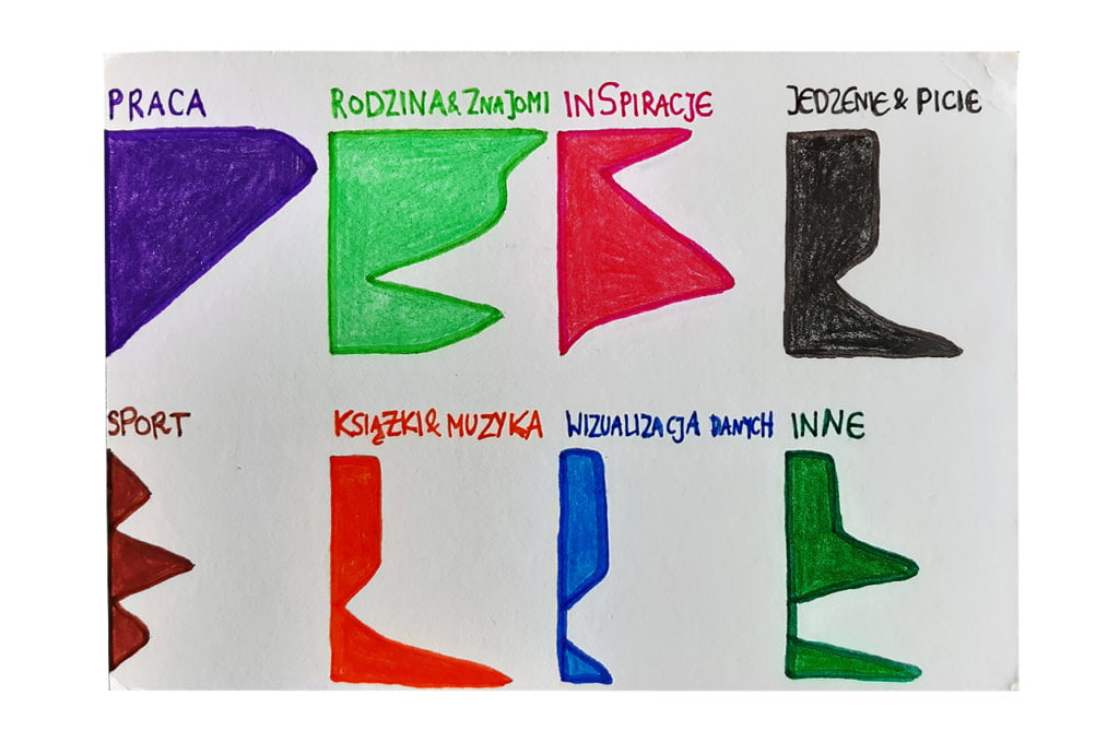
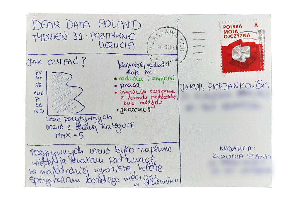
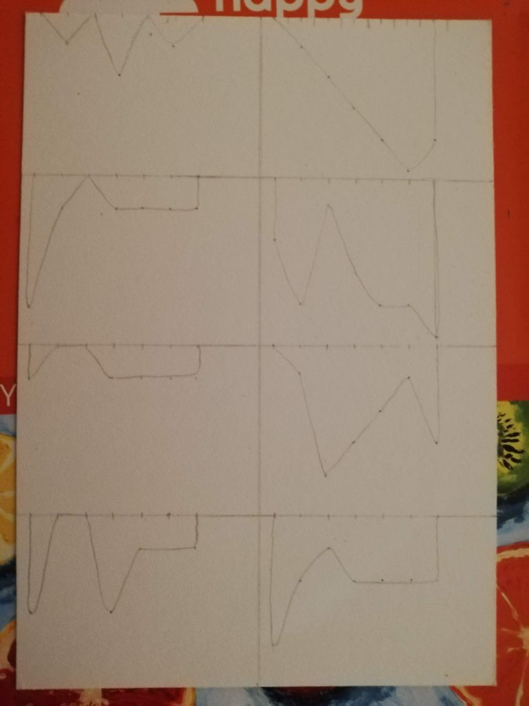
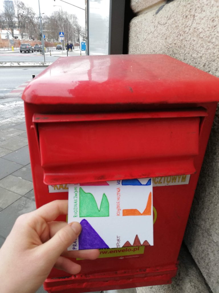
I really like small multiples charts. When I analyzed my journal entries, it turned out that they form 8 different categories. I decided to divide the postcard into 8 parts and devote each of them to a different life aspect. The postcard shows how my week evolved emotionally. The majority of positive work-related thoughts occurred in the first part of the week. My family and friends kept me happy all week, except maybe the busy Friday. Books and music accompanied me almost every day, but especially on Sunday, when I deeply enjoyed my dad’s piano playing. The last time I experienced live music was in the philharmonic hall 10 months ago. I look forward to being vaccinated as soon as possible!

Jakub’s postcard:

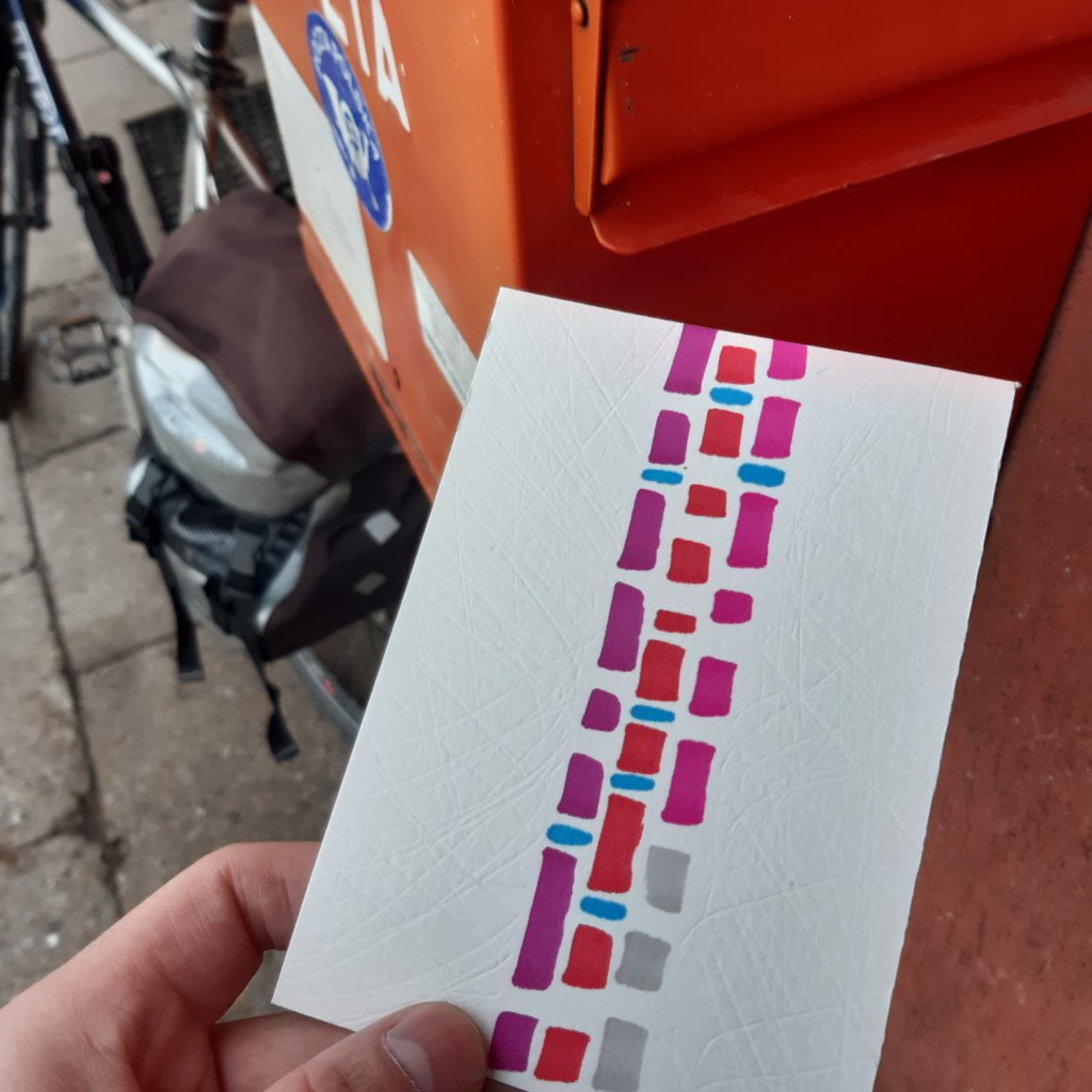
At first glance, Jakub’s card struck me as very enigmatic. I wondered if the effect of the scratched postcard was accidental or intentional – it turned out to be intentional. I agree with Jakub that it is difficult to define the power of feelings, and I also only “counted” their occurences.

The process:

Categories
Uncategorized

Week 30

Jakub

Topic:
I like being alone. I remember that when I was preparing for a triathlon, I really appreciated the moments of solitude while running, cycling and swimming. It was a time of reflection and just a break from wearing a mask in relationships with others. This week has proved that lately I haven’t had too much time on my own.

Data gathering:
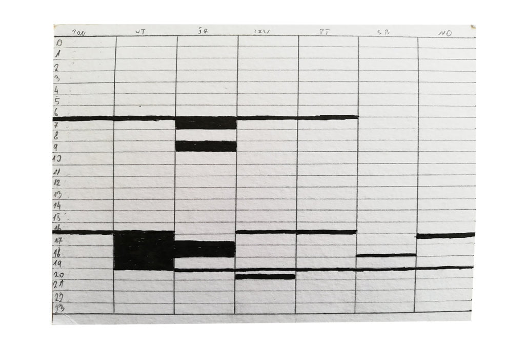
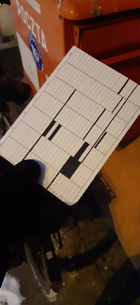
Every evening I analyzed my day and wrote down the exact moments of being alone. It was usually a recurring pattern: commuting to work, walking the dogs, etc.

Data drawing:
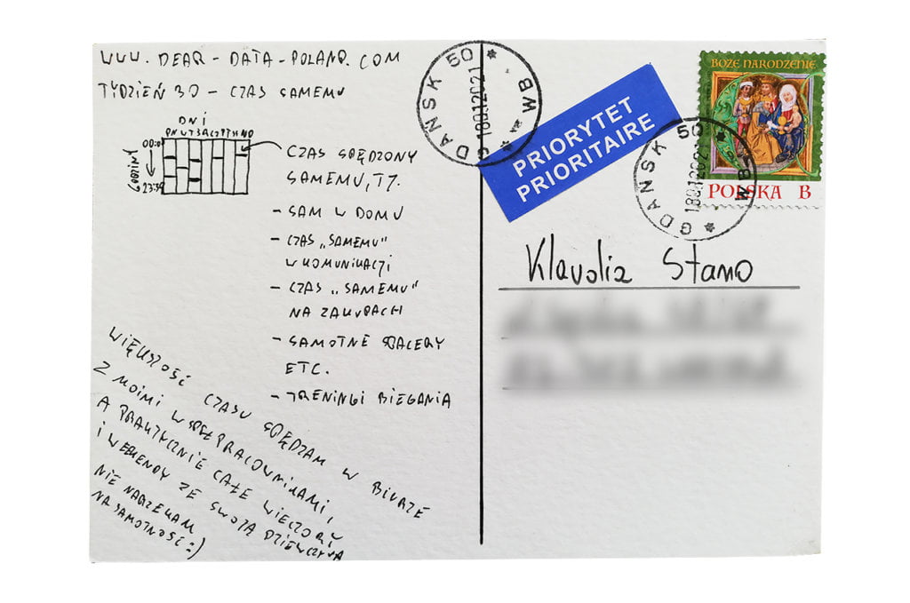
I used a very simple calendar-like diagram. The periods spent on my own are marked in black. Simplicity of communication 😉

Klaudia’s postcard:

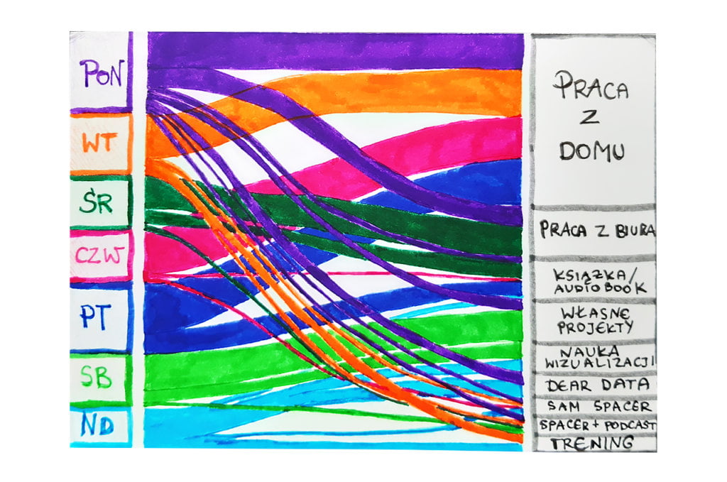
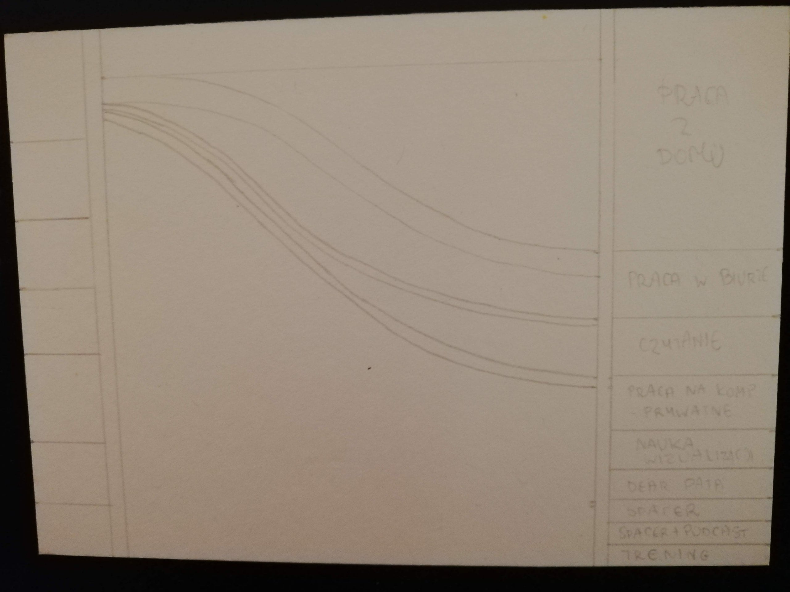
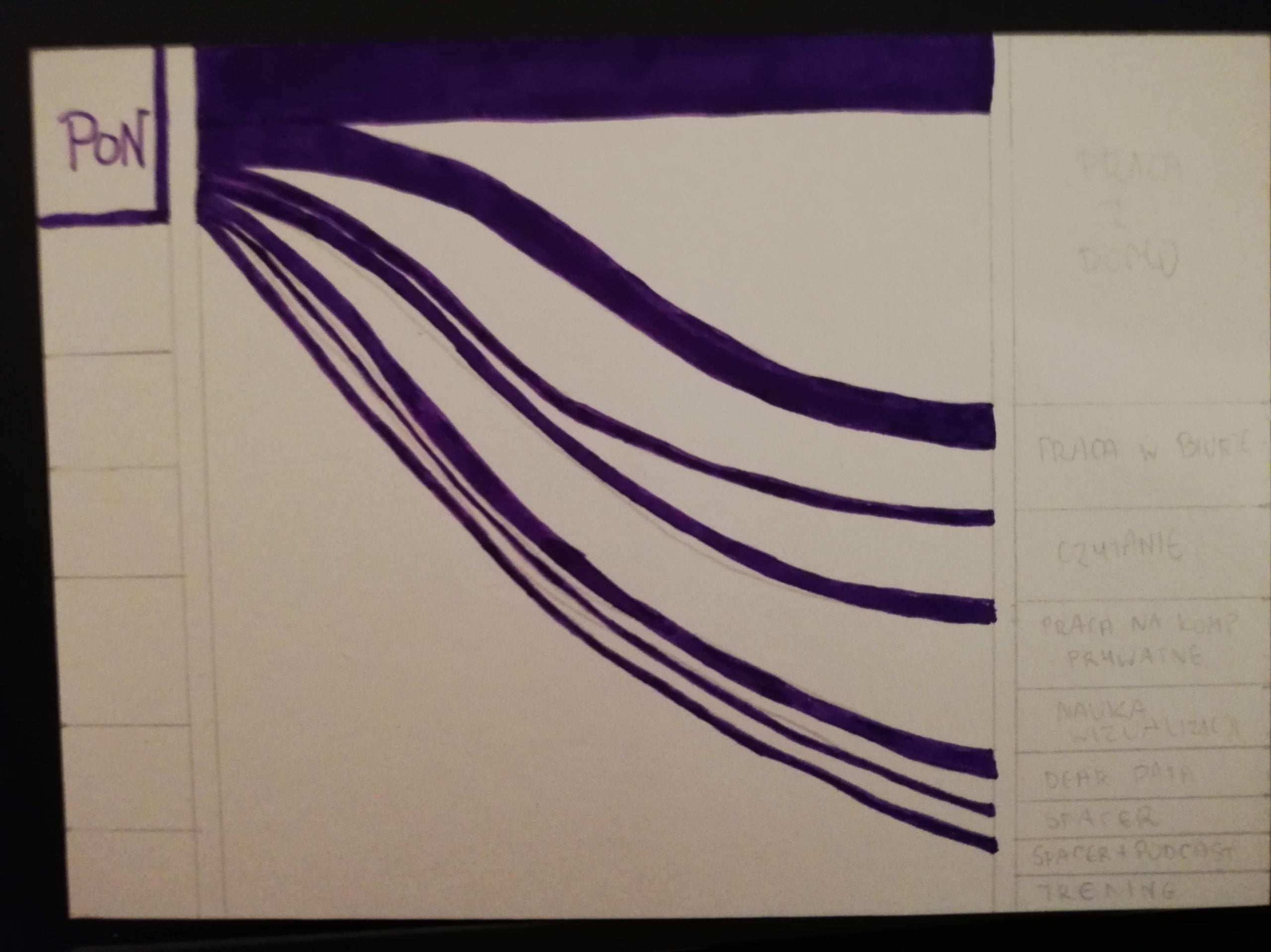
Klaudia impressed me. Drawing a Sankey diagram on the postcard is really something. Respect! I can see that it cost her a lot of time. I like it very much. I think this card is a pretender for the most interesting postcard of our Dear Data project edition;)

The process:


Klaudia

Topic:
Being alone is my every-day reality. I enjoy solitude and appreciate every moment of it. I’m an introvert, so I get my energy from being alone. I love to wrap myself in a blanket and spend the evening reading a book. I also like to work alone (although in a perfect setting I would like to spend 1-2 days a week with my colleagues, which is now impossible). Despite many hours of solitude, I do not feel lonely. As a mother of a 3-year-old I do not complain about the lack of company in the afternoons or on weekends. I also try to stay in touch with family and friends (as far as the current situation allows). It’s good that we can at least meet for a walk 🙂

Data gathering:
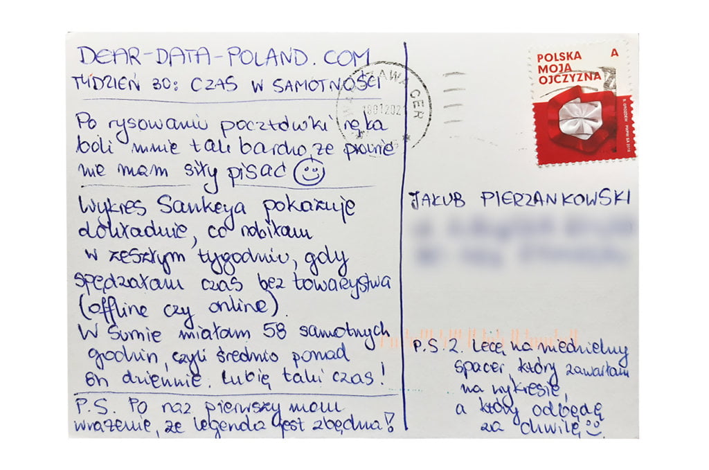
Every evening I wrote down how much time I spent alone and what I was doing. Of course online meetings counted as social time. In total, I counted 58 hours of pure solitude. 

Data drawing:
Due to my involvement in the Career Map project, this week I have carefully studied the World Economic Forum’s report on the future of jobs. I was very impressed with one of the flow charts. On Sunday, when I was analyzing my data, I thought that it was pretty suitable for a Sankey chart. Well… 3 hours later my postcard was ready. This is the most time-consuming postcard I have created so far.

Jakub’s postcard:

I like Jakub’s postcard – simple and clear solutions are the best. I also like black and white visuals. I was surprised that Jakub spends so little time alone!

The process:

Categories
Uncategorized

Week 29

Jakub

Topic:
It was the most awaited topic by my girlfriend, Agata 😉 I was wondering for a long time how to approach it and what to measure. I wanted to come up with something insightful. The idea emerged during a routine Facebook backup (I do it every two months). I decided I would investigate the intensity of our Messenger communication. We use it very often. As it turned out, a little less with the passing of years. Maybe it’s the fate of a mature relationship 🙂

Data gathering:
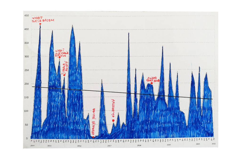
I exported from Facebook the entire history of our communication (yes, it can be done easily), from the day of our first message in October 2014 to January 2021. During this time, we exchanged over 13,000 messages in total. Having them all in Excel I was able to “play” with them.

Data drawing:
This is the second time in Dear Data that I use printing combined with drawing. I grouped all the messages into months. On this basis, I prepared a line graph, which I printed on a postcard, and then colored it and added additional comments to show the most important moments of our relationship.

Klaudia’s postcard:

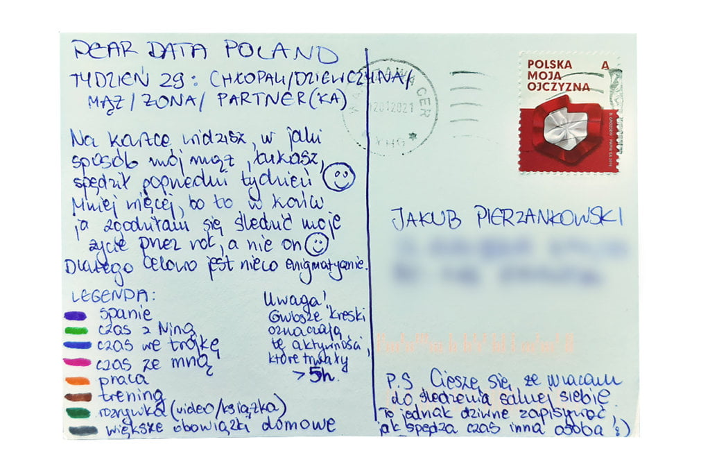
I come from Łowicz. Klaudia’s postcard reminds me of the Polish folk art from my city. And I admit that the postcard is enigmatic, just as Klaudia wanted. I think it will be fun for Klaudia to come back to this postcard in a few years.

The process:


Klaudia

Topic:
I was not looking forward to this week. I definitely prefer to collect data about myself than about other people 🙂 It feels weird. 

Data gathering:
Every day I wrote down what Łukasz did and at what times. I defined broad categories such as: work, time spent with our daughter, sports. 

Data drawing:
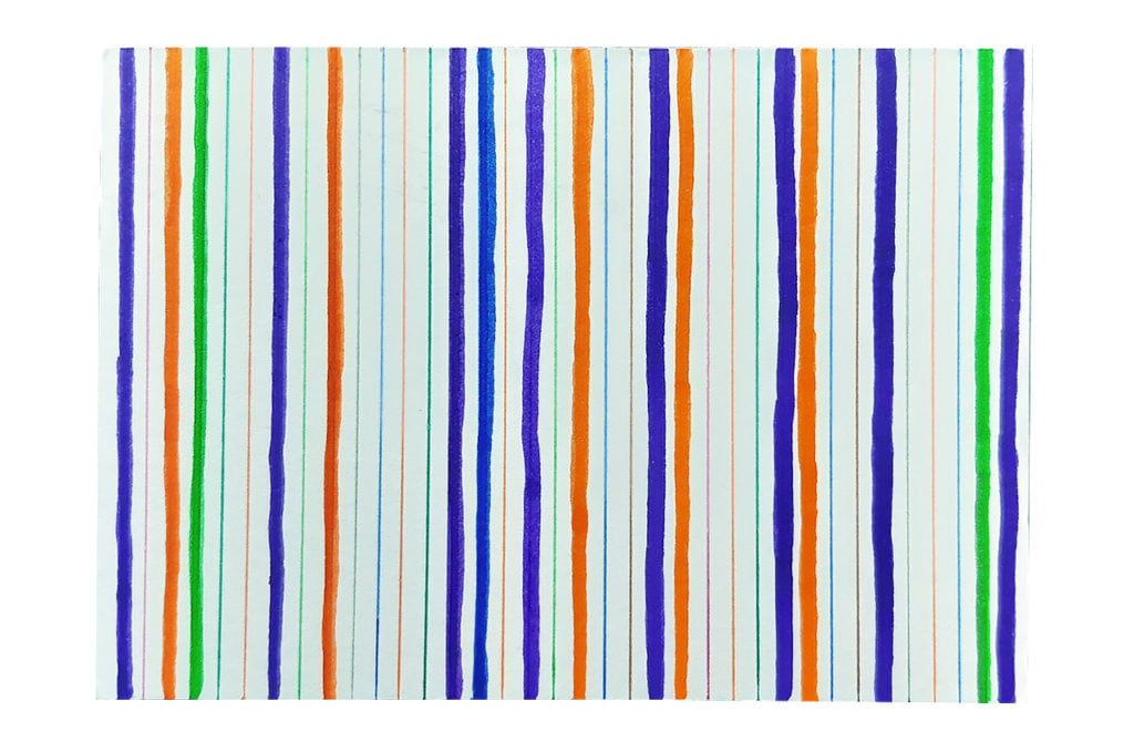
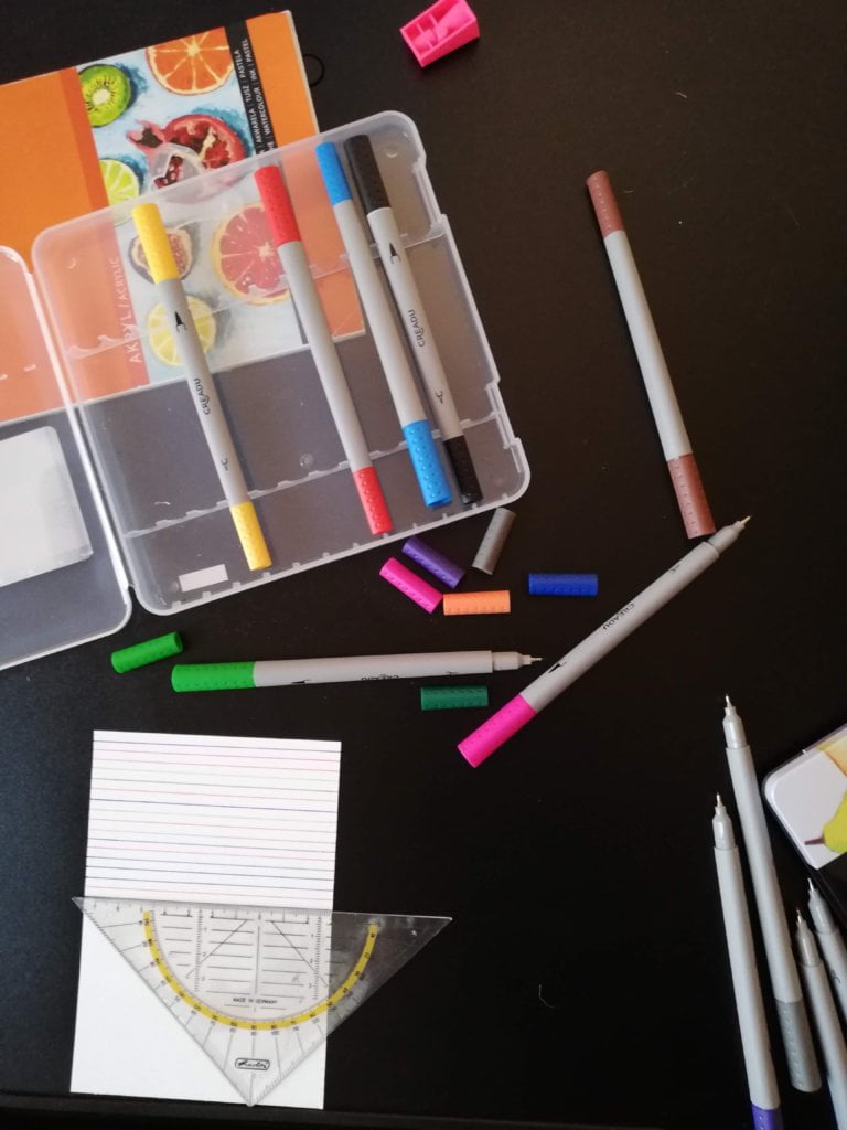
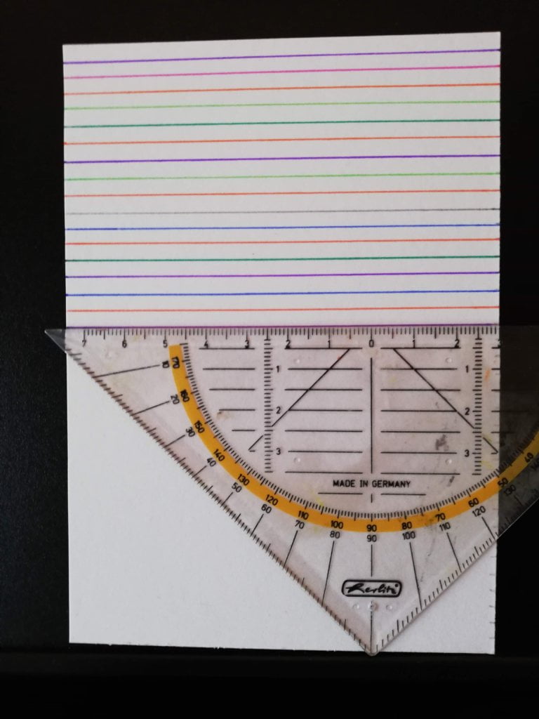
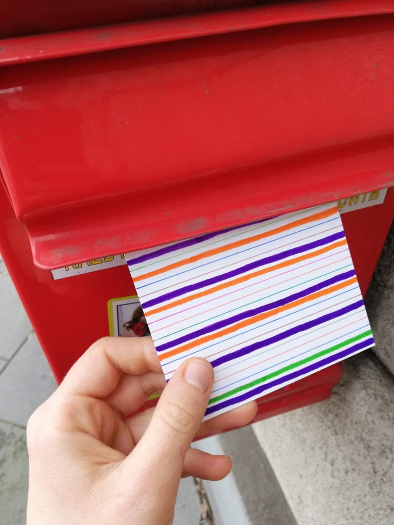
I wanted this postcard to be enigmatic and not very revealing. The idea of simple, colourful lines is an experiment that has been on my mind for a long time. I’m not particularly proud of this card 🙂

Jakub’s postcard:

I found really interesting the idea of exporting Messenger messages. I didn’t know it was possible! The downward trend and the comments added by Jakub caught my attention.

The process:

Categories
Uncategorized

Week 28

Jakub

Topic:
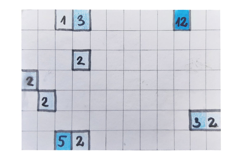
I’m definitely an extrovert. I build relationships with strangers quickly and naturally, e.g. with my neighbors, shop assistants or people in the same queue. I think I would fit into the American small-talk culture. The subject of smiling at strangers was perfect for me. The problem, however, was the pandemic and face masks.

Data gathering:
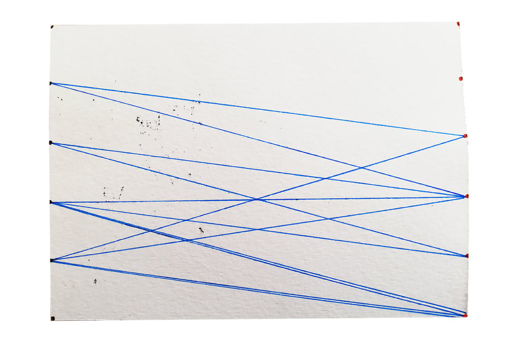
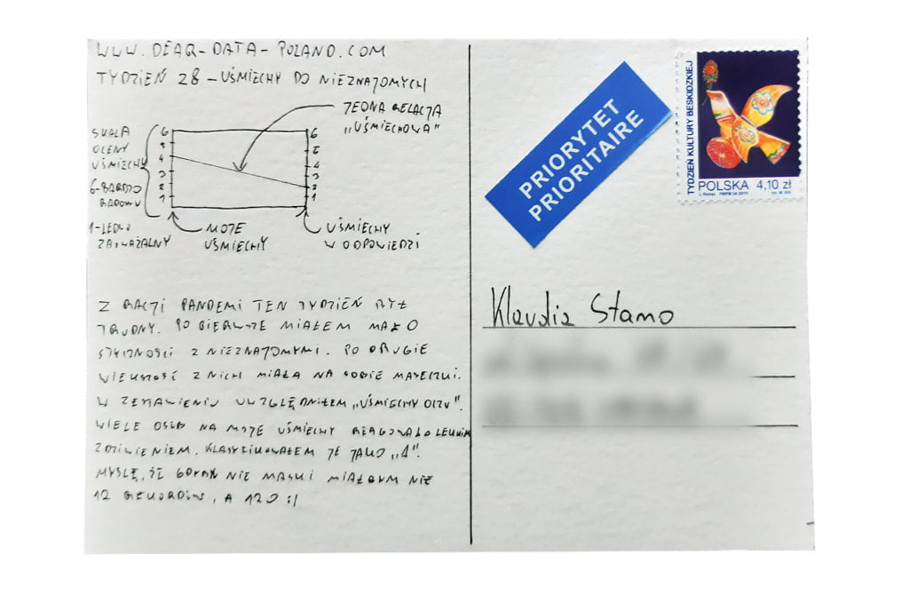
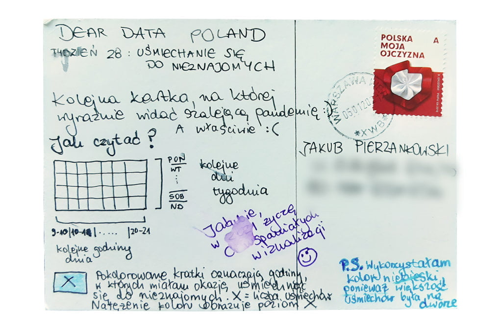
I set a reminder on my phone every hour to write down “smile” situations. The pandemic means that I don’t meet many people. In addition, practically everyone is wearing masks. In total, I only counted 12 smiles at strangers. Very little. I described each smile in two dimensions: the intensity of my smile and the intensity of the smile I received in response. I used the school scale, where 1 meant a barely noticeable smile and 6 was a very warm smile.

Data drawing:
This is the first time I have used a slope graph. I think it suits well the amount and nature of the data presented. I know this is a subjective opinion, but the postcard illustrates that very often people react to strangers’ smiles with caution. At least in Poland.

Klaudia’s postcard:

I remember that on Monday, the first day of this week, I had the opportunity to meet Klaudia in Sopot for a long walk. I can see that Klaudia was tracking the data during this walk. I wonder what happened late in the evening that day?

The process:


Klaudia

Topic:
I knew I was going to collect little data this week. Pandemic equals limited contact with strangers, let alone smiles.

I also asked myself a basic question: how do I check if someone smiled at me if every stranger I meet is wearing a face mask?

Data gathering:
Because of the problem described above, I decided to count how many times I smiled at strangers, regardless of whether the smile was reciprocated. The data was so scarce that it was not at all tiring to write it down every evening (which cannot be said of many weeks of Dear Data :-))

Data drawing:
Honestly, I didn’t have much time on Sunday, so the postcard is minimalistic and a bit gloomy. The predominance of empty spaces illustrates well the current pandemic situation, which offers very few opportunities to exchange smiles with strangers. I think the postcard would look completely different at other times.

Jakub’s postcard:

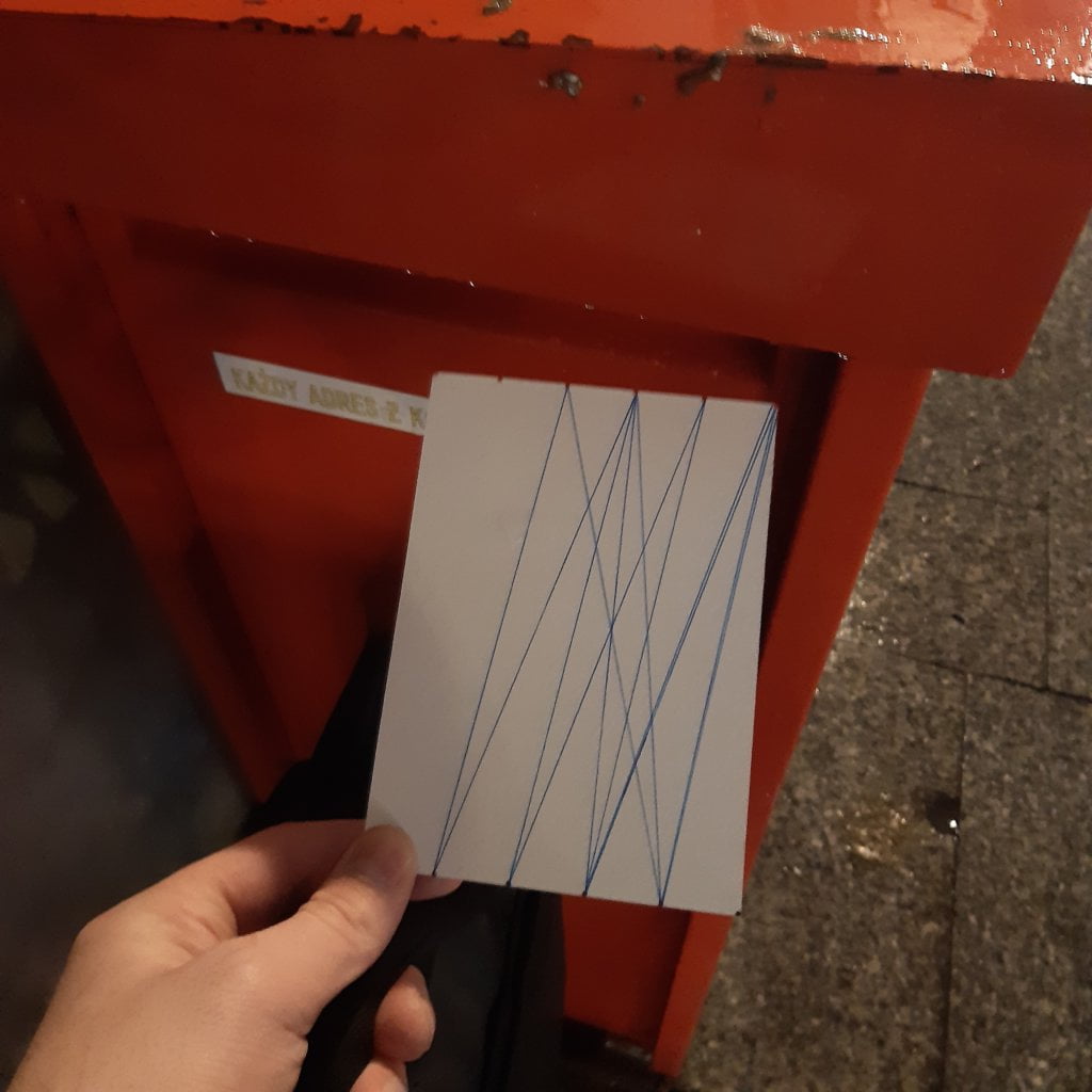
I really like this postcard. It is simple, yet creative. I am a fan of slope graphs. I admire Jakub for taking up the challenge of “evaluating smiles”, especially in times of ubiquitous face masks. It was probably a good training on how to read emotions from the eyes 🙂

The process:
Categories
Uncategorized

Week 27

Jakub

Topic:
I try to be up to date with current news and trends. I approached this topic with great interest and curiosity. From the beginning I knew how I wanted to obtain the data. There is only one conclusion from this week – my media consumption boils down mainly to videos.

Data gathering:

I exported last week’s browser history (both from my computer and smartphone) to a .csv file. Then, with a few formulas, I shortened the links to the basic domains and counted their frequency. Based on this, I built my chart.

I did a similar thing with Youtube, the platform I used the most. In this case, however, I was unable to export the data. I had to write it down by hand. I narrowed it down to the TOP 10 channels that I watched the most.

Data drawing:
I’ve been recently reading the book “Storytelling with data” by Cole Nussbaumer Knaflic. There could only be one decision: a bar chart. My additional goal was to avoid writing the legend on the reverse.

Klaudia’s postcard:

The postcard is impressive. Klaudia really examined the topic. And I’m glad that out of the 6 best-rated articles, 5 were in Polish;) I also like the card visually. However, I believe it would be clearer if the data on each article were shown horizontally, not vertically.

The process:


Klaudia

Topic:
This week, I looked at the press articles I read. I have two digital press subscriptions –  New York Times and Gazeta Wyborcza, a popular Polish daily newspaper. In consequence, the vast majority of articles came from these two sources. 

I’ve been reading quite a lot of press lately, which means at least a few articles a day. Earlier, however, there were weeks when I would focus only on books, not worrying in the slightest about everyday news 🙂

Which article from this week captivated me the most? I think the one from the New York Times about solidarity and neighbourhood help in the time of coronavirus. It was very positive and uplifting.


Data gathering:
During the week I just noted down the titles of the articles I had read (and all the links for a future reference), because I didn’t know how I would use the data eventually.

Data drawing:
There were many concepts, as usual. I started putting them on paper, searching for the perfect solution, and finally I liked the idea of analyzing each article from seven angles:

  • connection with the coronavirus (or no connection, which turned out to be possible in more than half of the articles – this is of course the result of my auto-selection :));
  • geographical relevance (Poland or the world);
  • the language in which I read the article;
  • the emotional charge of the article – positive, neutral or negative;
  • whether the article referred to current news or had no expiry date;
  • my article rating on a scale of 1 to 3;
  • the article length.

After drawing the postcard I came to an interesting conclusion. I rated only 6 out of 22 as very good. The rest was average or below expectations. 

I also observed that I would prefer to read more texts with a longer or no expiry date. Current news becomes outdated after a few days and often just creates chaos in my head.

Jakub’s postcard:

Nothing compares to a well-designed bar chart!

The process:

Categories
Uncategorized

Week 26

Jakub

Topic:
I am a fan of ongoing optimization. I experiment a lot with various tools to optimize my work. At the same time I try to be a minimalist. There is virtually nothing on my desk but my computer. I keep my desktop clean and constantly strive for the so-called “zero inbox”. This week I focused on the tools I used.

Data gathering:
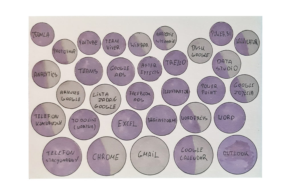
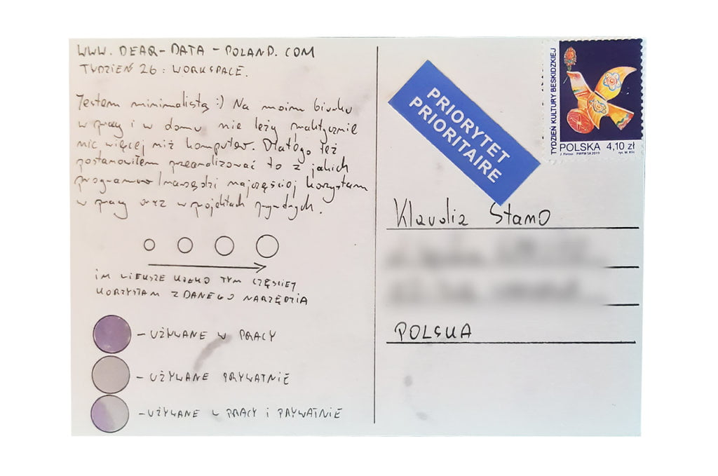
Based on weekly reports sent to my boss and my private notes summarizing the week (I have been keeping them for over a year), I knew exactly what tools I used and whether it was for professional or private purposes. Then I divided the data into four categories depending on the frequency of usage.

Data drawing:
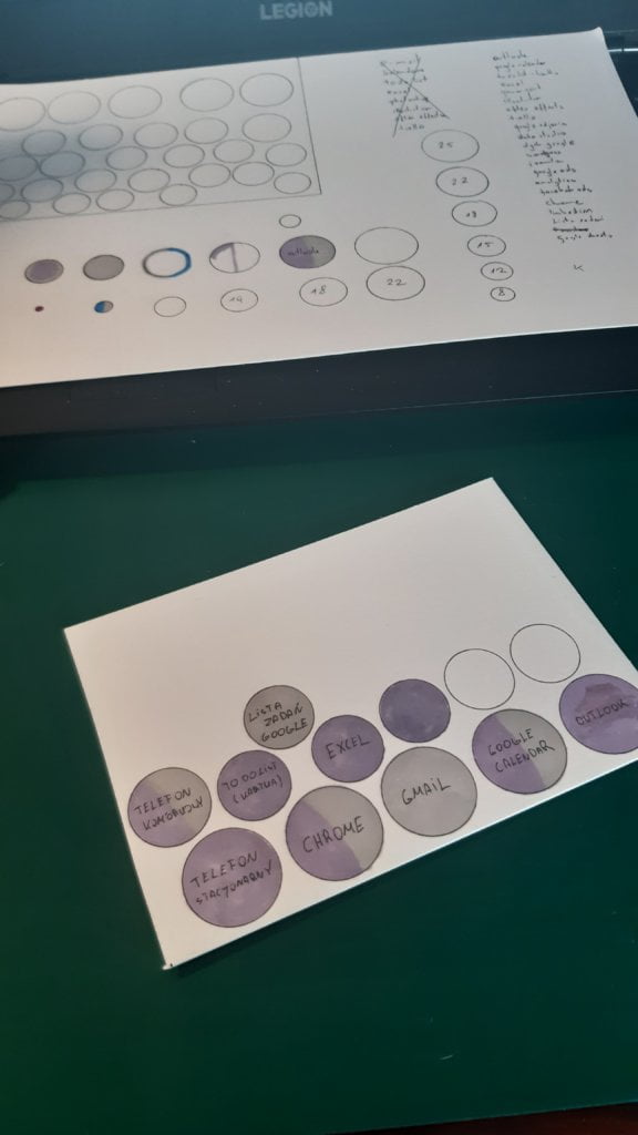
I am a fan of circles, even though I know that they are quite risky in data visualization. This postcard only proves it. Upon finishing I noticed that the size differences are sometimes hard to notice. It’s easy to see the difference between the largest and the smallest circle. However, this cannot be said for the middle circles. Well, learning from mistakes 🙂

Klaudia’s postcard:

I appreciate Klaudia’s diligence 🙂 I am becoming a bigger and bigger fan of the colours used by Klaudia.

The process:


Klaudia

Topic:
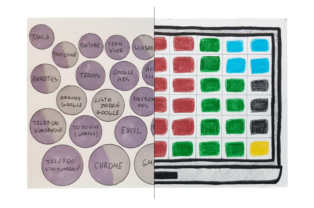
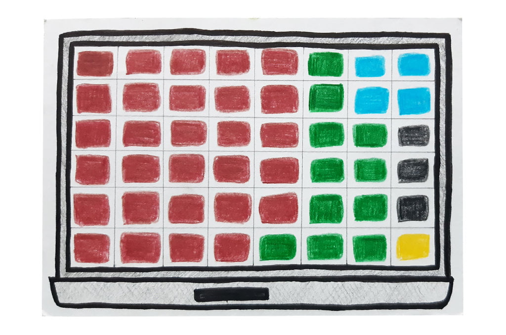
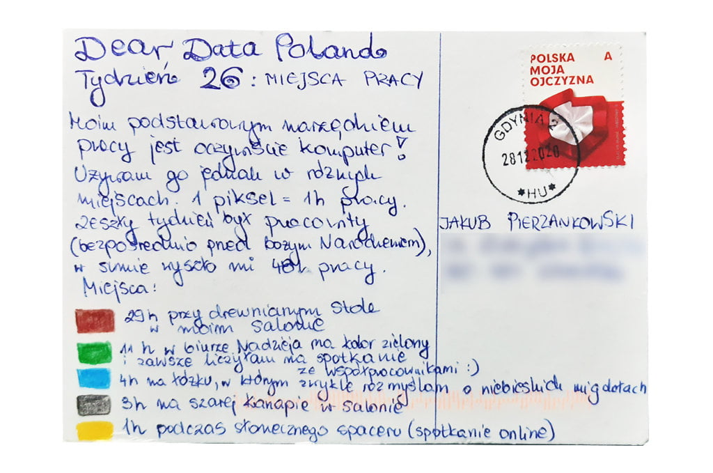
It’s been a very busy week – I spent 48 hours in front of my laptop. Like most of us I work mainly from home. Over the last few days, however, I was running two webinars from my organization’s office, so this week was more diverse than the previous ones in terms of location (for the benefit of the postcard). 

Data gathering:
Every evening I would write down where I worked that day and for how long. 

Data drawing:
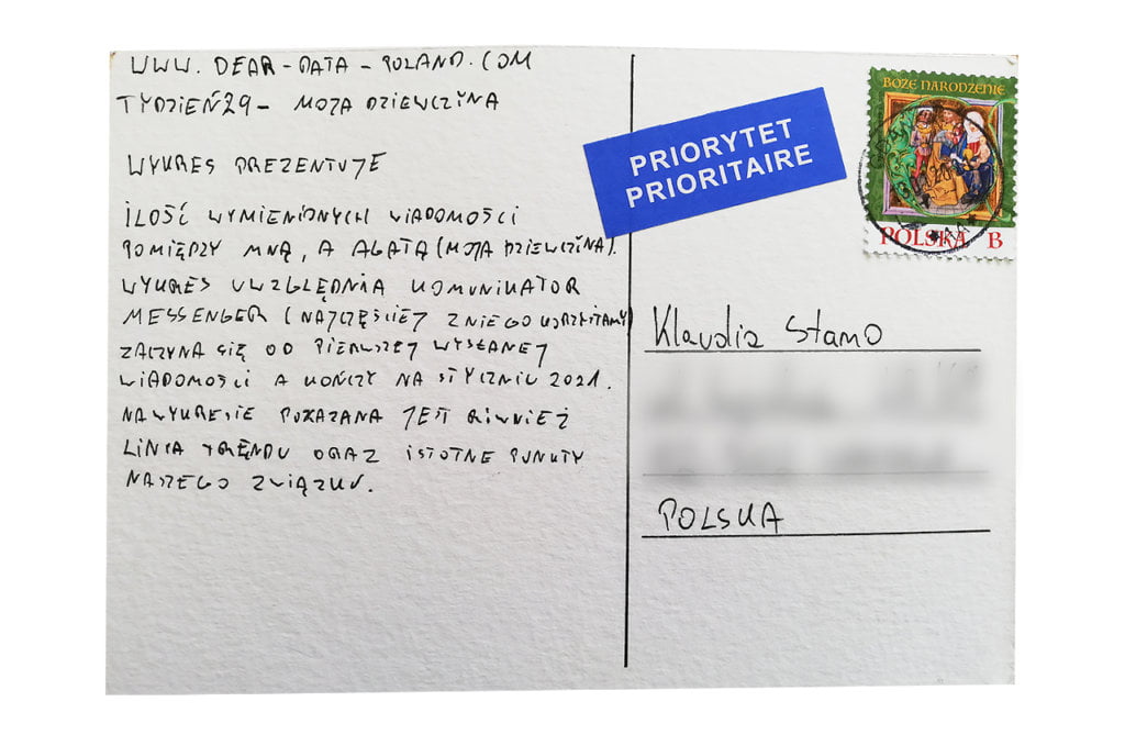
I procrastinated with drawing this postcard for 2 or 3 days, as no idea coming to my mind seemed to be right. In the end, I thought about the so-called waffle chart, the elements of which I could use as pixels. As a result, my postcard laptop is pretty pixelated, but after all, there were “only” 48 working hours in my week 🙂

Jakub’s postcard:

It’s interesting that this week we interpreted the main topic, workspaces, in a completely different way. I saw it more literally, Jakub – figuratively. I read with curiosity Jakub’s postcard. I can see a soulmate when it comes to Trello, Google Analytics and Google Docs 🙂

The process:
Categories
Uncategorized

Week 25

Jakub

Topic:
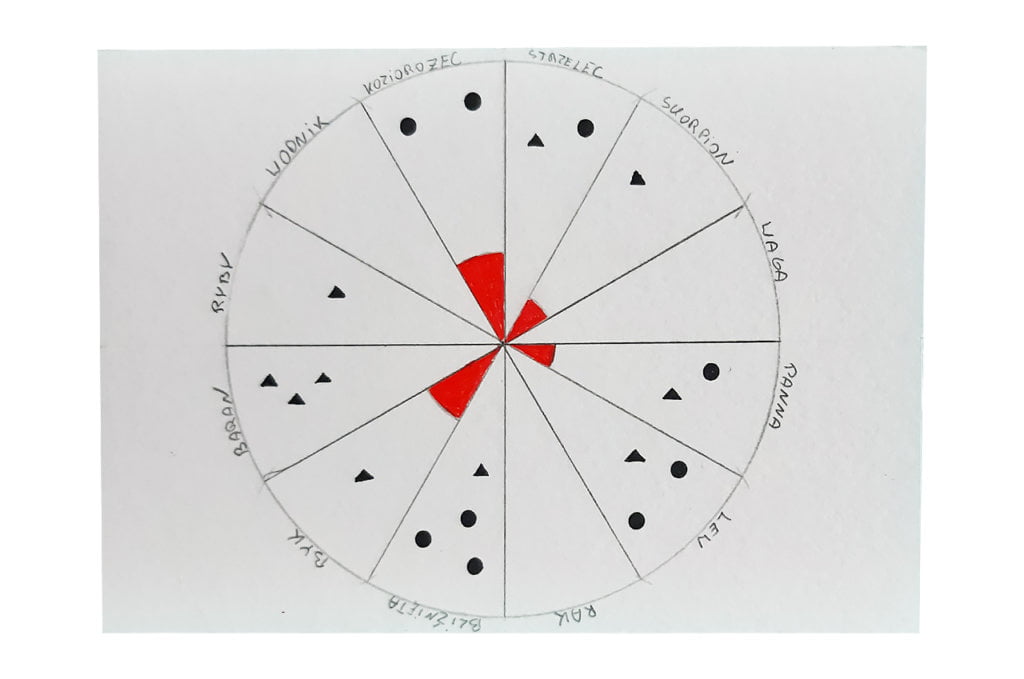
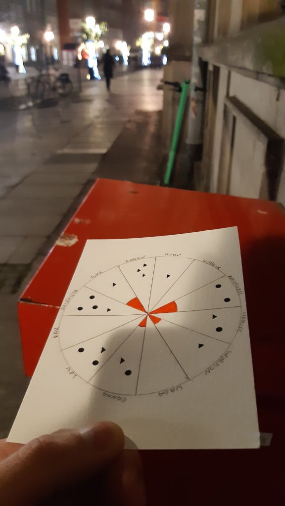
A few years ago I discovered that three people close to me were born on the same day, on January 19th. For a long time it was an argument for me to believe at least a little bit in horoscopes. This week I wanted to test it out. And my conclusion is that this argument is rather weak.

Data gathering:
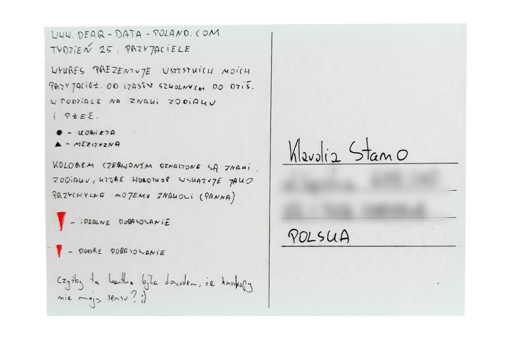
I went back to elementary school and started writing a list of my friends. From adolescence until today. I counted 19 people in total. I checked the zodiac sign for each of them and put it in the appropriate place on the chart. Then I read a few horoscopes of my sign (Virgo) to check the associations with other signs. I marked in red these zodiac signs that I should get along with particularly well.

Data drawing:
My chart is very simple. My girlfriend, who is always the first reviewer of my postcards, finds it not very visually appealing, but comprehensible and effectively illustrating the subject. I guess it’s a success 🙂

Klaudia’s postcard:

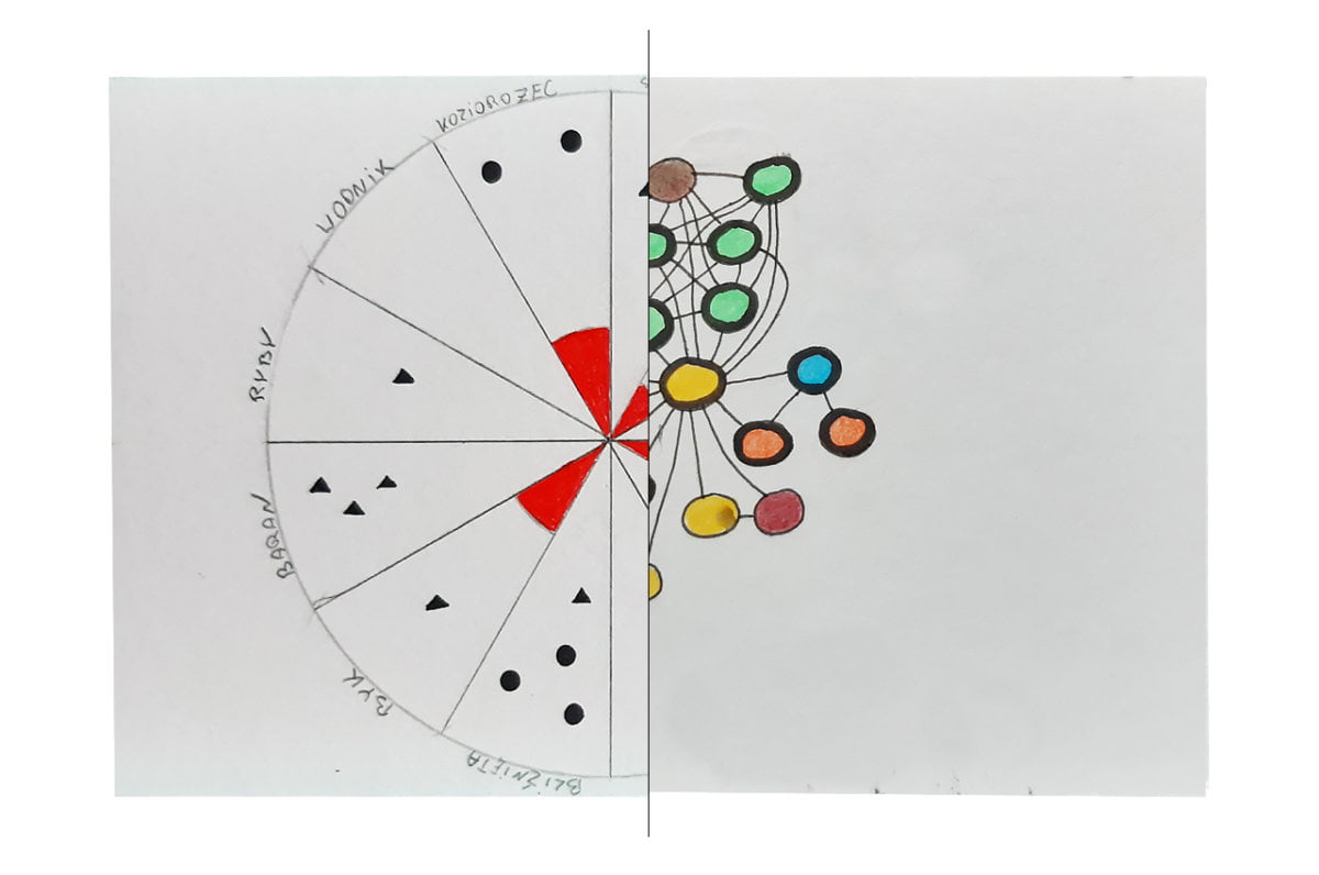
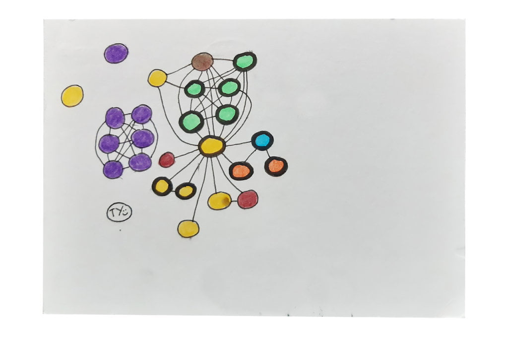
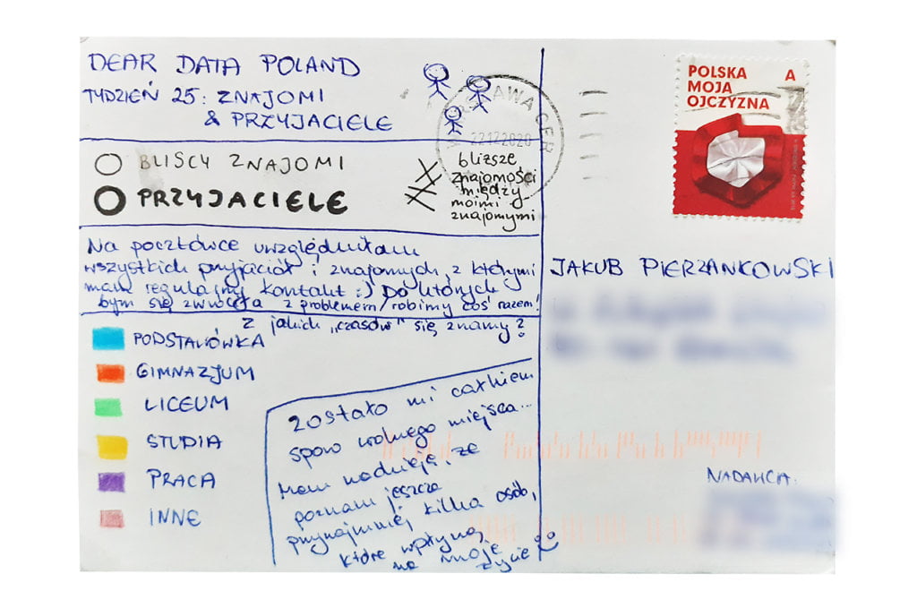
The network interestingly depicts people as vital links in all relationships. It also shows the importance of school and university friends. It is when we build the strongest relationships. Klaudia’s postcard confirms in a way the so-called Dunbar numbers theory, i.e. that we dedicate approx. ⅔ of our social time to only 15 people.

The process:


Klaudia

Topic:
Great topic 🙂 It made me wonder: With how many people I actually maintain regular contacts? With how many do I share interests and common discussion topics?

This week I was also thinking about the durability of relationships I have made in recent years. Today it is not as easy to become close friends as it was in childhood. The people closest to me (as you can see on the postcard) are those I met at school and in university. Fortunately, however, I regularly meet new friends who become a source of inspiration for me.

My other conclusion is that during the pandemic it is difficult to properly take care of relationships. Common experiences, long conversations and strange adventures are less frequent, and yet they bring people together and are remembered after many years.

Data gathering:
Due to the rather limited “live” contacts this week, I simply decided to stop for a moment and check: 1) with how many people I had an ongoing, non-professional contact and/or 2) how many people I could contact without hesitation asking them to eat lunch together, go for a walk, or just have a discussion about all sorts of things and they wouldn’t be surprised 🙂

Data drawing:
I’ve been thinking about drawing a net for some time and this week seemed a perfect opportunity. Using this technique I decided to visualize the relationships between all my friends. By relationship, I mean more than just a passing acquaintance.

Several peninsulas emerged, mainly connected by a circle representing my husband, because he knows many of my friends and we often meet in a larger group.

You can also see a few larger and smaller islands made up of people that only I know (e.g. my colleagues)

Jakub’s postcard:

How interesting! Once, in the past, I also wondered if my friends’ zodiac signs meant something, but as a person with little faith in astrology, I never did an in-depth analysis. I suspect that, just like in Jakub’s case, not much would come out of it 🙂 Anyway, this is a very interesting approach to the subject.

The process:

Categories
Uncategorized

Week 24

Jakub

Topic:
Mythical week. Postcard on this topic made by Giorgia Lupi is my favorite one. It is for me a Dear Data project symbol. Initially, I thought I would approach this topic in a similar way, i.e. by showing, among others, types of doors I pass through. However, I changed my mind quickly.

Data gathering:
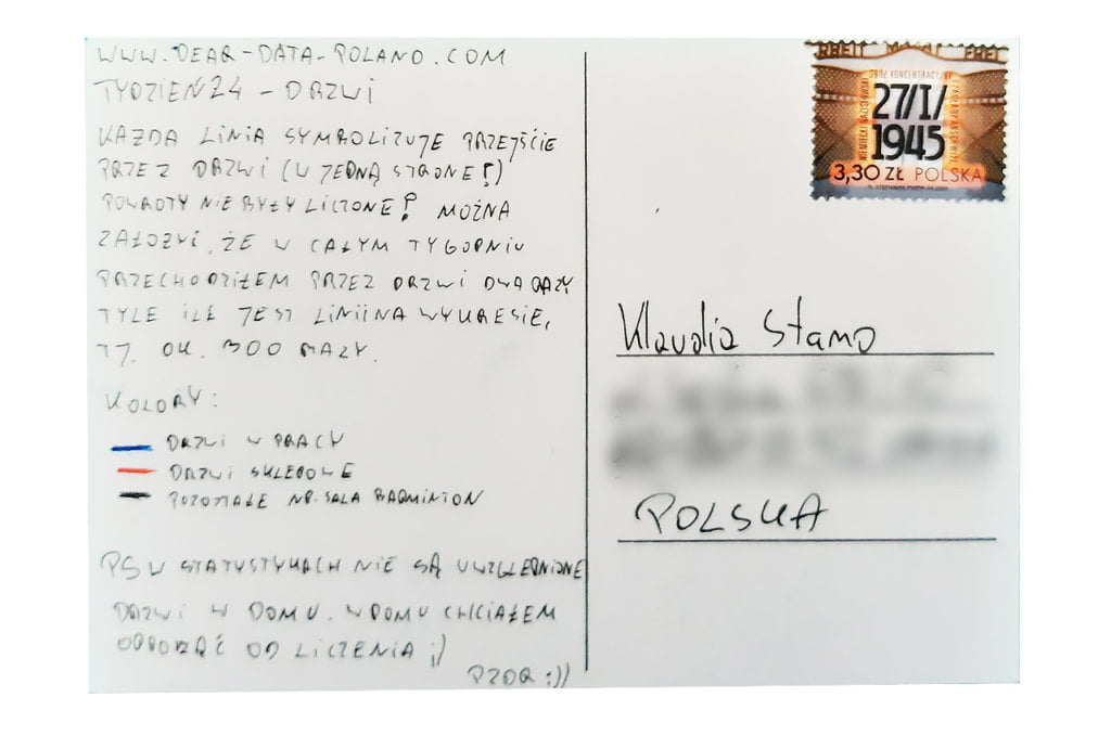
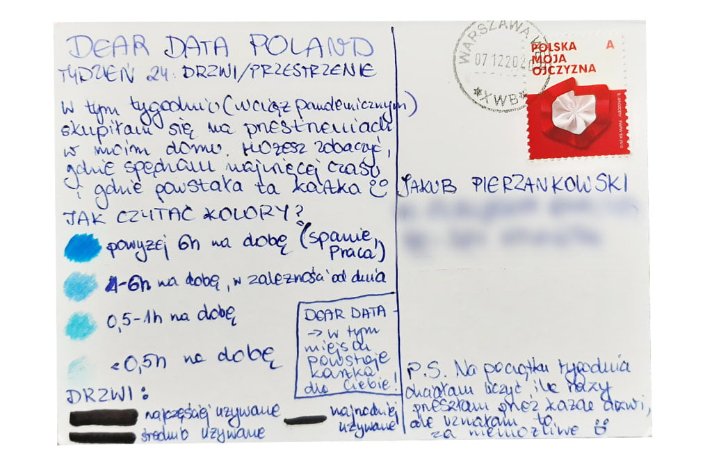
I focused on the number of doors and their location. It would burden me too much to focus on the type of doors. Especially that at work I was carrying out a project of a dozen or so photo sessions, which I was deeply involved in. I set a reminder on my phone every 2 hours, and at such intervals I was noting down all the doors I walked through.

Data drawing:
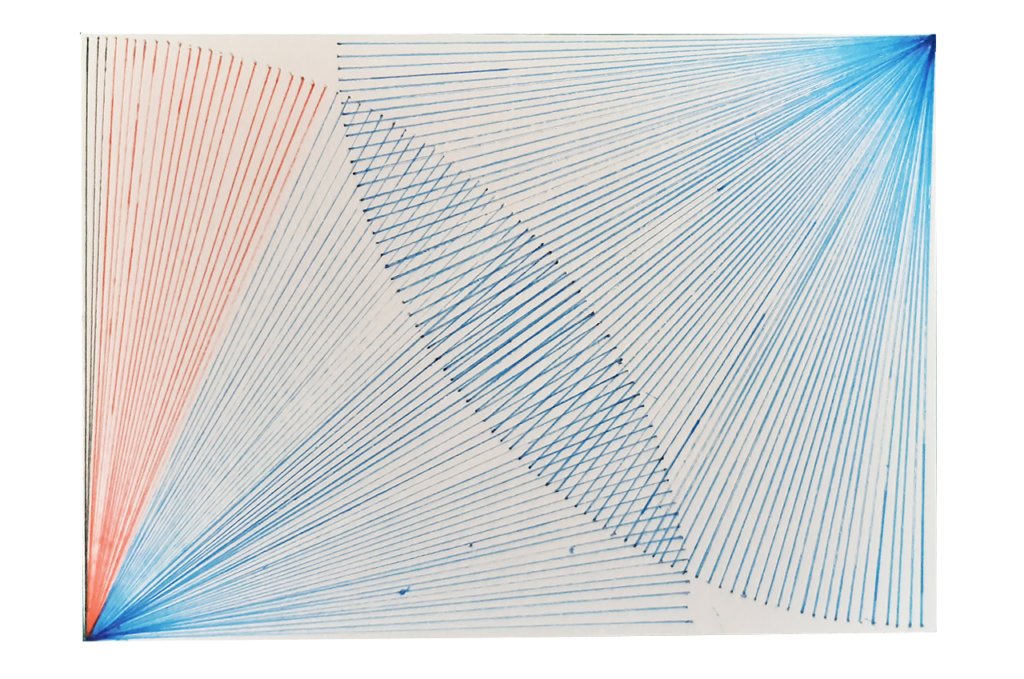
The graph resembles the representation of doors in architectural solutions. The intersection of lines in the middle refers to the nature of doors, i.e. connecting two spaces. I am not entirely happy with the card. I think it is pretty, but it is far from an effective data visualization.

Klaudia’s postcard:

Currently, it is my favorite Klaudia’s postcard. It is eye-catching and clearly presents the data. I am a fan of using color saturation and I will definitely use this type of technique in the future.

The process:


Klaudia

Topic:
Doors and spaces. I have been waiting for this week for a long time. Can I really count how many times I’ve walked through different doors in and out of my apartment?. 

Data gathering:
Already on Monday at 11 AM, which is 4 hours after waking up, I decided that recording each time I pass through the door would drive me crazy and I’d rather give up the Dear Data project 🙂

With full deliberation, I stopped counting door passages and focused on the word spaces. As I spend 95% of my time at home (the pandemic reality), I counted every evening how much time I spent in different corners of the apartment. 

Data drawing:
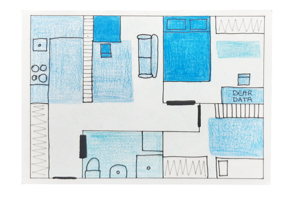
The idea came quite naturally. I sketched the layout of my apartment and, using the saturation of colors, I indicated the most frequently used spaces. The most intense blue spaces are my favorite ones 🙂

Jakub’s postcard:

I like the visual effect of Jakub’s postcard. The multitude of lines resembles the trajectory of doors opening and closing.

I also have to admit that I am a liitle jealous of the number of times Jakub spent at work 😉 I haven’t been to my office even once this week and I still miss the everyday coffee and chats with my colleagues.

The process:

Categories
Uncategorized

Week 23

Jakub

Topic:
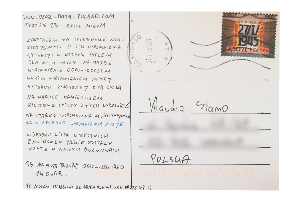
Am I nice? I think so. I avoid conflicts. I am aware of emotional intelligence and try to relieve tensions, not create them. But… am I a nice person? This week was going to give me an answer.

Data gathering:
Imagine my surprise when I realized on Thursday that I am not collecting any data. I threw myself into work and completely forgot about the project. The end of the year is always a busy period in marketing departments. Closing the budget, planning a new one and all the activities related to Christmas.

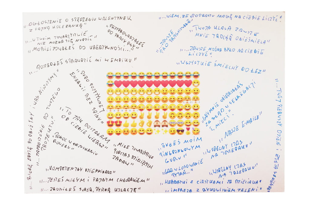
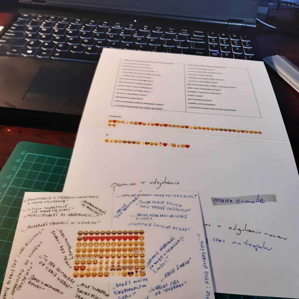
Facebook and my friends came to my aid. I published a post asking for memories of my friends where I was nice to them. I have received over 20 comments. I responded to each of them with a similar memory. In this way, I collected the data.

Data drawing:
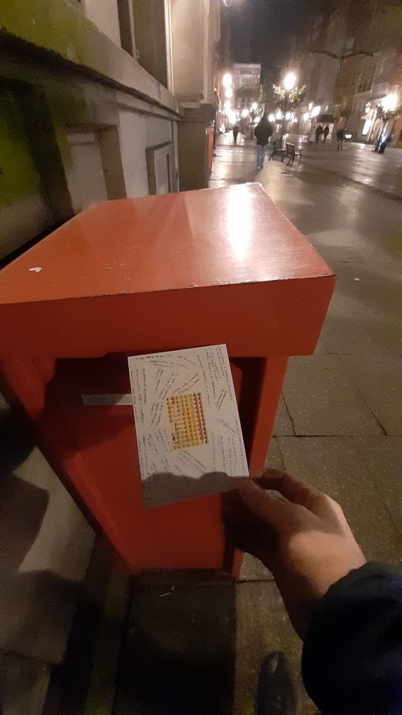
Once again, I tried to mix printing and drawing techniques. This is why printed emoticons and handwritten quotes can be both found on my postcard. I think that this type of technique increases the attractiveness of postcards and I plan to use it more frequently 🙂

Klaudia’s postcard:

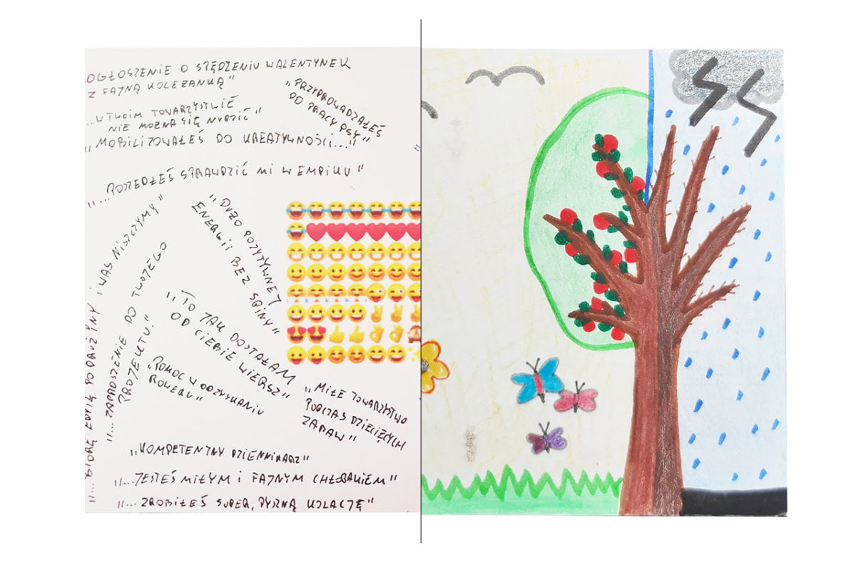
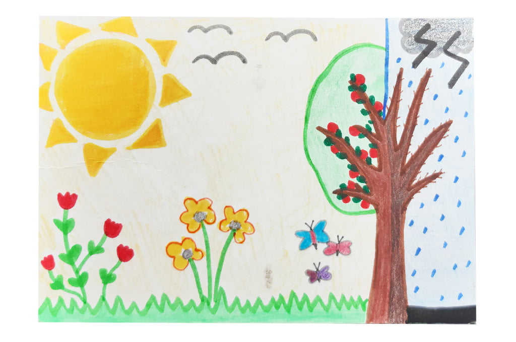
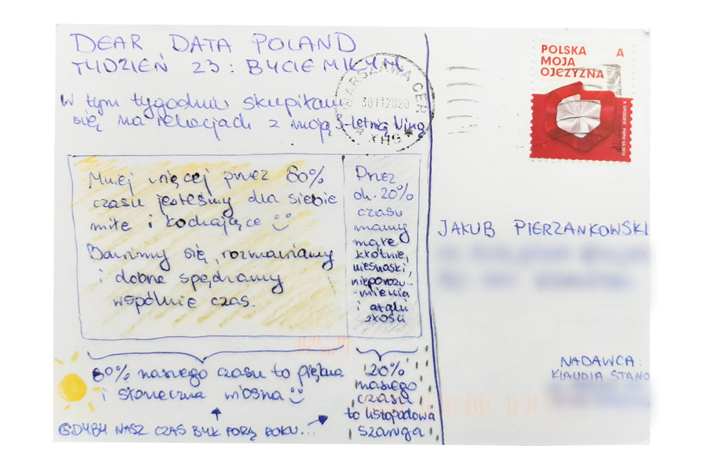
What I like about Klaudia’s postcard is the simplicity of the idea, i.e. dividing the card into two areas. The reference to the weather is clear. I hope that Nina, Klaudia’s daughter, was at least partially involved in drawing this postcard 🙂

The process:


Klaudia

Topic:
I always try to be nice and kind. If I were to collect data only on superficial relationships with other people, my card would be quite boring, especially during the pandemic. I felt resistance. After some time, however, I thought that not every relationship in my life is a fairy-tale. I have a 3-year-old at home! Raising a child is not all roses. Or rather, it is the greatest rose in the world, but it stings a lot. So I decided to check what percentage of my time with Nina can be described as nice and trouble-free, and what percentage consists of small quarrels and disagreements, which – to put it bluntly – throw me off balance ;-). 

Data gathering:
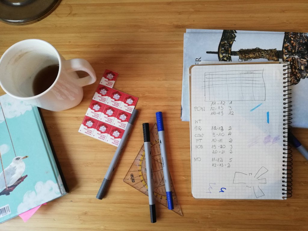
During several periods of spending time together, I wrote down the proportion of pleasant and unpleasant times. 

Data drawing:
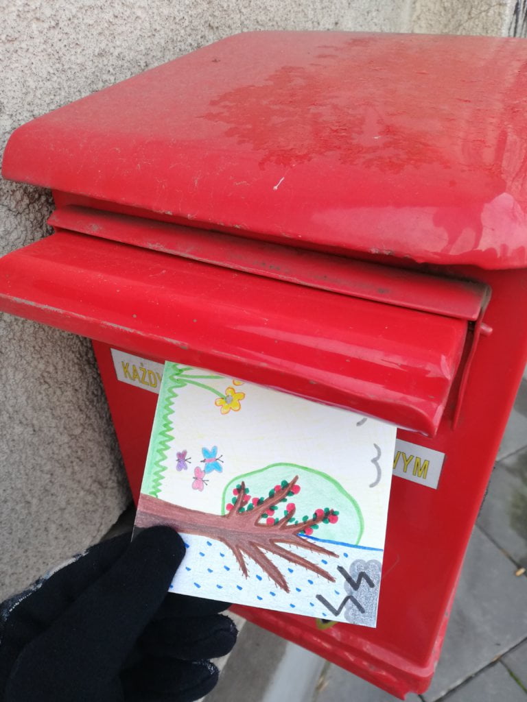
As the card shows my relationship with Nina, I wanted it to resemble a child’s drawing. Not without significance was the fact that it is precisely my artistic level 🙂 The reference to the weather also struck me as an accurate metaphor.

Jakub’s postcard:

I did not think about involving my friends in collecting data, but it is a great idea and I will certainly use it in one of the nearly 30 weeks that are still coming.

The process: