Categories
Uncategorized

Week 22

Jakub

Topic:
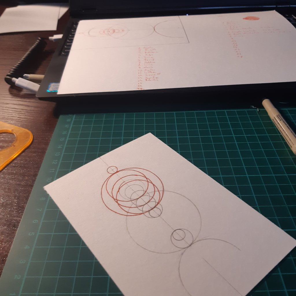
I enjoy thinking about the past. I analyze my mistakes and my successes quite often. From the very beginning of this project I knew how I wanted to approach this topic. Mostly because women shaped my personality. There was also another important aspect – I collected some of the data earlier.

Data gathering:
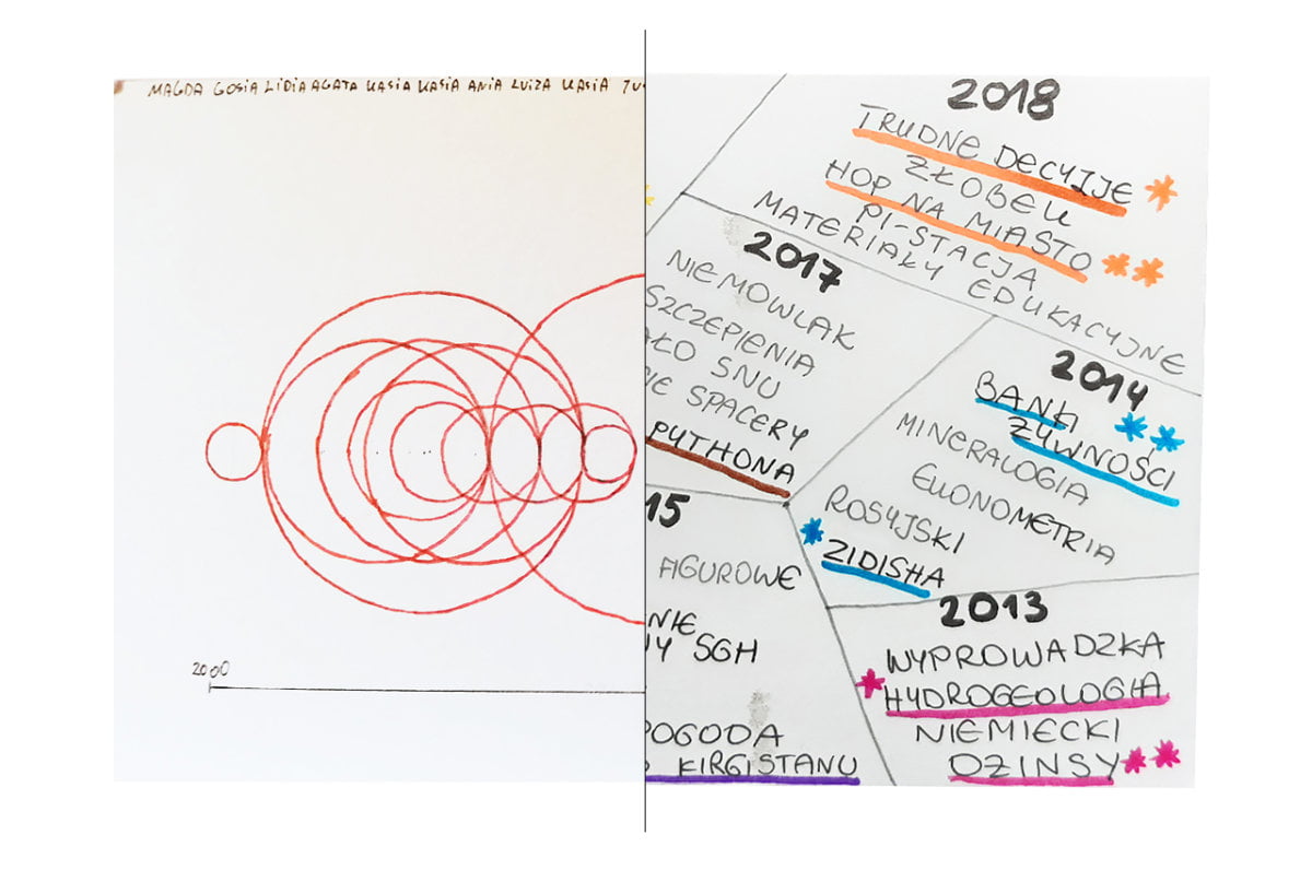
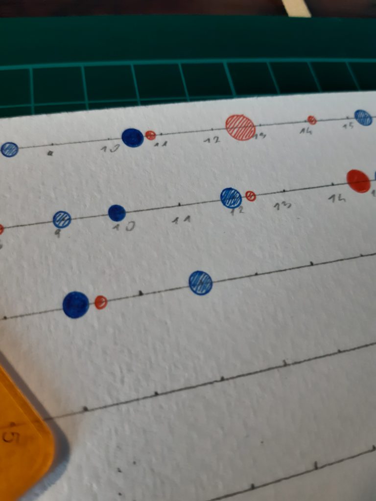
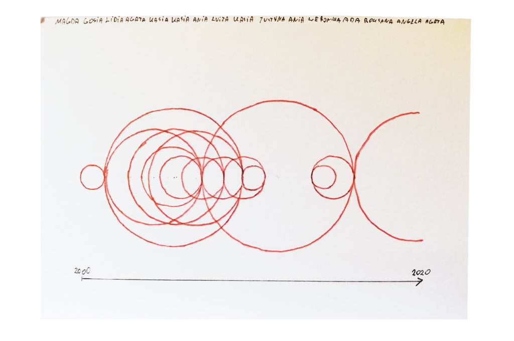
Back in university, when I was often unhappily in love, I decided to prepare a table with all my “love stories”. Those crazy years 🙂 I managed to find this file and, after many attempts, I guessed the password. I updated the table for the last 8 years and this is how my postcard came to life.

Data drawing:
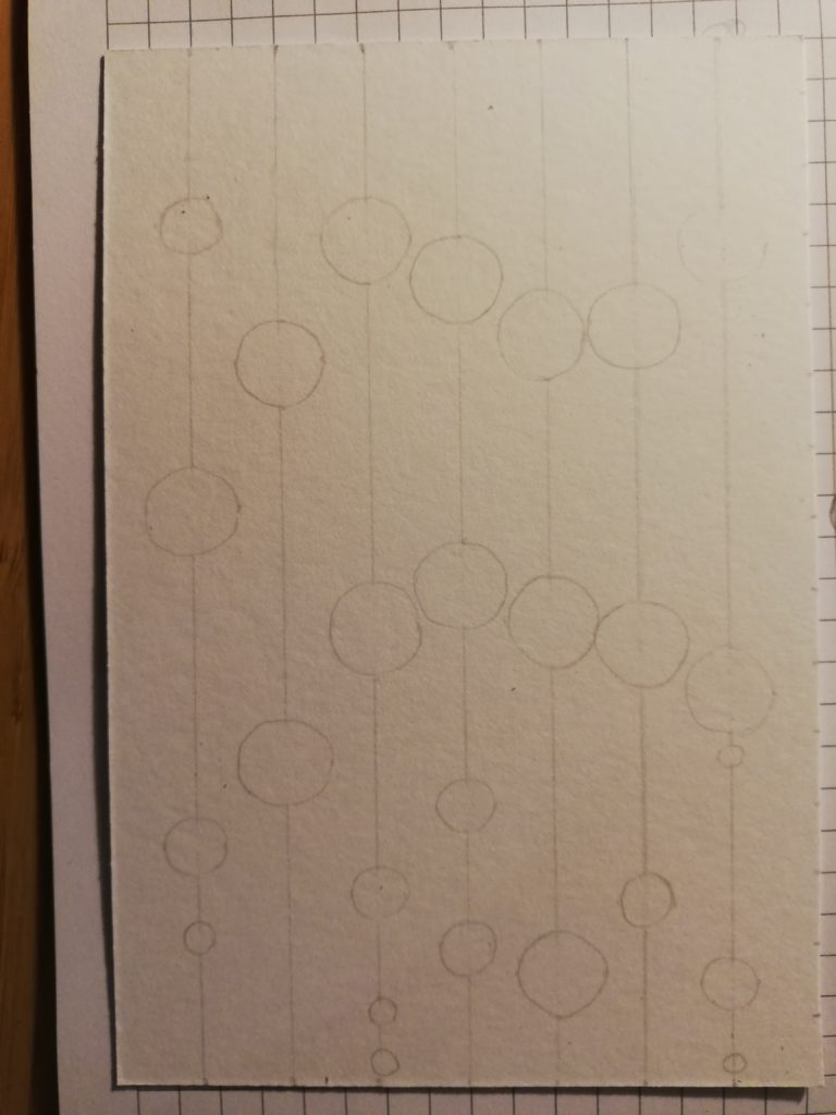
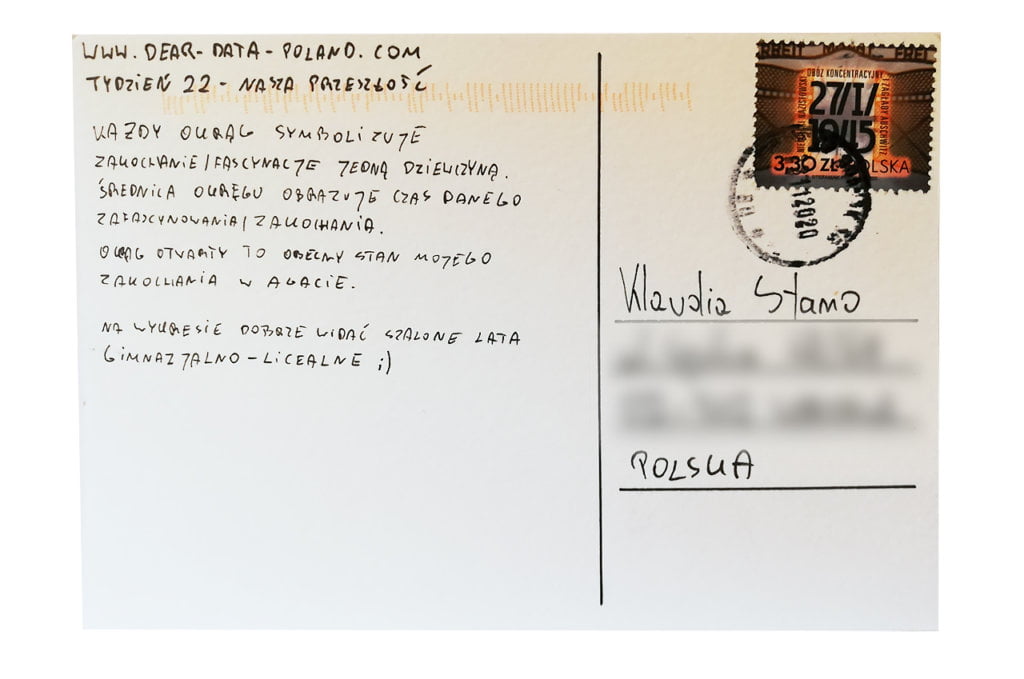
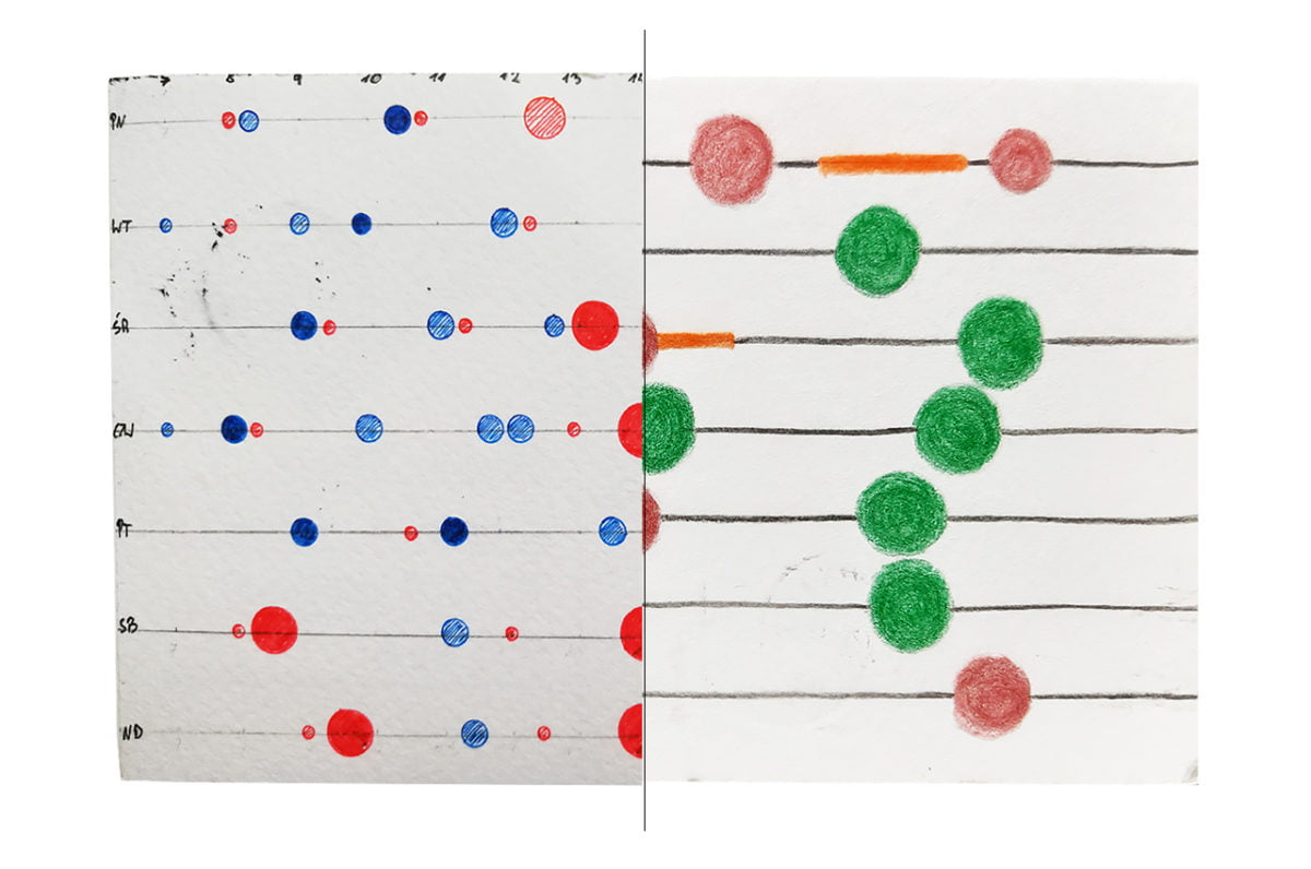
I wanted to show the number and the duration of my infatuations. The circles (and their diameter) present the duration. The circles often overlap, which shows that my feelings were not always stable. I just wish I had made a distinction between reciprocated and unreciprocated love stories. There were many more of the latter. Well, young people make mistakes. Today I am in a stable relationship with Agata and I hope it will stay this way forever.

Klaudia’s postcard:

I read Klaudia’s postcard with great interest. It is very rich in content and allowed me to get to know Klaudia and her life path better.

The process:


Klaudia

Topic:
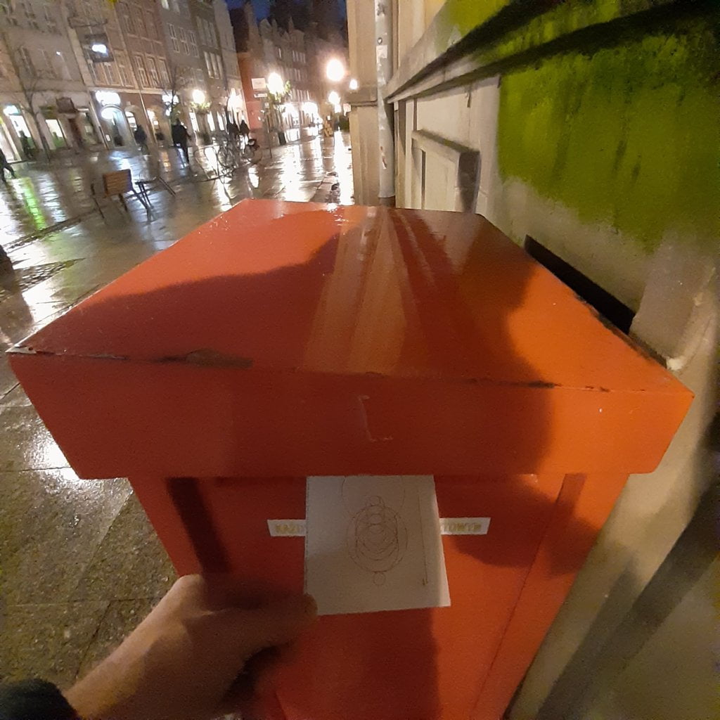
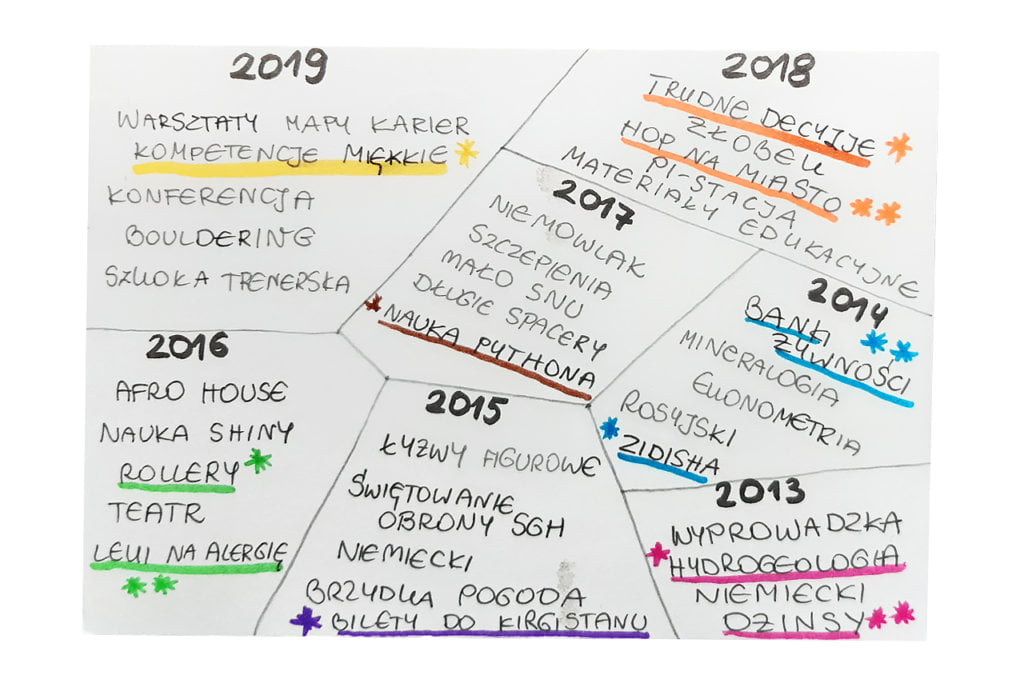
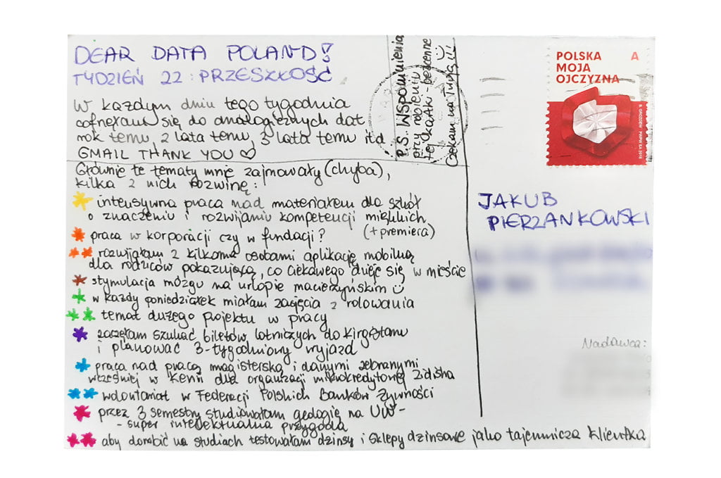
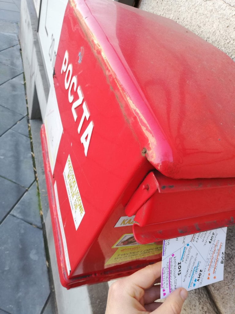
How to show my past through the lenses of one rainy, November week? I wondered for a long time how to address this topic. Suddenly, I knew it. Every day of the week I would go back to the same November week a year ago, two years ago, three years ago etc. All in all I went back to 2013 and I must admit it was a compelling adventure!

Data gathering:
I don’t have a good memory, so I had to rely on my digital footprint. My mailbox archive turned out to be the most reliable data source for this week. Fortunately, I write a lot of emails 🙂 I also looked at the photos on my phone. In this way, I found keywords that characterized my mid-November in previous years. 

Those memories! I have almost forgotten some things and events, even though they were important to me not so long ago.

Data drawing:
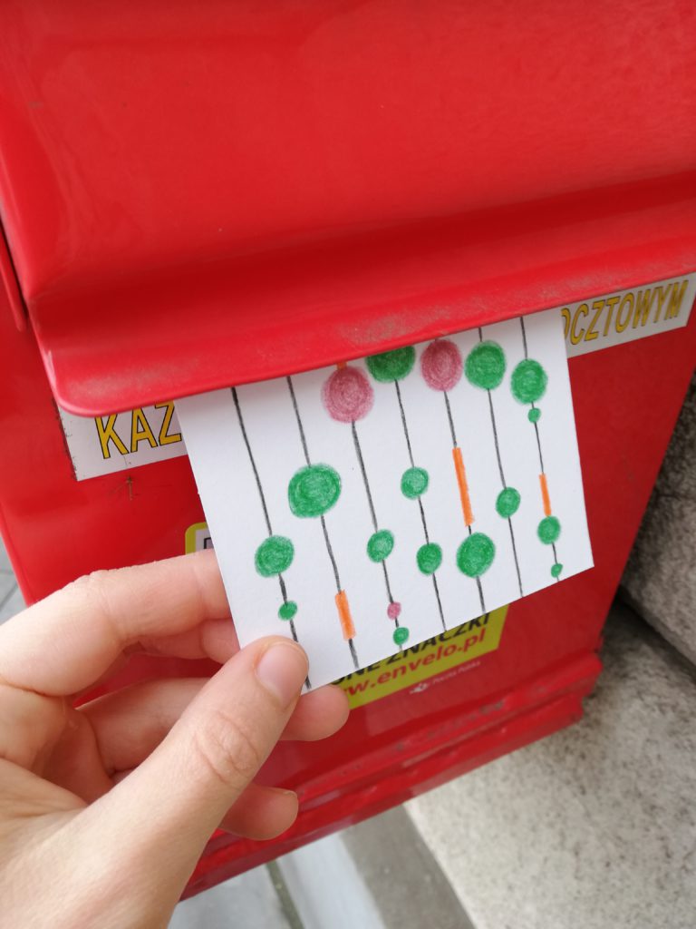
I resisted using words on postcards for a long time, but this week I gave up. I also hoped that with a more self-explanatory visualization I would let Jakub get to know me better – and I think I managed to do it 🙂 I explained more thoroughly some keywords on my postcard because at first glance they could seem weird.

Jakub’s postcard:

The postcard surprised me and made me laugh. I also remembered my school days and my own infatuations. I keep my fingers crossed for the open circle with Agata 🙂

The process:
Categories
Uncategorized

Week 21

Jakub

Topic:
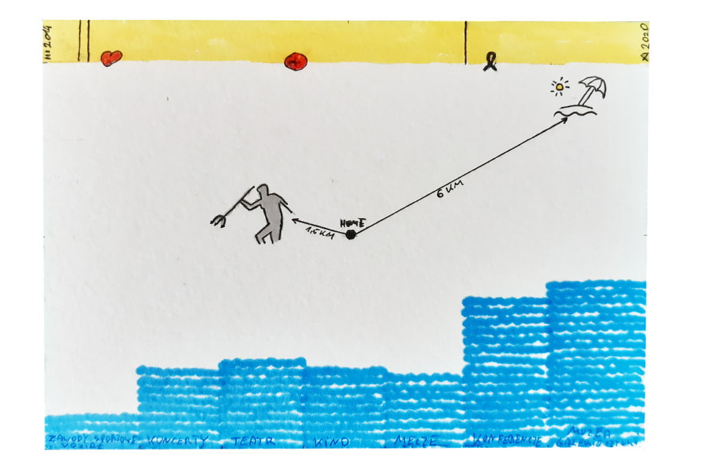
My city. Gdańsk. A never-ending story. For a long time I didn’t know how to approach this topic. In the middle of the week I realized that I still have no data and no idea. My indecision is reflected in the postcard.

Data gathering:
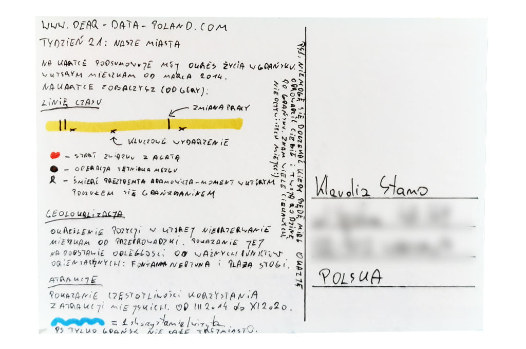
I used my “diary” where I regularly gather tickets from all events, such as theatre, cinema, conferences. I decided to show my life in Gdańsk, where I have lived for the past 6 years. It is both long and short.

Data drawing:
In my infographics I tried to refer visually to the sea waves and the sun. I am not fully satisfied with the result. I think it is one of my least attractive postcards. My friends agreed: interesting data and good idea, but… poor execution. With hindsight I would approach this topic differently.

Klaudia’s postcard:

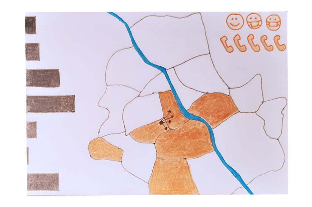
Back in my university time in Warsaw I spent a lot of time in Klaudia’s district. I waited for this postcard with great curiosity. I am a big fan of urban transportation systems and I hoped to see something around this topic. However, I forgot about the pandemic and home office. There are even face masks! Luckily I can see some walking on Sunday 🙂

The process:


Klaudia

Topic:
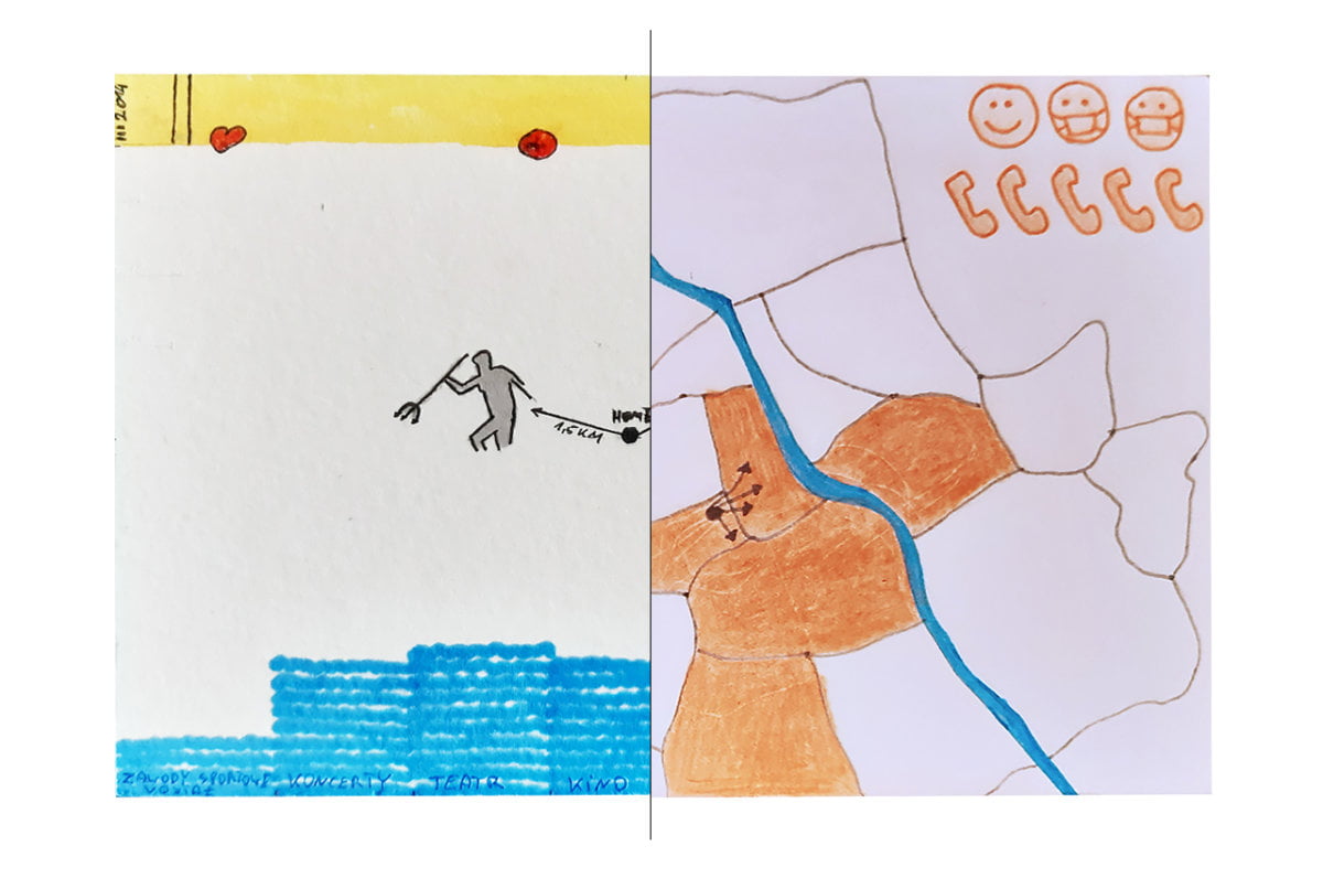
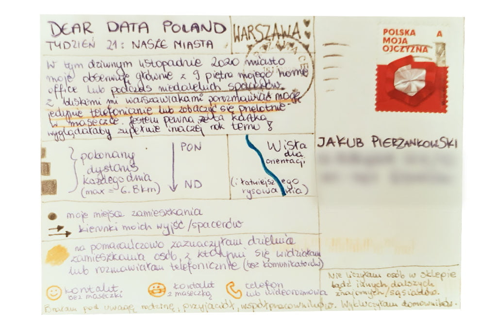
In the last few (pandemic) months Warsaw suddenly got smaller. I spend time only in Ochota and the neighbouring districts. I rarely see family and friends who live in different parts of Warsaw. It is actually quite sad. Recently it does not make a difference to me if my loved ones live in the same district, the same city or the same country. We only see each other online (with some exceptions that prove the general rule). 

Data gathering:
Data gathering this week brought me down. I realized how limited my relationships with the outside world are (excluding my household). 

I tracked the distance on foot each day and people from Warsaw who are important to me and with whom I had more in-depth contacts (face-to-face, phone call or a video-call).

Data drawing:
I challenged myself to sketch the map of Warsaw. It turned out even more difficult than I thought! The map on the postcard is my 6th attempt and still far from perfection.

Jakub’s postcard:

I can feel the sea and the beach in Jakub’s postcard. It would be so nice to be only 6km away from the seaside – I am jealous 🙂

The process:
Categories
Uncategorized

Week 20

Jakub

Topic:
Nowadays avoiding information requires more effort than collecting information. I try not to spend too much time on the Internet, especially on social media. I carefully select my news sources, at the same time avoiding so-called information bubbles. I guess I am doing quite well in this respect. Nonetheless, I am always hungry for interesting news. 

Data gathering:
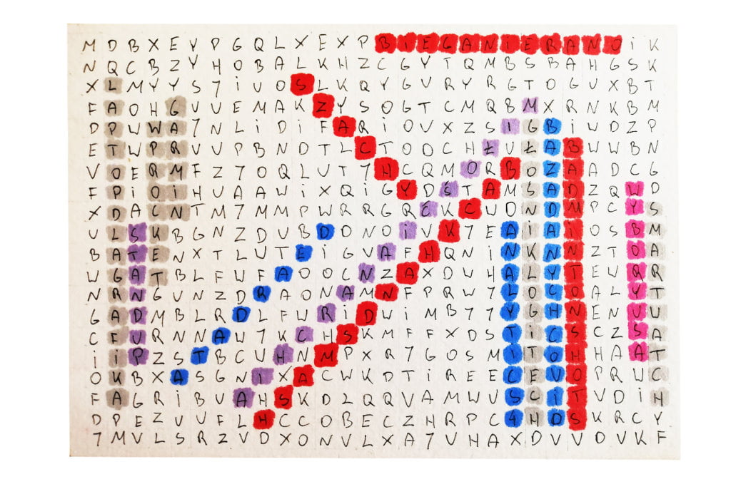
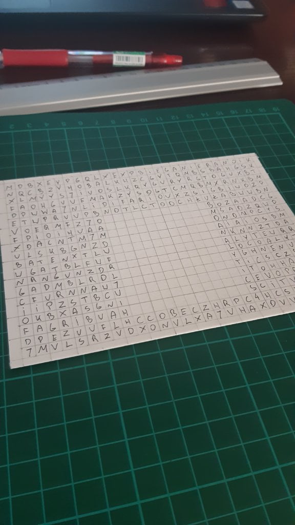
Every evening I noted down all the things that were interesting and important to me during the day.

Data drawing:
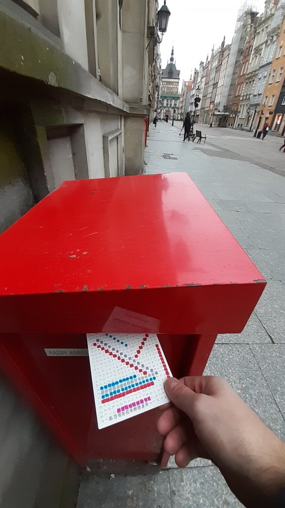
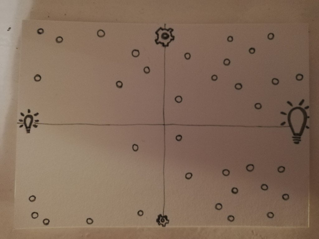
Dear Data lets me explore new and non-obvious visualization techniques. I saw somewhere a kid playing word search and it inspired my postcard design. Now I see this is not the most effective way to visualize data because it’s too chaotic. However, experiments are good!

Klaudia’s postcard:

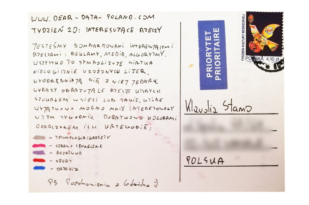
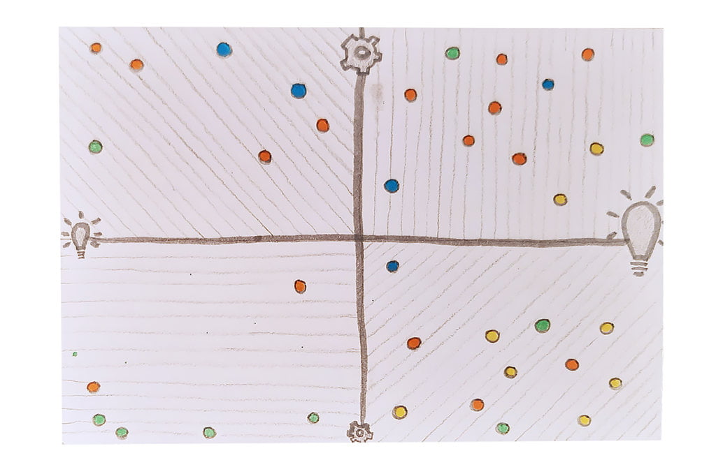
I like the matrix – it shows Klaudia’s work-life balance. I would like to know, however, what things exactly attracted Klaudia’s attention. I could be inspired myself.

The process:


Klaudia

Topic:
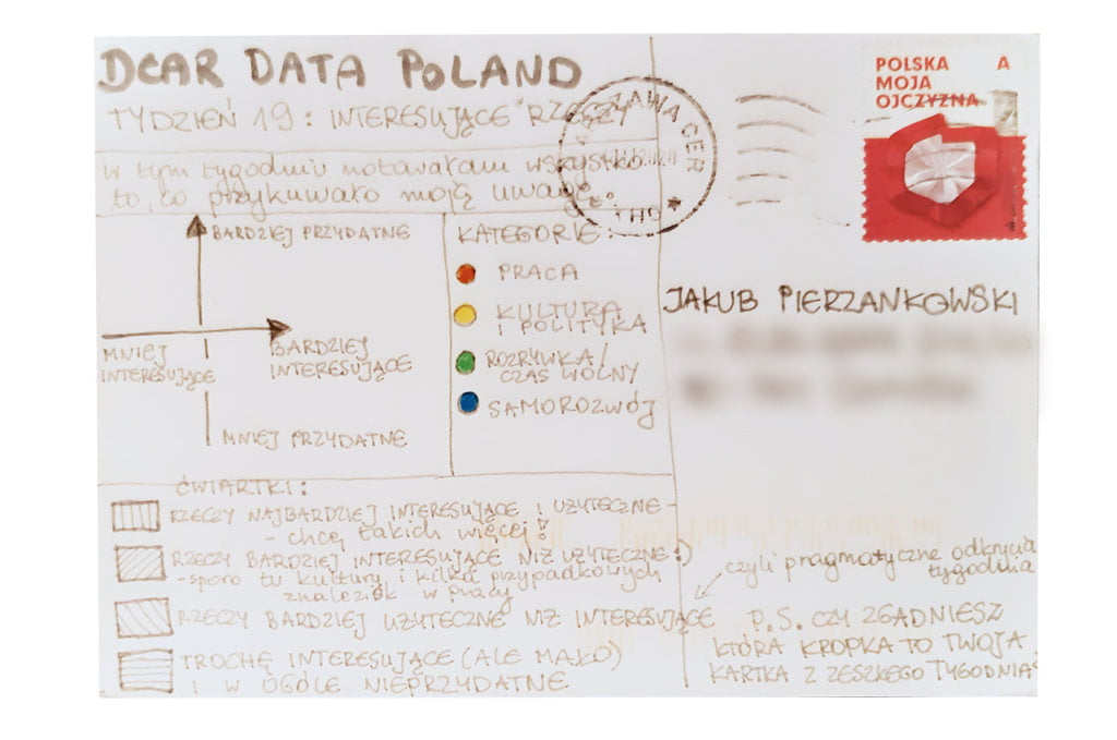
People who know me have probably noticed my addiction to new ideas and inspirations. I also love to share my findings and thoughts with others. This is why I really enjoyed this week’s topic. It encouraged me to observe even more attentively all the interesting things happening around me. Pure pleasure.

Data gathering:
I was regularly writing down things that seemed interesting to me and caught my attention (in any way), such as: insights after listening to a thought-provoking podcast, an interesting scenery on the way to the office, resources recommended by my colleagues, new words spoken by my 3-year-old daughter. There was one condition: it had to be something new that I have not heard about before, have not seen before.

Data drawing:
My starting point was just a long list of inspirations. The idea to create a matrix appeared during the first sketches. Why a matrix? Everything I wrote down was somehow interesting (as this week’s topic indicates), but some findings and thoughts were really novel and useful (those will stay with me for longer), whereas others were just funny and/or quite useless. I wanted to observe the proportions. In order to gain more insights I also grouped all inspirations by context: work, self-development, culture&society, entertainment.

Jakub’s postcard:

I like how Jakub depicted the daily information overload that sometimes prevents us from focusing on the important stuff. The ability to discern valuable things from the useless rest is very important.

The process:
Categories
Uncategorized

Week 19

Jakub

Topic:
My use of cosmetics is rather boring. I’ve been using the same products for months. I do not have plenty of them, but probably more than most men – I use a cleansing gel, tonic, serum, face cream and eye cream. I was inspired to take care of my skin after watching one of Kasia Gandor’s videos on YouTube (a well-know popular science channel in Poland). 

Data gathering:
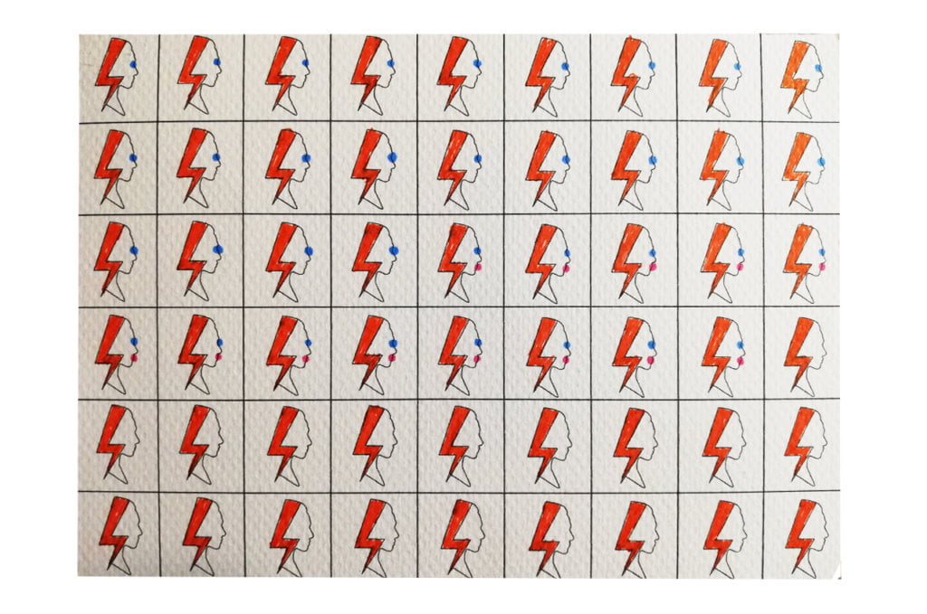
On Monday morning I analyzed my first use of cosmetics this week and I discovered that my postcard was going to be… dead boring. Few hours later we briefly discussed with Klaudia our approach to data this week. In our talk we also touched on the Women’s Strike. It was an aha-moment for me and I decided to analyse the make-up of all women I was going to talk to face-to-face in the following 7 days.

Data drawing:
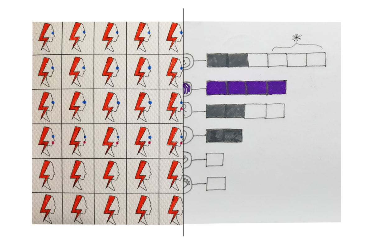
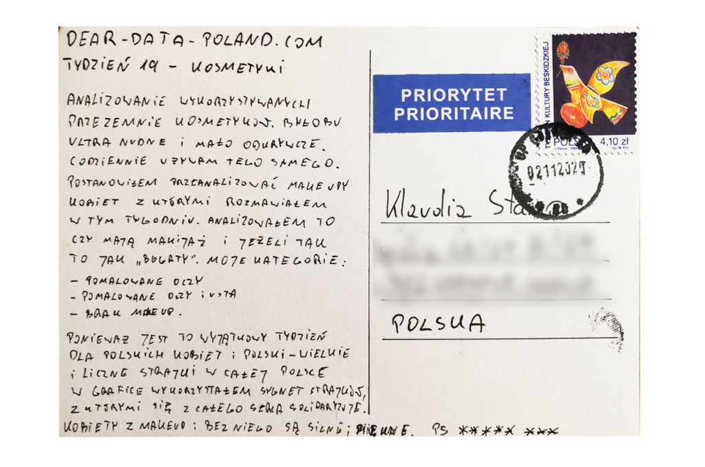
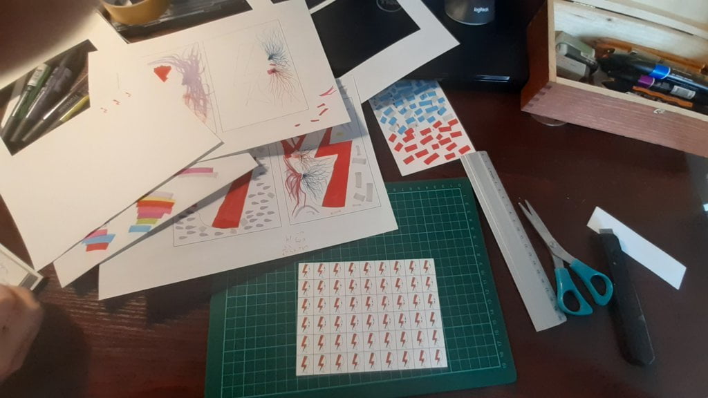
It was the most time-consuming postcard since the beginning of Dear Data Poland. It took me over 4 hours to finish. I had at least 5 ideas. I really wanted to show the lightning (Women’s Strike characteristic sign), because it was the most important event in Poland this week. My main challenge was how to show both women’s make-up and their fight for basic rights (at the same time I did not want to imply that women only care for make-up!). I decided to multiply the lightning sign and show that women are very different from each other in terms of make-up usage. My only regret is that I did not collect data on the lipstick and eye make-up colour. It would certainly enrich my postcard. 

Klaudia’s postcard:

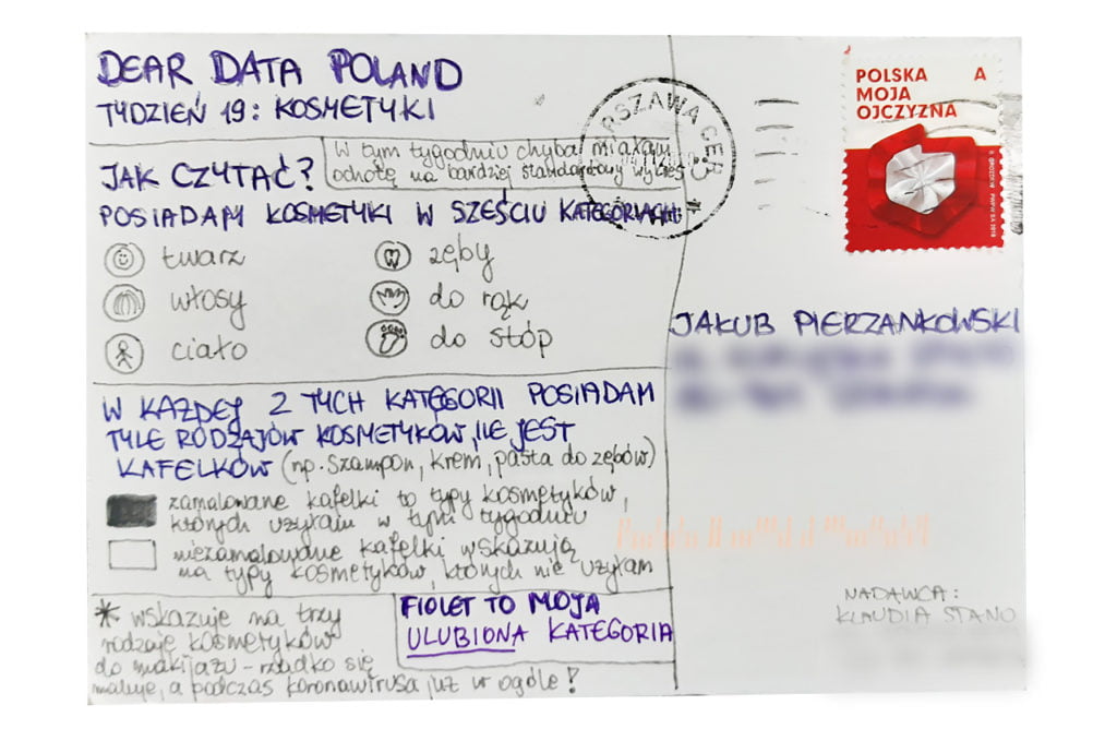
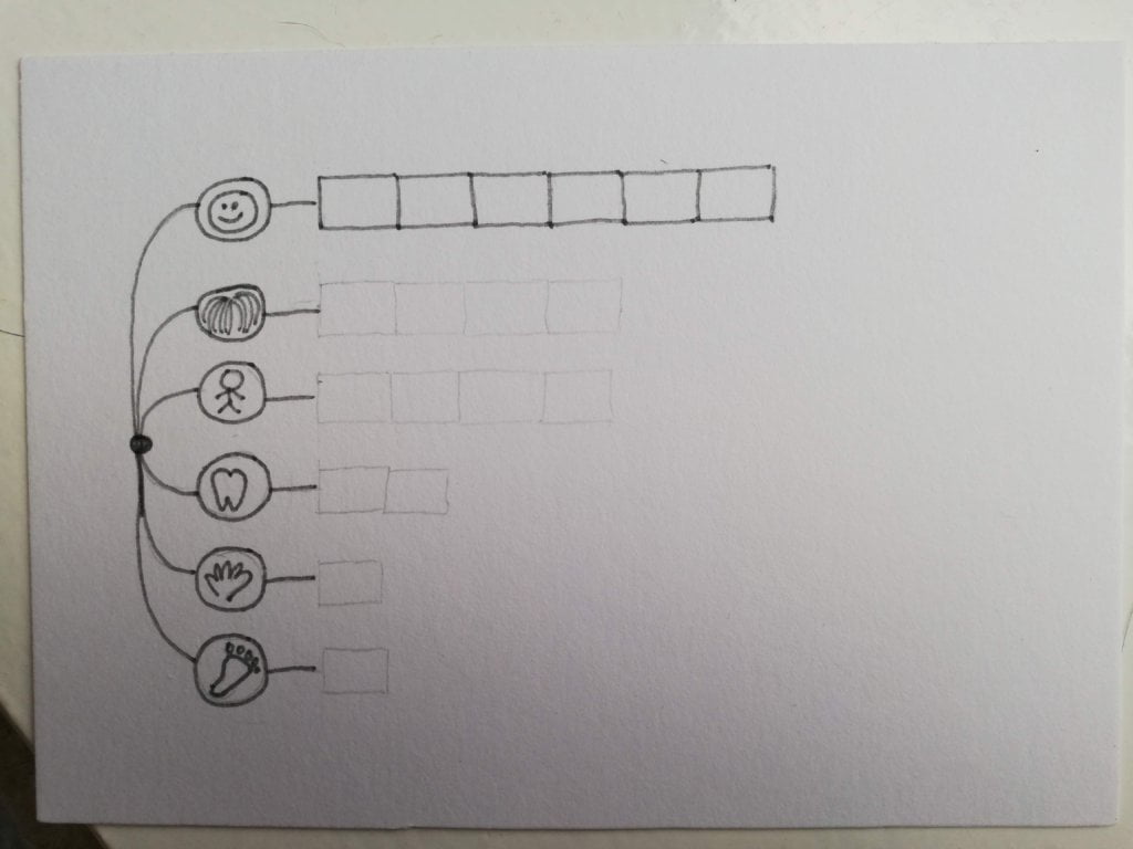
Klaudia’s project is minimalistics and this is what I expected. We both agreed that there was not much data to collect. The idea to split cosmetics into used and not-used is interesting. I will try to convince my girlfriend to carry out a similar analysis 😉

The process:


Klaudia

Topic:
I must admit that cosmetics is an ultra-unexciting topic for me. I use only a few products on a daily basis, with a neutral approach. I only like to take care of my hair (which is reflected in my postcard).

Data gathering:
Because of the topic I was worried that my Google sheet was going to fill slowly and I was right. However, I drew some conclusions at the end of the week. I discovered there were many cosmetics on my shelf that I did not use even once. It made me wonder how many cosmetic types I own (by category). I used this analysis as a starting point for the postcard.

Data drawing:
This week I felt an urgent need to create a more ordinary data visualization than before. I wanted my graph to convey the most important message at the first glance. And although my chart is (in my opinion) comprehensible, I lacked an “artistic spirit” from the weeks before. And it doesn’t feel right. My conclusion is that the Dear Data project is a place to experiment and not to follow the beaten tracks. So I look forward to the upcoming weeks! 🙂

Jakub’s postcard:

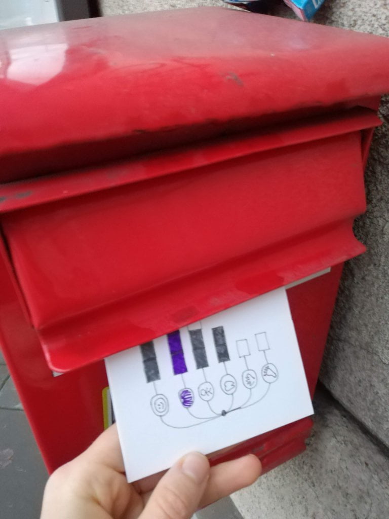
When I took Jakub’s postcard out of my mailbox, my jaw literally dropped! The combination of this week’s topic and the current political atmosphere truly enchanted me as I myself actively participated in the protests. I am really impressed and happy that the fight for women’s rights became part of Dear Data Poland!

The process:
Categories
Uncategorized

Week 18

Jakub

Topic:
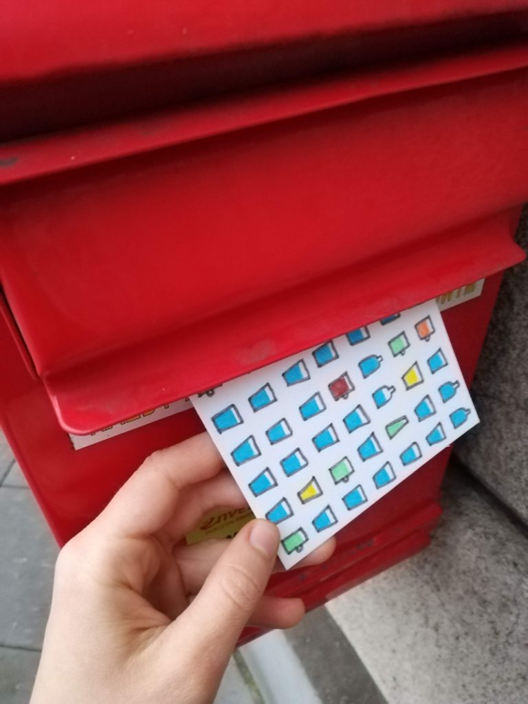
A few weeks ago I downloaded an app to count my daily water intake. The results were surprisingly bad. Even though I should drink around 2.5 liters of liquids per day, I sometimes struggled to drink even 1 liter. I used this app for 2-3 weeks and luckily managed to create a habit of drinking more water. This week was a perfect opportunity to test my habits and check if they are really permanent. 

Data gathering:
This time I used a notebook, not an app. I enjoy hand-writing recently. Data collecting was not annoying at all and I am 100% sure I did not omit anything (which could have happened in the past with more complicated topics). 

Data drawing:

I am still looking for my “style” and I explore various data visualization techniques. Meanwhile I learn the basics of drawing. I also have to admit that creating postcards is very relaxing for me.

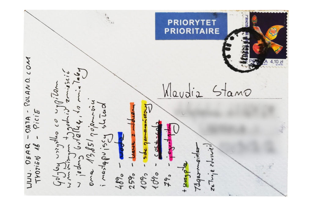
Klaudia’s postcard:

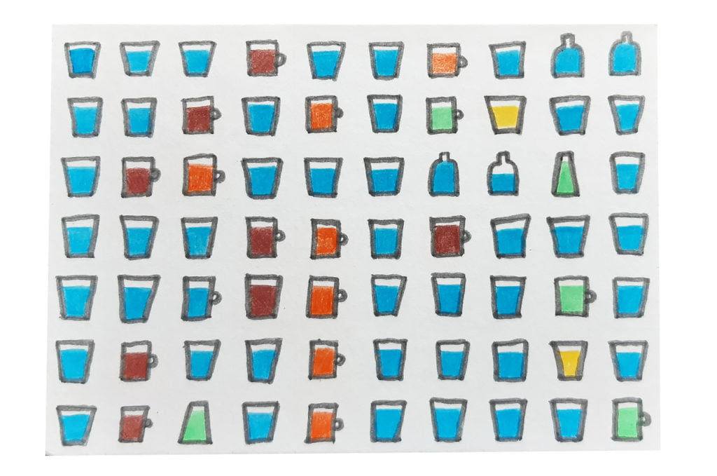
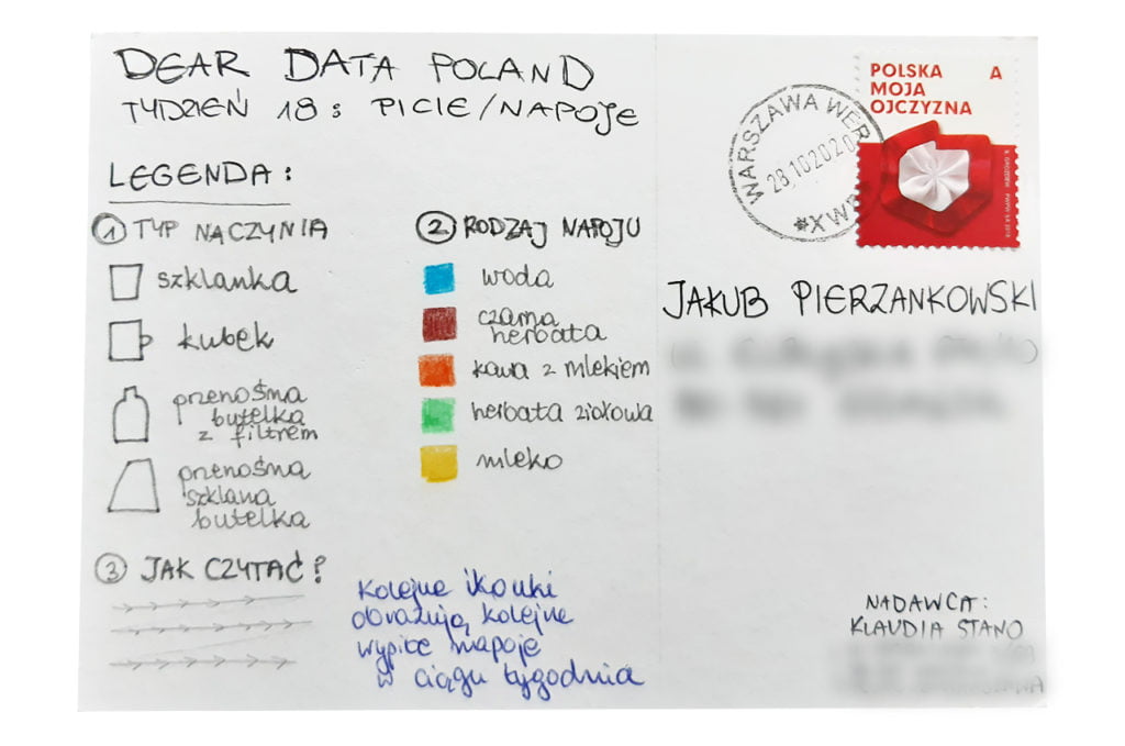
What I particularly like about Klaudia’s postcard is that she showed the various dish types she used. I regret that I have not thought about it before! It is an interesting additional data layer.

The process:


Klaudia

Topic:
This week’s “leitmotiv” is a bit less insightful for me than previous ones as I already know quite well my drinking habits. My staple drink is tap water (highly recommended in Warsaw!). I also enjoy tea and allow myself one coffee with milk and cinnamon per day.

I made, however, two discoveries. I have never before counted how much I drink on a daily basis. Now I know that the volume is between 1.7 and 2.5 liters of liquids per day (more on workout days). What I also noted is that I had only one sweet drink this week (tea with raspberry juice) and I am happy about it.  

Data gathering:
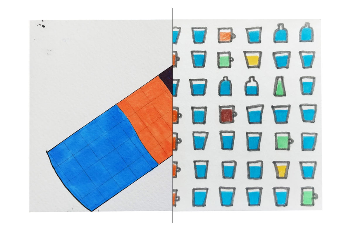
During the week I was noting down all my drinks (and their order) on a piece of paper that I had always close at hand. I paid attention to the type of drink, dish type (glass/mug/bottle) and exact volume. 

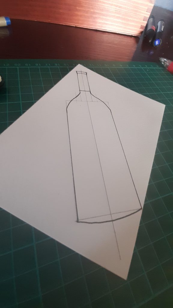
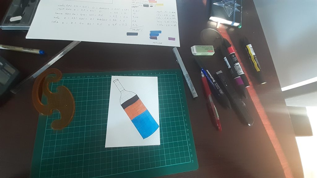
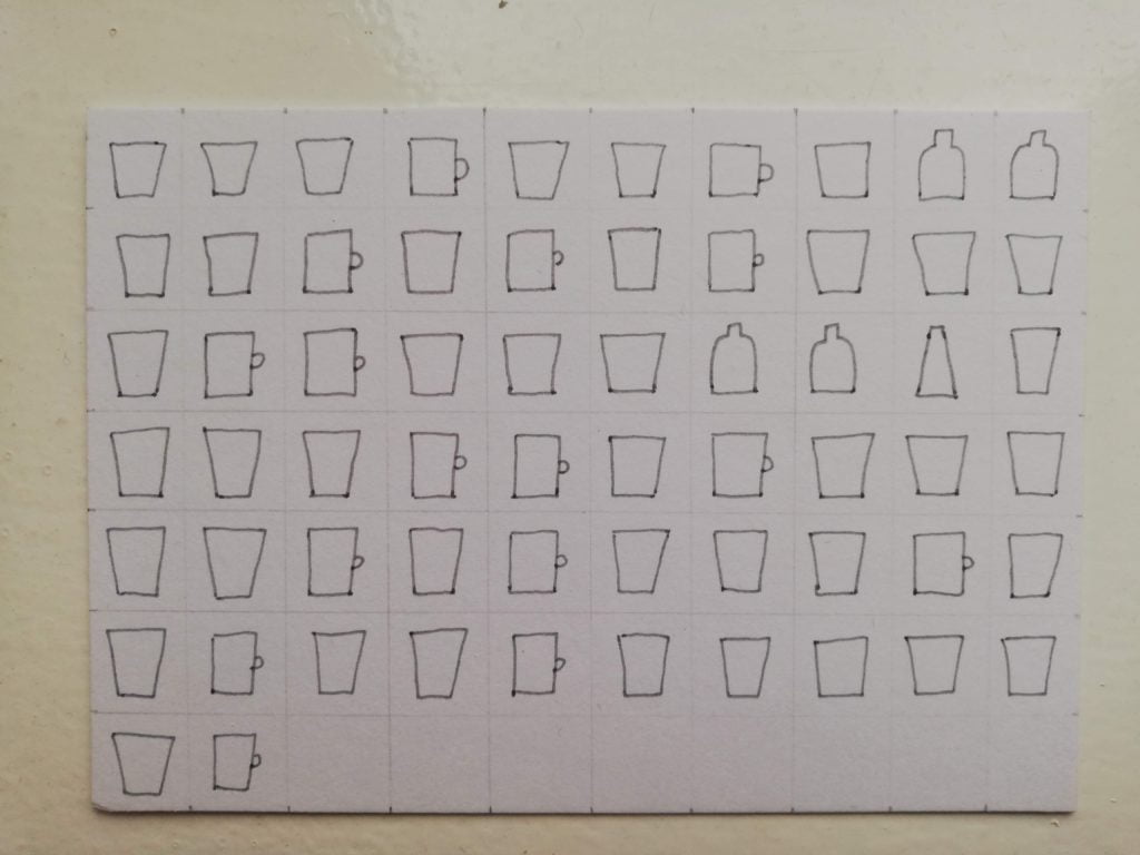
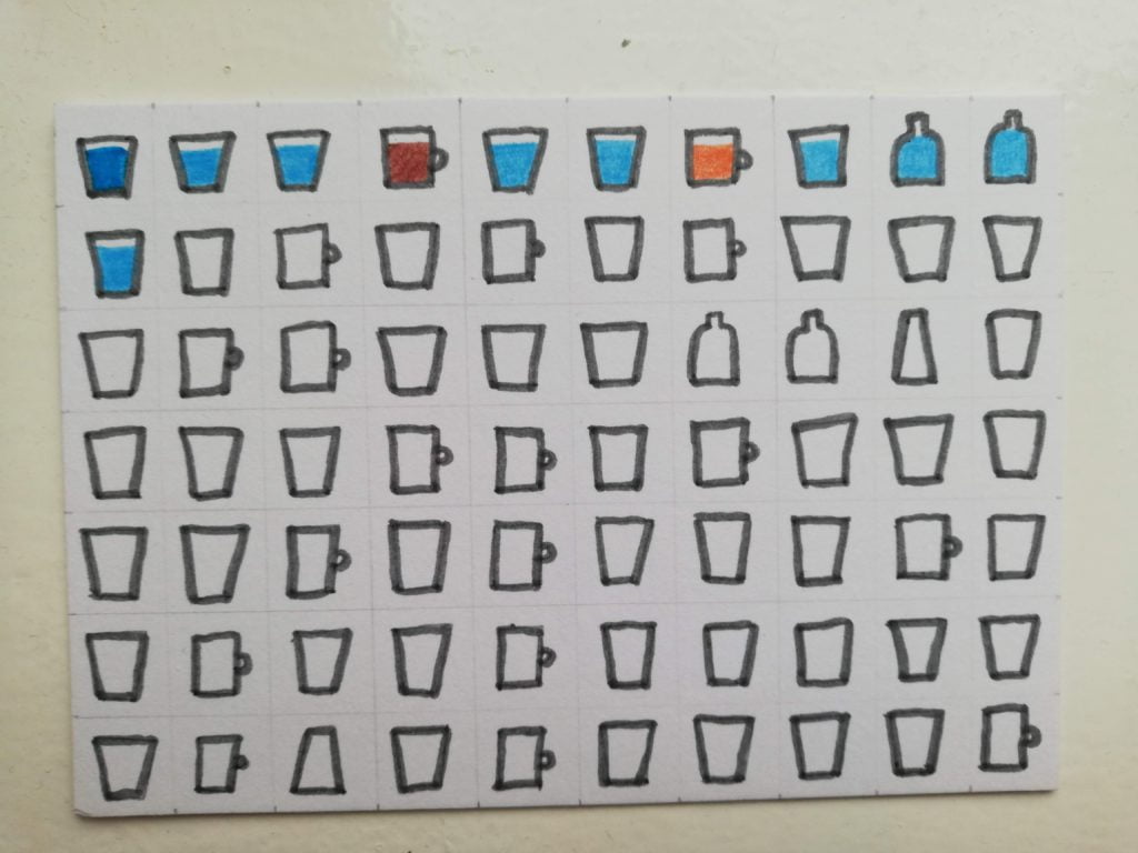
I had five or six different concepts. Some of them turned out to be misguided after initial sketches. As usual I was pondering different levels of data aggregation. Eventually I decided to draw all my drinks in their exact order. I am quite happy with the result!

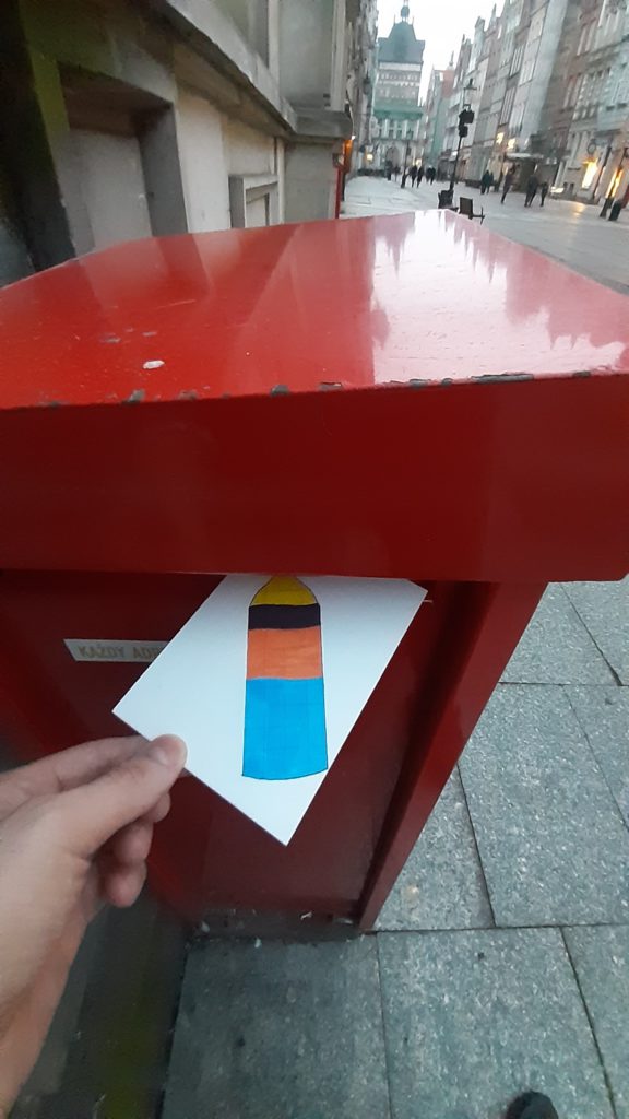
Jakub’s postcard:

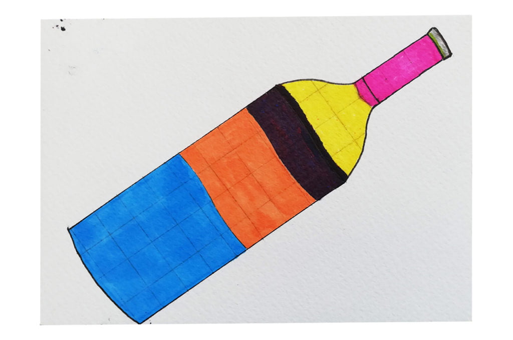
I really like Jakub’s postcard. I appreciate the mathematically correct proportions “inside the bottle” (from my experience this is sometimes overlooked, especially in media charts). 

I also noticed that our weekly liquid intake was very similar – around 14 liters 🙂 

The process:
Categories
Uncategorized

Week 17

Jakub

Topic:
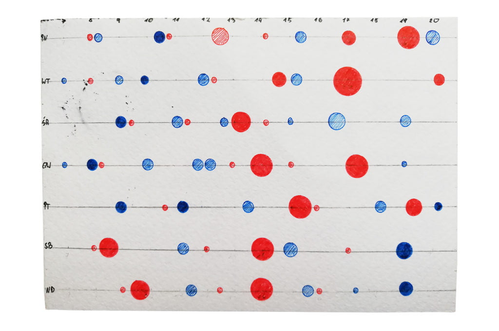
In times of intense workouts there were periods when I meticulously counted my caloric intake (sometimes even for a few months). I go back to this habit once in a while to see if my meals are well-balanced and, if needed, I correct my diet. 2-3 weeks are enough to gain a good understanding of my eating patterns. This week was a great opportunity to step back and keep track of my food habits.

Data gathering:
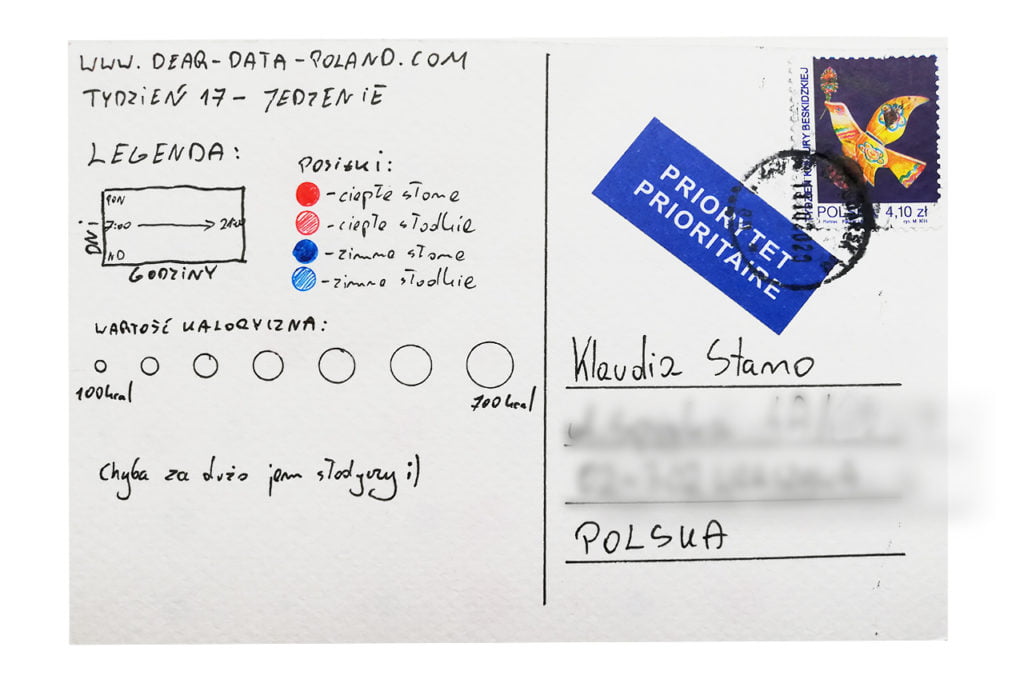
I wanted to approach the food subject a little bit differently than popular nutrition apps. Apart from caloric intake I took into account the meal type: hot or cold, sweet or savory. I have never before analyzed my diet in this way.

Data drawing:

The idea to show my meals’ distribution by days and hours came to my mind on the first day of data gathering. I decided to use two colours, so you can clearly see the proportion of hot and cold meals. My main conclusion – I will try to eat hot breakfasts more frequently. I hope it will help me cut back on sweet snacks during the day. 

It will be interesting to carry out a similar analysis in a few years.

The process:


Klaudia

Topic:
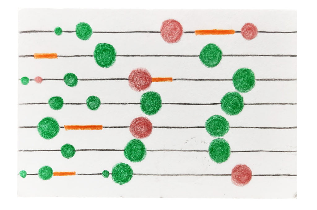
Healthy eating is important for me. I pay attention to the quality of food. The less processed it is, the better. In general I am trying to limit the amount of meat, but unfortunately this week I was quite unsuccessful in this area. The postcard also shows a change that I introduced a few months ago. My first meal is usually only at 10-11 AM. I feel really good about it, even though my whole life I heard that the best time to have breakfast is within 1-2 hours after waking up.

Data gathering:
This week gave me an opportunity to observe not only what I eat, but how much, when and how it relates to my workouts. I took notes after each meal. I also kept track of the colours of my plate, but it turned out to be quite unexciting.

Data drawing:
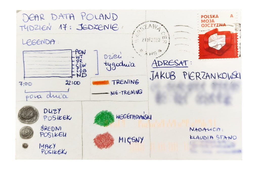
My objective was to create a visual, culinary map of the whole week. 

This postcard made me realize that my meal times (especially in the evenings) are quite irregular. I would certainly like to work on it and make the evenings less chaotic in terms of food consumption. After analyzing this postcard I also have an impression that workouts do not impact my eating habits too much. Well, I always eat a lot, no matter what… 🙂 

Vegetarian meals are marked green. My goal is to limit myself to only 2-3 meat dishes a week. Well, there is still a lot of work ahead of me…  

The process:
Categories
Uncategorized

Week 16

Jakub

Topic:
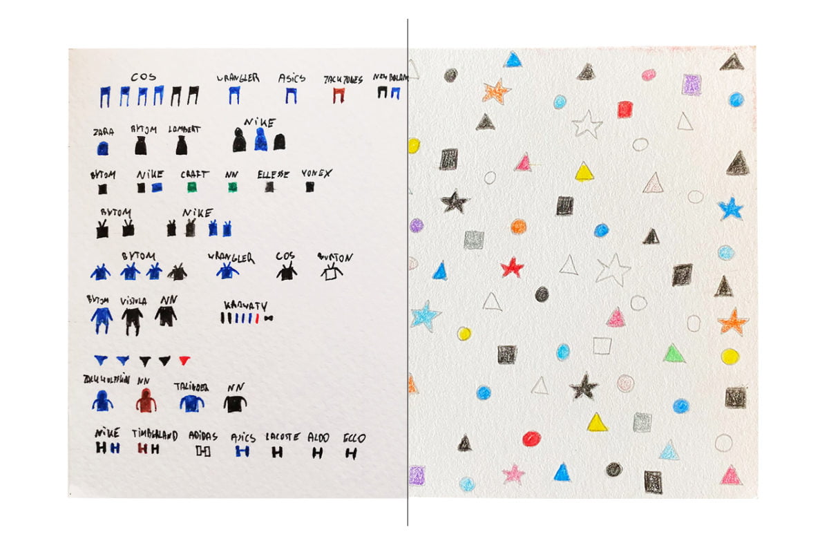
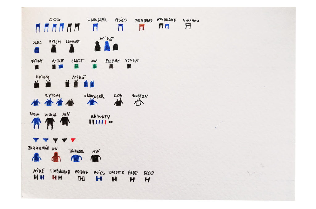
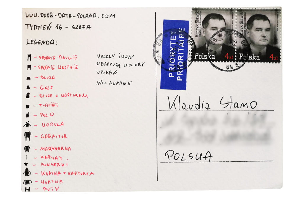
For the last few years I’ve been gradually introducing minimalism into my life (and my wardrobe). This year one of my resolutions was to buy only black clothes from only three brands (NIKE, COS, ECO). You can see it a little bit in my postcard.

Data gathering:
I have not gathered any data during the week. I just analyzed my whole wardrobe on Sunday. It was a good opportunity to throw away some things. All in all, I have 66 pieces of clothing, including shoes, underwear and ties. 

Data drawing:
I really wanted to show the colour palette of my clothes. The postcard shows that black and dark blue dominate my minimalist wardrobe.

The process:


Klaudia

Topic:
This week’s topic was a great opportunity to organize and clean my wardrobe. Very pragmatic!

Data gathering:
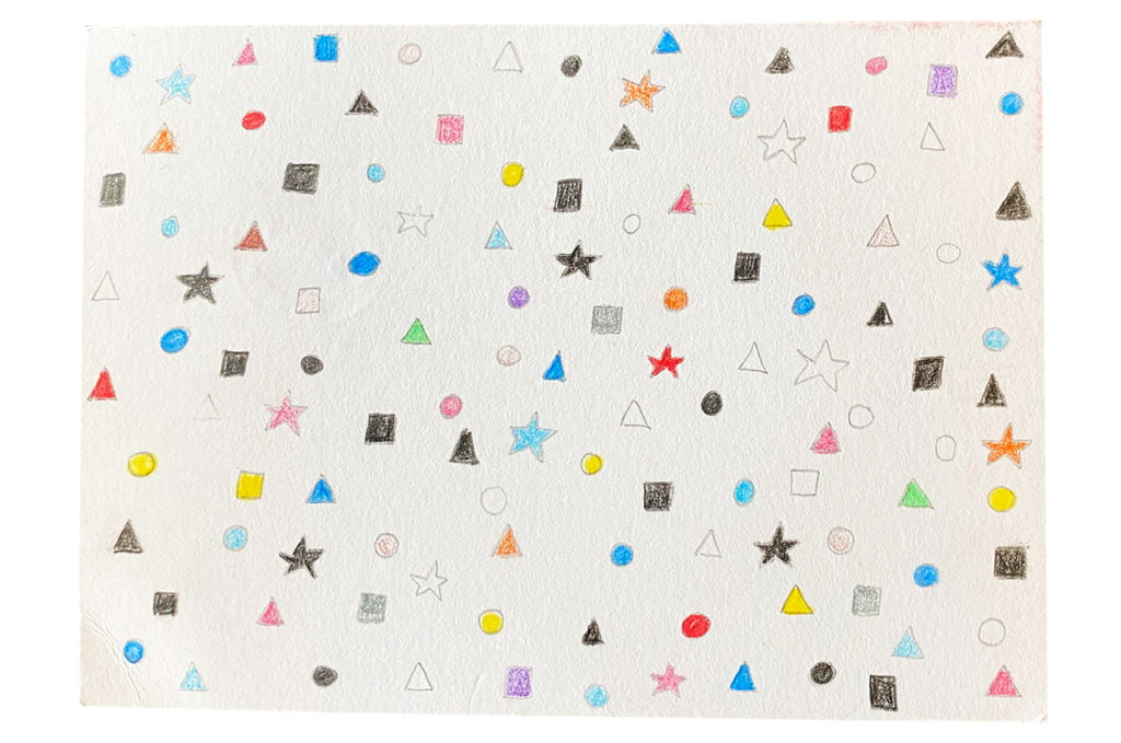
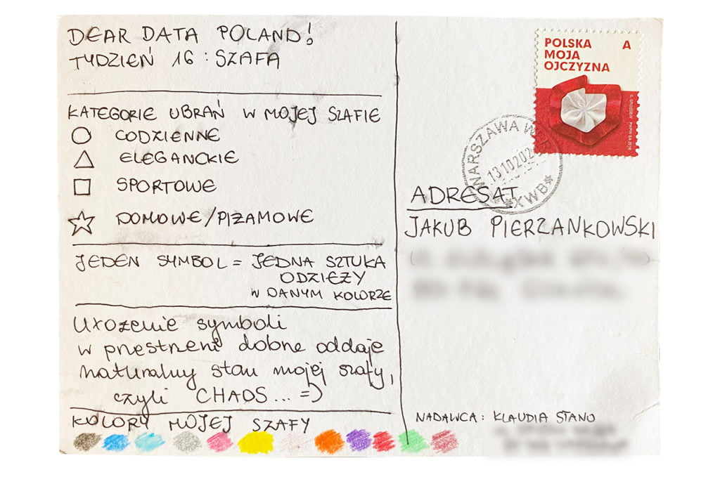
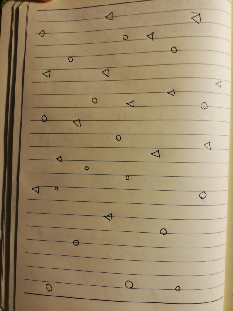
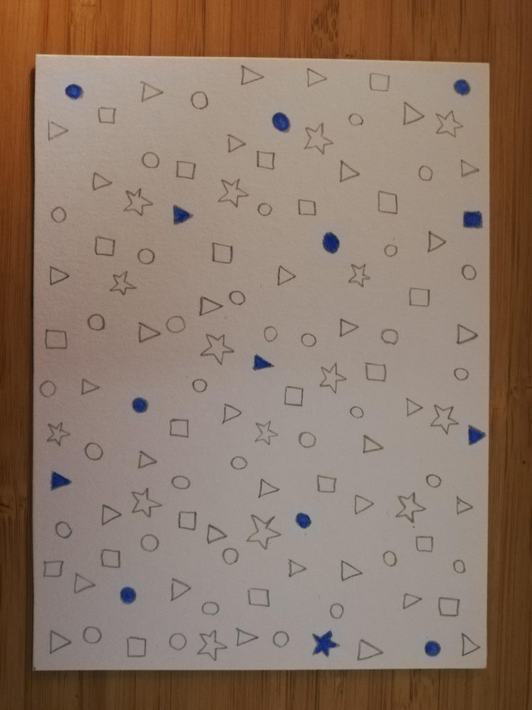
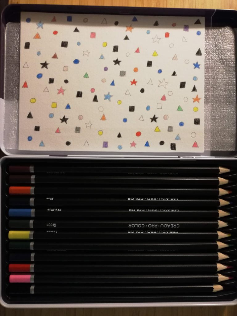
I divided all my pieces of clothing into 4 categories: casual, elegant, sportswear, home&pyjamas. I wrote down the colour of each item (which was not difficult as most of my clothes are one-colour). It turned out that I have… 120 pieces of clothing. A lot… And maybe too much?

Data drawing:
This chaotic visualization faithfully reflects my wardrobe’s entropy. I do not find it the most efficient data visualization, because you cannot see immediately which category is the biggest, but I think in case of my wardrobe it works 🙂

The process:
Categories
Uncategorized

Week 15

Jakub

Topic:
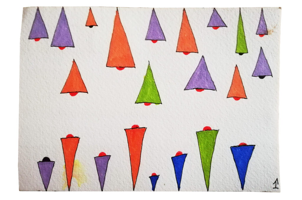
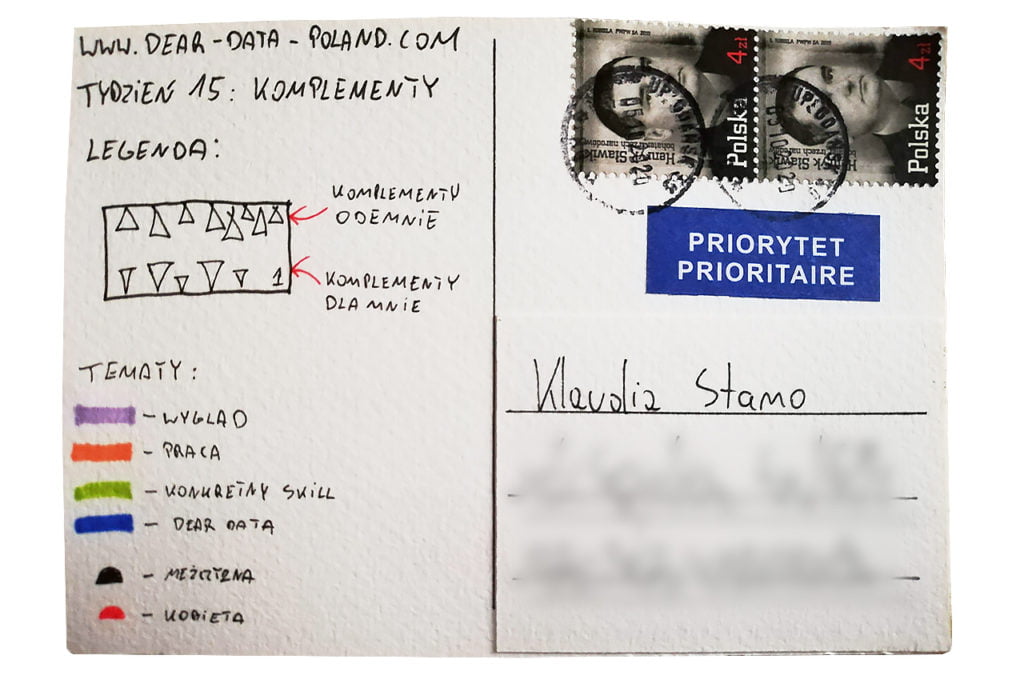
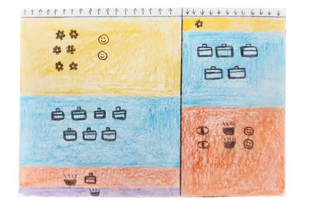
I agree with the statement that the less often we pay compliments, the more value they have for the recipient. I am not sure, though, if two compliments given per day is a lot… One thing’s for sure – I give more compliments than I receive. 

Data gathering:
I always try to weigh my words, so the compliments I pay never escape my attention. This week I put down in writing everything in detail including gender and category. I was also happy with three compliments on the Dear Data project 🙂

Data drawing:
My main goal was to discern the compliments paid and received. This week, unlike the others, I did not have a clear idea on how to visualize the data. Probably I will not hear any compliments for this postcard 😉

The process:


Klaudia

Topic:
This is my first Dear Data week. I am happy to start with compliments!

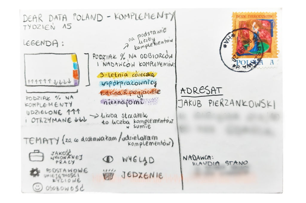
This week made me realize that I pay more compliments to my colleagues than to my friends and close family (excluding my 3-year-old daughter that I am trying to support with good words every day). The first conclusion is positive and quite expected, as I work in a team where we truly appreciate each other’s daily work. The second conclusion (not enough compliments given to my closest ones) is something I will try to work on in the future. Positive comments are sometimes so obvious that I forget to say them out loud… 

Data gathering:
I created a Google Sheet that I updated after each compliment (paid or received). I collected data on names, occasions, time of the day etc.

Data drawing:
The final version of my postcard is quite far from the first sketches (and the original idea I had in my mind for the last few days). I eventually decided that my main point was to see the discrepancy between compliments paid and received. The other layers were people (colours) and general topics (icons).

The process:
Categories
Uncategorized

Week 14

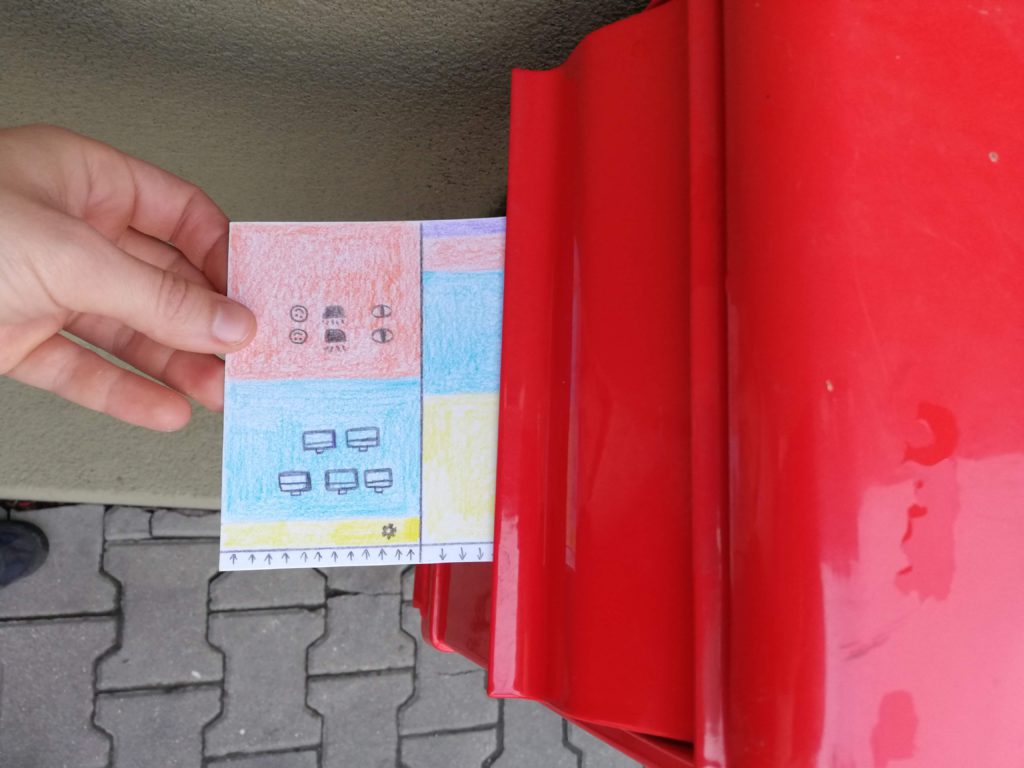
Jakub

Topic:
It took me a while to figure out the right approach for this one. Productivity and scheduling. Couldn’t come up with anything. The inspiration finally came when my new fitness band got delivered.

Data gathering:
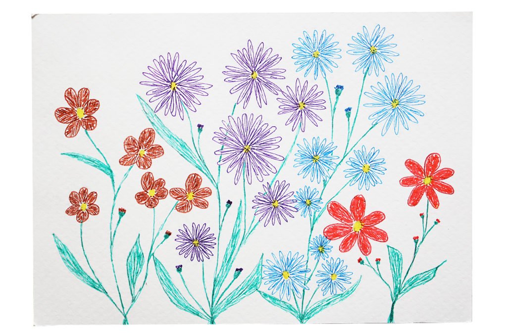
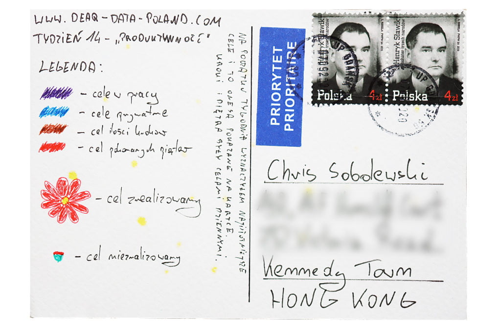
I maintain separate to-do lists for work and personal. That’s my primary productivity tool. I like checking off done tasks. And that was the data I gathered this week — the number of entered and completed tasks. The other data point was related to fitness goals, such as daily step count (goal: 10,000) or floors climbed count (goal: 20).

Data drawing:
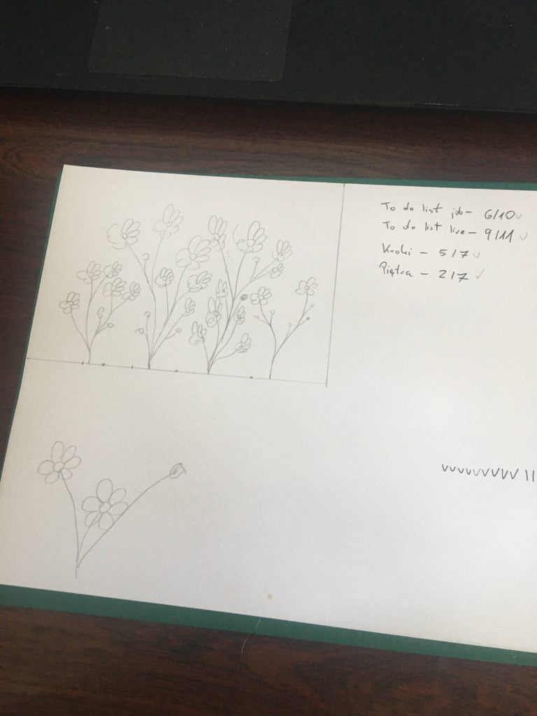
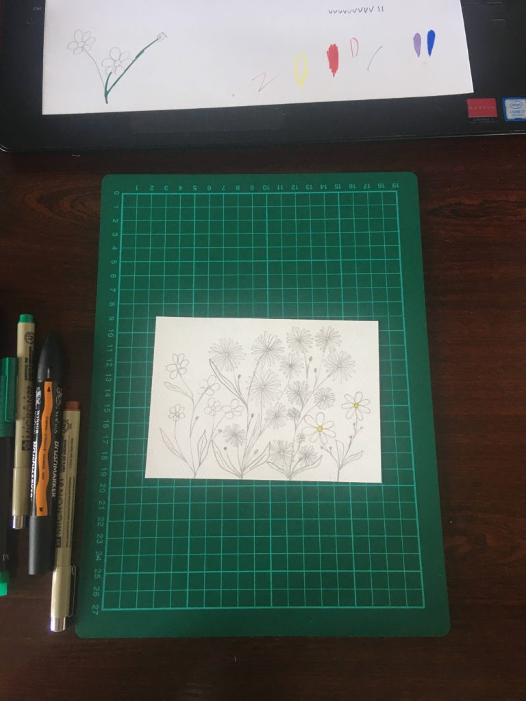
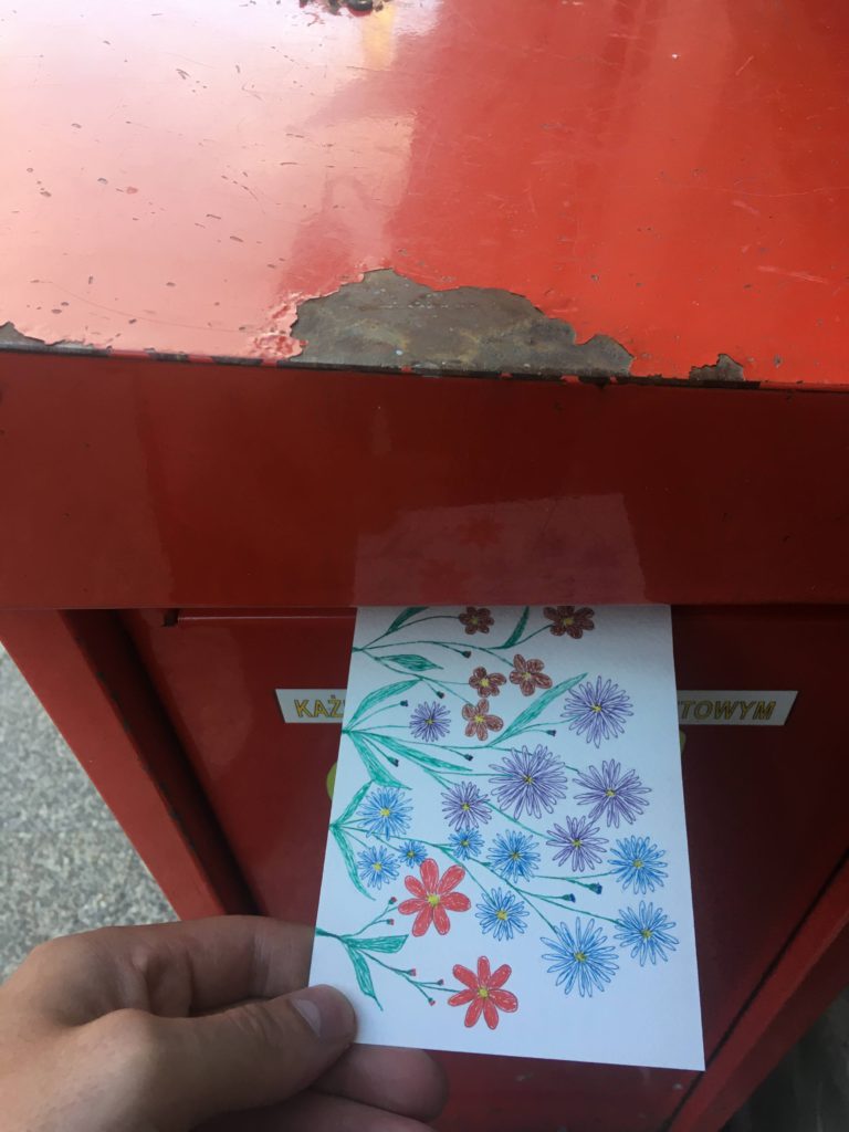
In my projects I like to venture into areas that surprise even myself. I’ve never had a talent for drawing. Regardless, I tried a flower motif this week. I think I have nothing to be ashamed of 🙂. Flowers in bloom indicate completed tasks. I think that’s a nice metaphor.

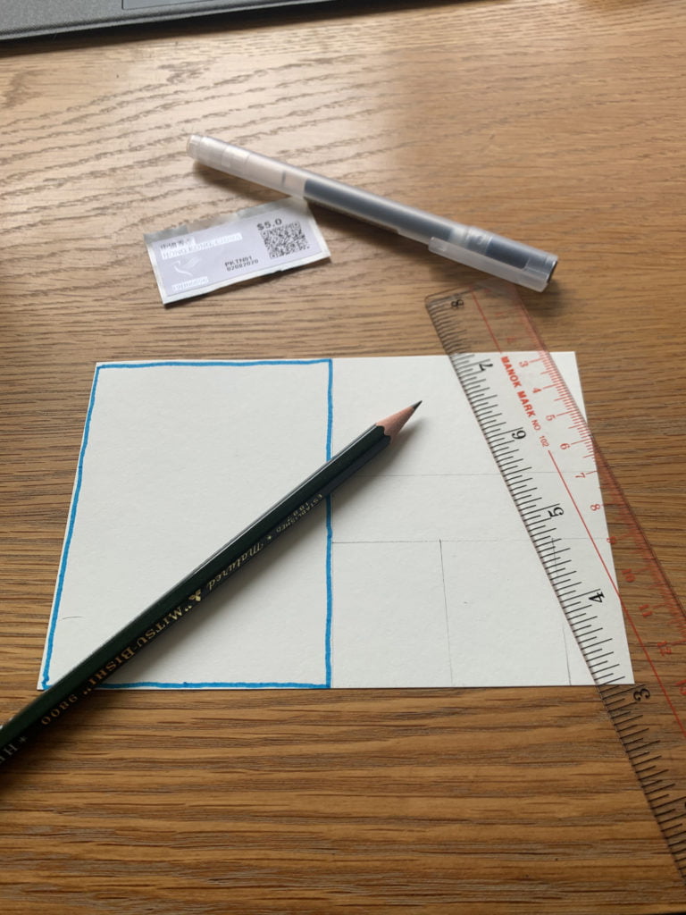
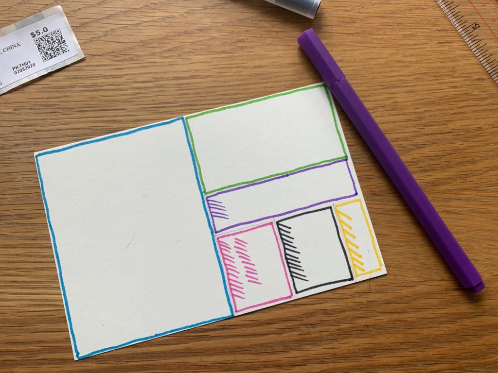
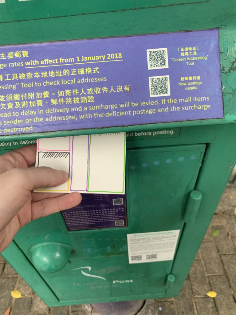
The process:


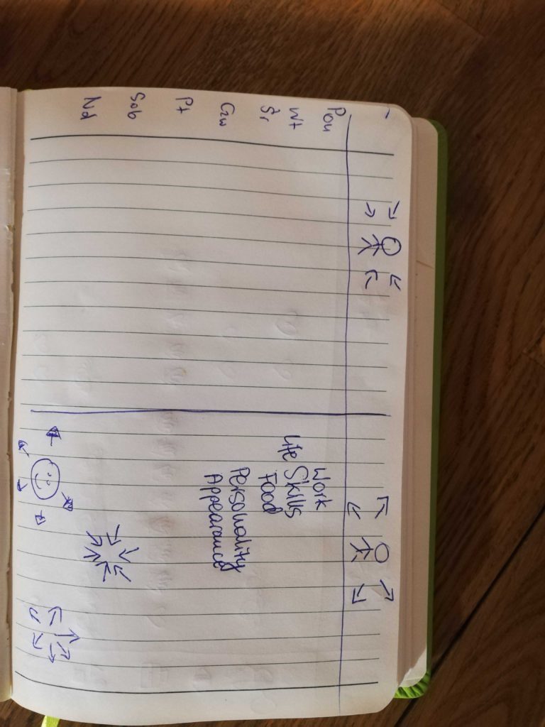
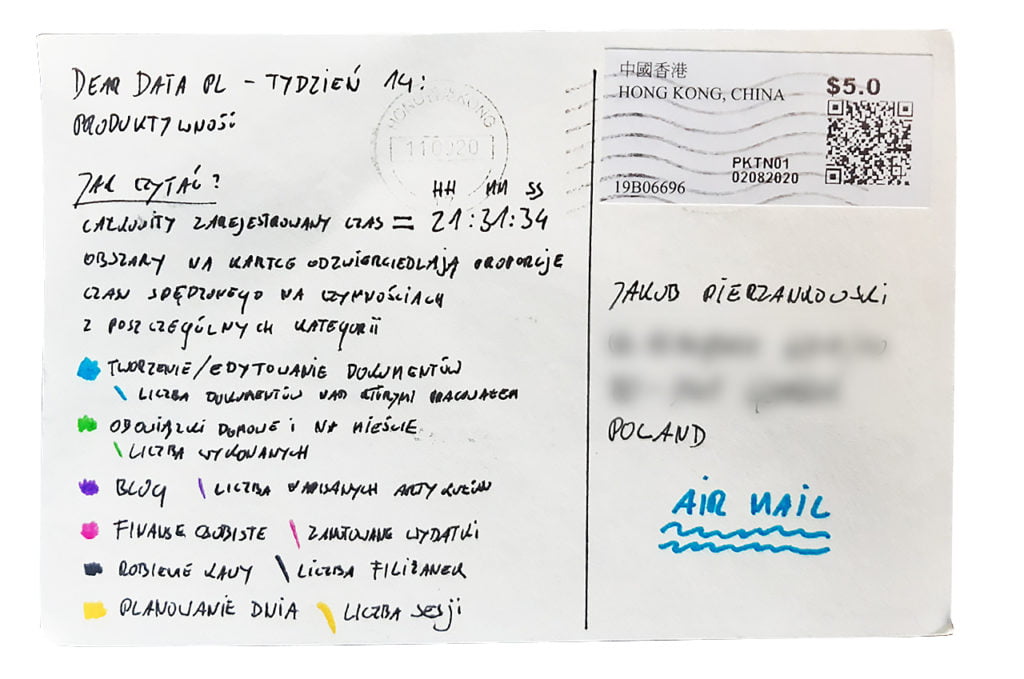
Chris

Topic:
This was a particularly unproductive week. I’m still not back to work and you can see that in a relatively low number of “worked” hours and lack of task diversity.

Data gathering:
I used time tracking for this one (with the help of Toggl app) and counting observable effect of my work (such as created documents).

Data drawing:
The big challenge here was to accurately reflect the time tracked with the area on the postcard. I’d say the final effect is “more-or-less” accurate 😉.

The process:
Categories
Uncategorized

Week 13

Jakub

Topic:
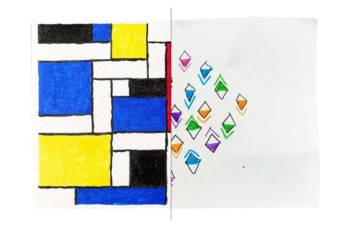
Desires. Probably a taboo subject for many people. Not for me.

Data gathering:
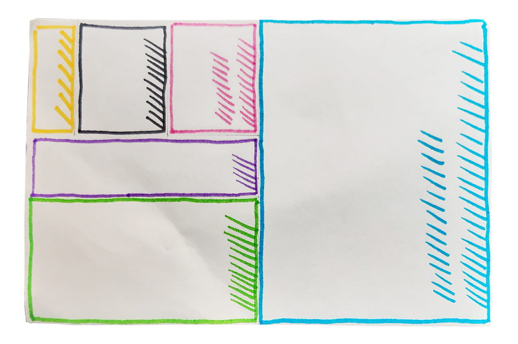
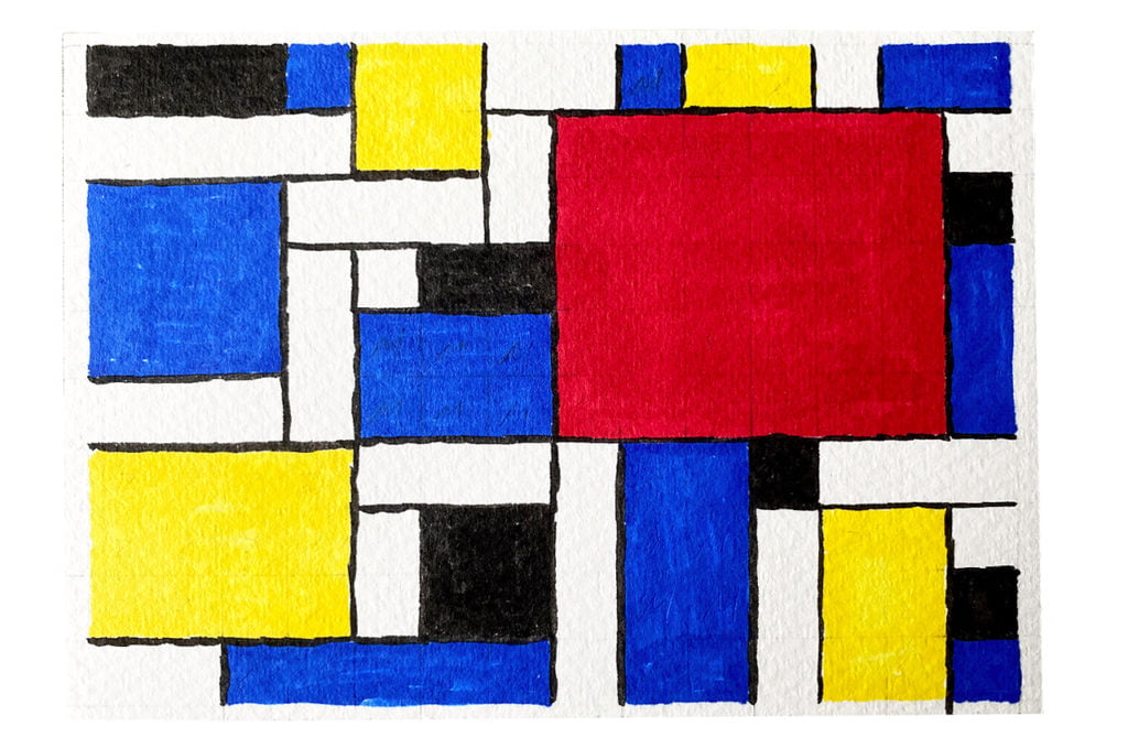
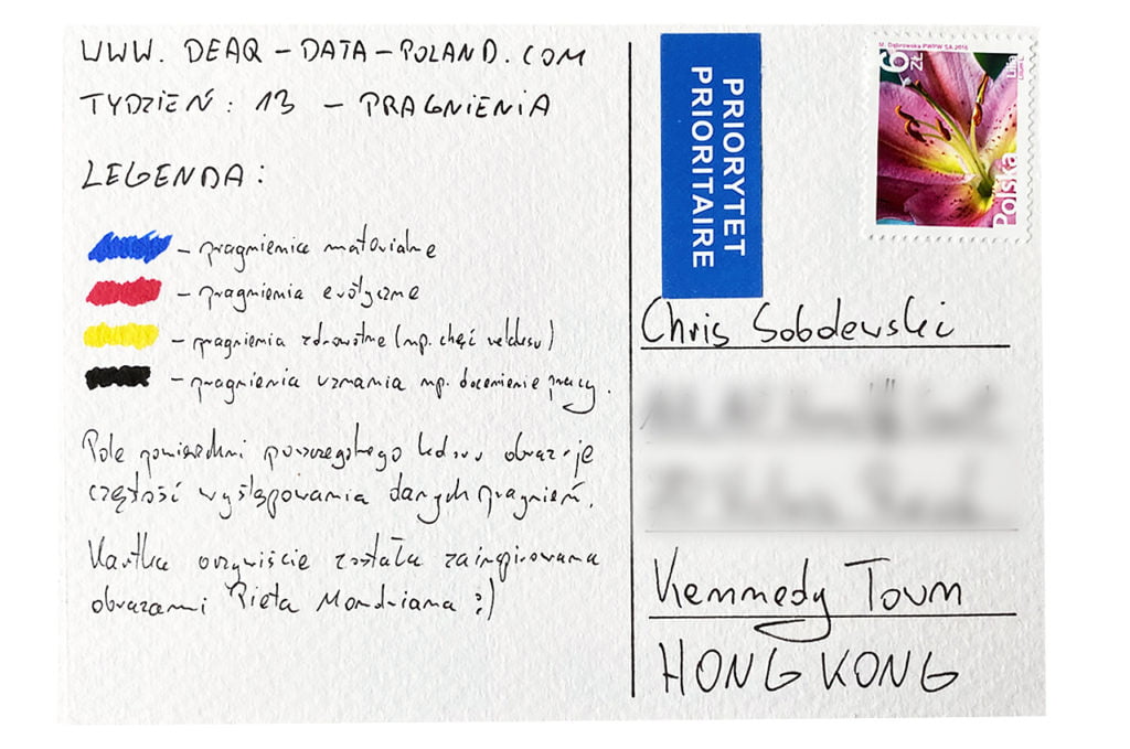
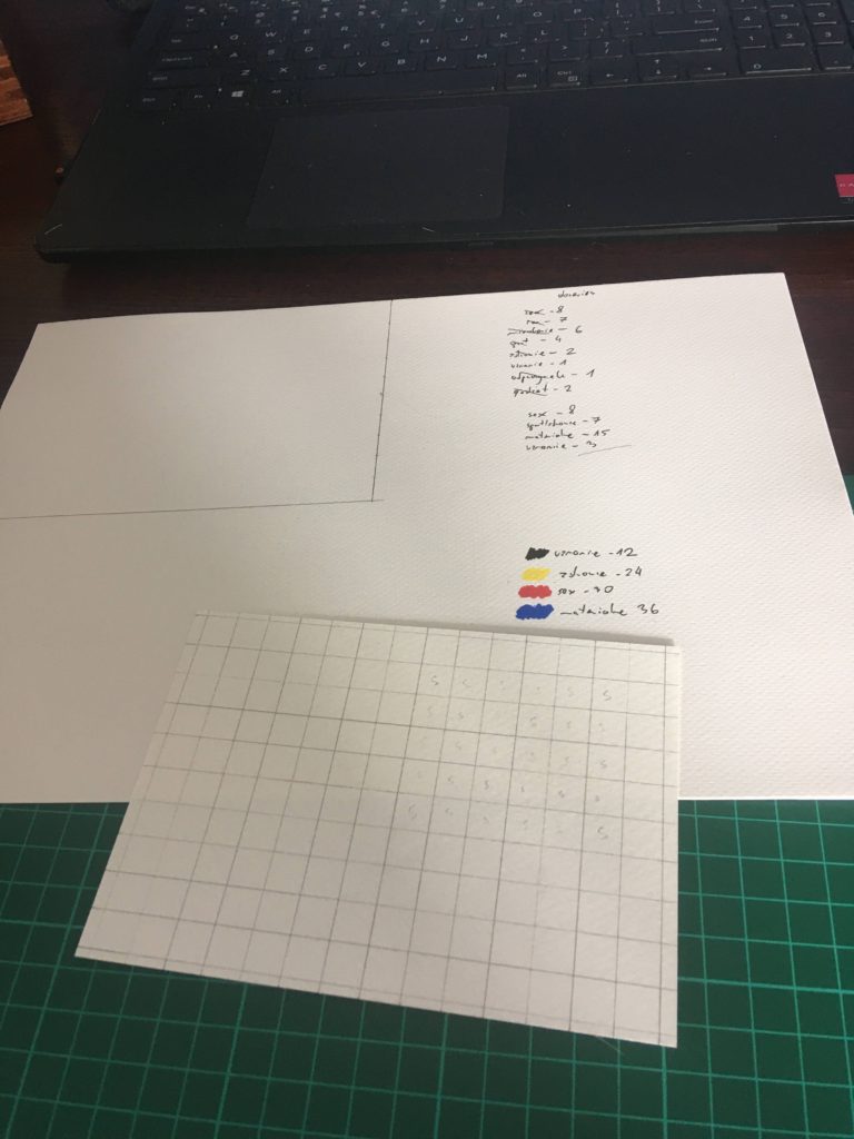
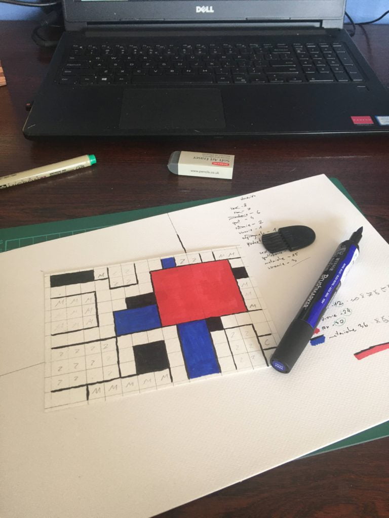
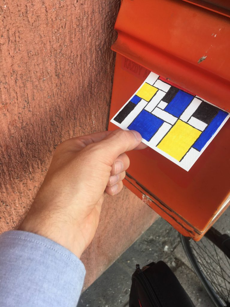
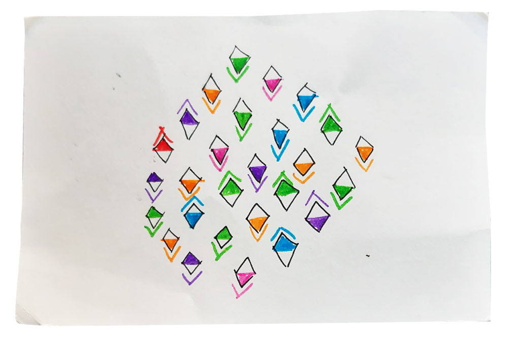
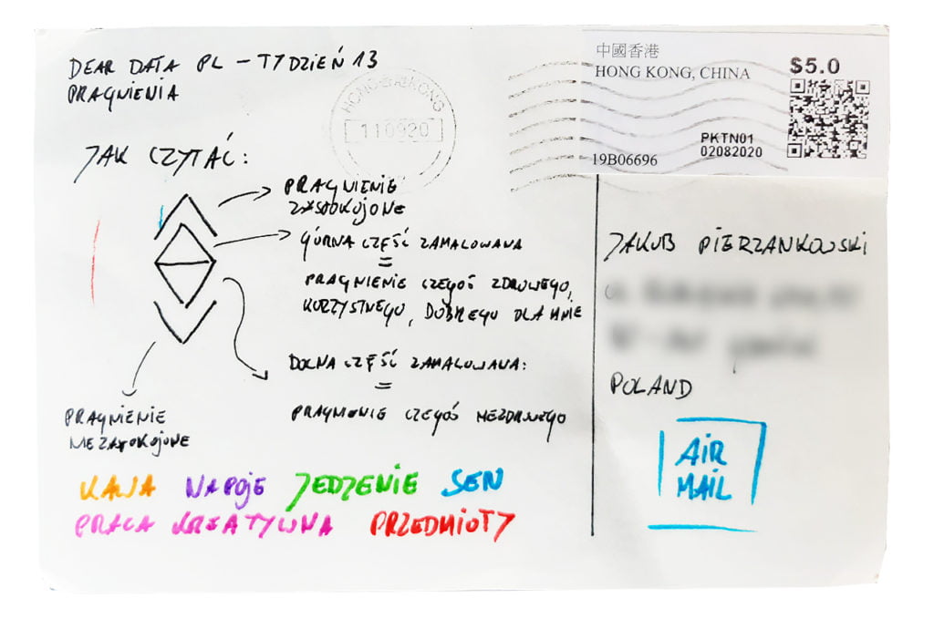
I collected data on a regular basis. When I really wanted something, I saved the details in Keep app. After collecting all the data for the week, I grouped it into four categories. Material, erotic, health / relaxation and appreciation desires.

Data drawing:
I try to take inspiration from modernist art. The card refers to the paintings of Piet Mondrian. So far, this is my favorite card.

The process:


Chris

Topic:
This one was a challenge! Mostly because I failed to note every single time I desired something. It was really difficult to keep track of all the “wants” during the day!

Data gathering:
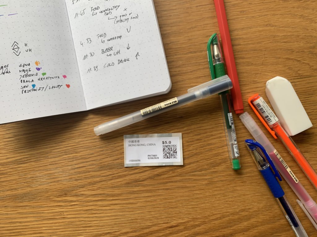
Paper notebook made its comeback this week. Every time I realized I desired something, I would make a note of that. I also added some extra context, like whether the thing I desire was good for me for not (like, having a fast food craving was definitely not good).

Data drawing:
This card is simple but easily readable. Every data point clearly shows all the data I wanted it to show.

The process: