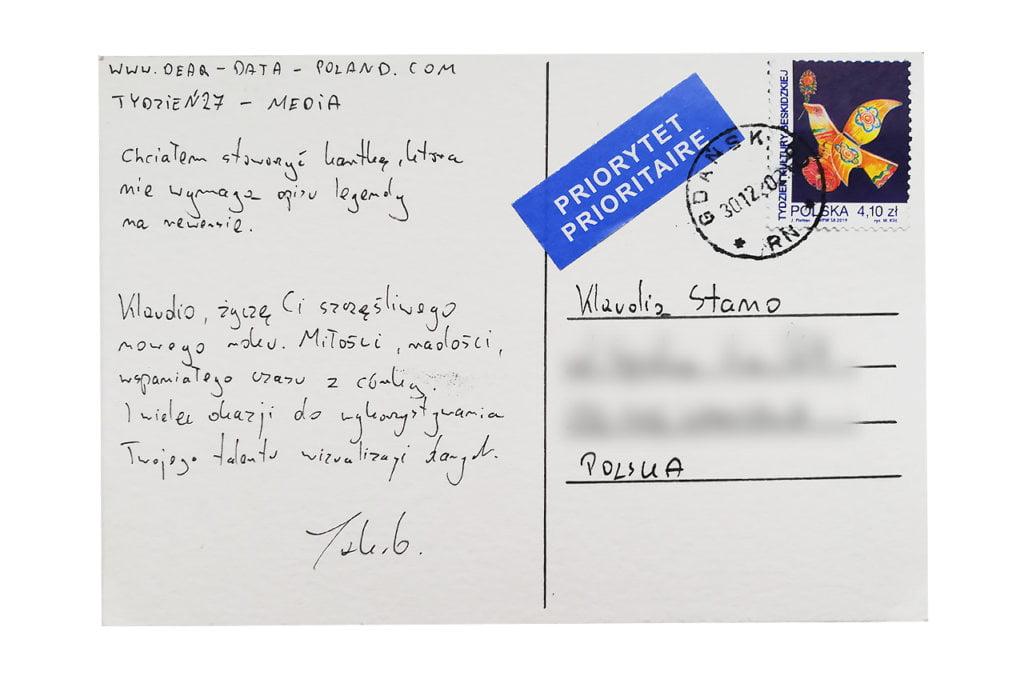

Jakub
Topic:
I try to be up to date with current news and trends. I approached this topic with great interest and curiosity. From the beginning I knew how I wanted to obtain the data. There is only one conclusion from this week – my media consumption boils down mainly to videos.
Data gathering:
I exported last week’s browser history (both from my computer and smartphone) to a .csv file. Then, with a few formulas, I shortened the links to the basic domains and counted their frequency. Based on this, I built my chart.
I did a similar thing with Youtube, the platform I used the most. In this case, however, I was unable to export the data. I had to write it down by hand. I narrowed it down to the TOP 10 channels that I watched the most.
Data drawing:
I’ve been recently reading the book “Storytelling with data” by Cole Nussbaumer Knaflic. There could only be one decision: a bar chart. My additional goal was to avoid writing the legend on the reverse.
Klaudia’s postcard:
The postcard is impressive. Klaudia really examined the topic. And I’m glad that out of the 6 best-rated articles, 5 were in Polish;) I also like the card visually. However, I believe it would be clearer if the data on each article were shown horizontally, not vertically.
The process:


Klaudia
Topic:
This week, I looked at the press articles I read. I have two digital press subscriptions – New York Times and Gazeta Wyborcza, a popular Polish daily newspaper. In consequence, the vast majority of articles came from these two sources.
I’ve been reading quite a lot of press lately, which means at least a few articles a day. Earlier, however, there were weeks when I would focus only on books, not worrying in the slightest about everyday news 🙂
Which article from this week captivated me the most? I think the one from the New York Times about solidarity and neighbourhood help in the time of coronavirus. It was very positive and uplifting.
Data gathering:
During the week I just noted down the titles of the articles I had read (and all the links for a future reference), because I didn’t know how I would use the data eventually.
Data drawing:
There were many concepts, as usual. I started putting them on paper, searching for the perfect solution, and finally I liked the idea of analyzing each article from seven angles:
- connection with the coronavirus (or no connection, which turned out to be possible in more than half of the articles – this is of course the result of my auto-selection :));
- geographical relevance (Poland or the world);
- the language in which I read the article;
- the emotional charge of the article – positive, neutral or negative;
- whether the article referred to current news or had no expiry date;
- my article rating on a scale of 1 to 3;
- the article length.
After drawing the postcard I came to an interesting conclusion. I rated only 6 out of 22 as very good. The rest was average or below expectations.
I also observed that I would prefer to read more texts with a longer or no expiry date. Current news becomes outdated after a few days and often just creates chaos in my head.
Jakub’s postcard:
Nothing compares to a well-designed bar chart!
The process:


