Jakub
Topic:
A few years ago, the “Screen Time” function appeared in iOS. Its purpose was to make users aware of how much time they spend looking at the screen and that they should limit it.
Data gathering:
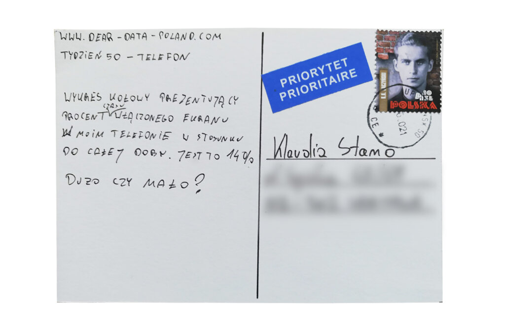
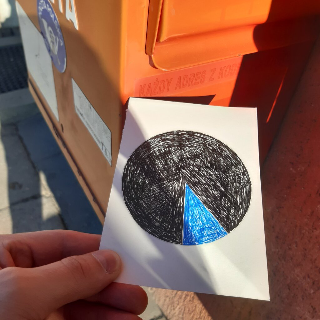
I used this “Screen Time” function to check how long during the day my phone is awake. The result of 14% on average is satisfactory for me. For sure there are many people around who spend twice as much time using their phones.
Data drawing:
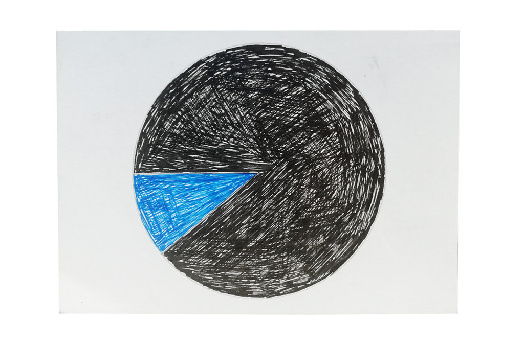
A simple pie chart. Finish of the project = simple visualizations 😉 I like the inaccurate circle filling.
Klaudia’s postcard:
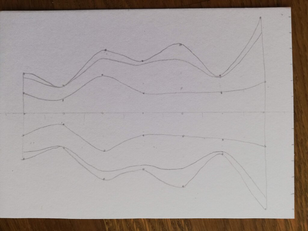
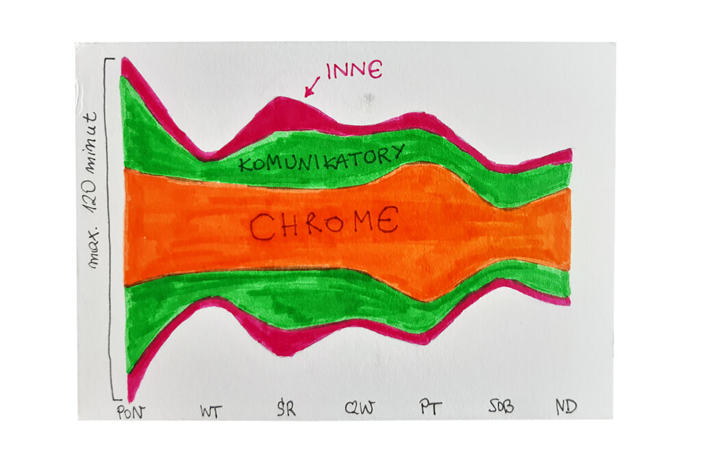
The mirror image makes it difficult to interpret the graph. In the 21st century, we use the phone more often to look for information than to communicate with other people. Klaudia’s postcard reflects this.
The process:
Klaudia
Topic:
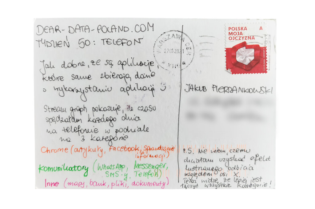
I only have a couple of interesting applications on my phone. I deliberately uninstalled all the others that were stealing too much of my time and energy. I use my phone mainly to search for information and communicate with friends. This week I wanted to check if my image of reality was not distorted.
My phone serves also as a source of podcasts and audiobooks, but I don’t count that because I don’t look at the screen while listening.
Data gathering:
In my phone settings I can check how much time I spent in the previous 7 days using different applications. Thus, I did not have to worry about collecting data.
Data drawing:
I’ve wanted to use a stream graph for some time. I think it fits this type of data, but I made one major mistake that I actually noticed only after finishing the postcard. I do not know why I made a mirror image. Luckily I treat Dear Data as part of my learning process so it’s OK to make mistakes.
Jakub’s postcard:
The postcard reminds me of Pacman;) 14% * 24h = over 3 hours of active phone. For me it is 1.5 hours, so half as much. But the truth is I spend a lot of time in front of my PC…
The process:
