Jakub
Topic:
I’ve been managing my personal budget for years, so this topic was very easy for me to tackle.
Data gathering:
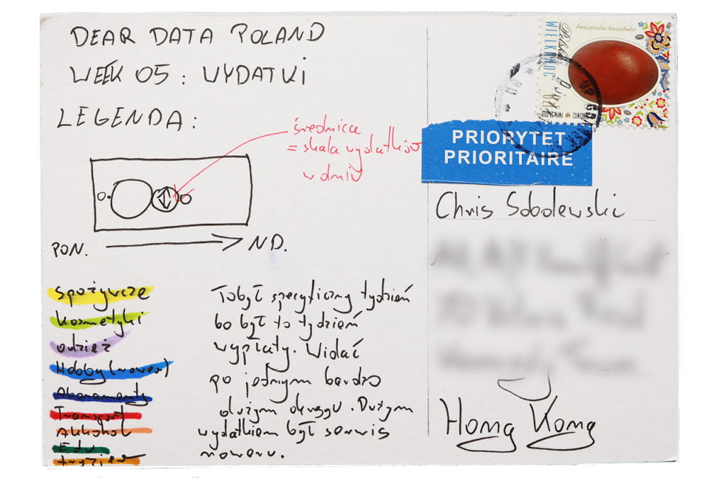
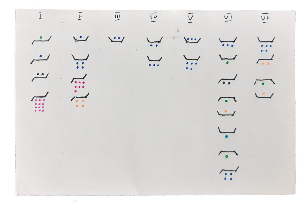
I was collecting receipts. Then, every expense from this week I put into Excel and divided into categories and days of the week. This particular week was my payday week, which is quite visible on the chart. Every month on the payday I treat myself (e.g. with some clothing purchase).
Data drawing:
Every week I’m trying to find some not-so-obvious way of visualizing the data. This week’s inspiration was the solar system.
The process:
Chris
Topic:
This week’s assignment felt very familiar. On my personal blog — Metafinanse (in Polish only) — I write about managing your personal budget and keeping your expenses in check. So the fifth week of our Dear Data project was tapping into an already-existing habit for me.
This is also another topic where you can see the effects of the pandemic. Had we lived in “normal” times, I’d have made more purchases during this week, I’m sure.
Data gathering:
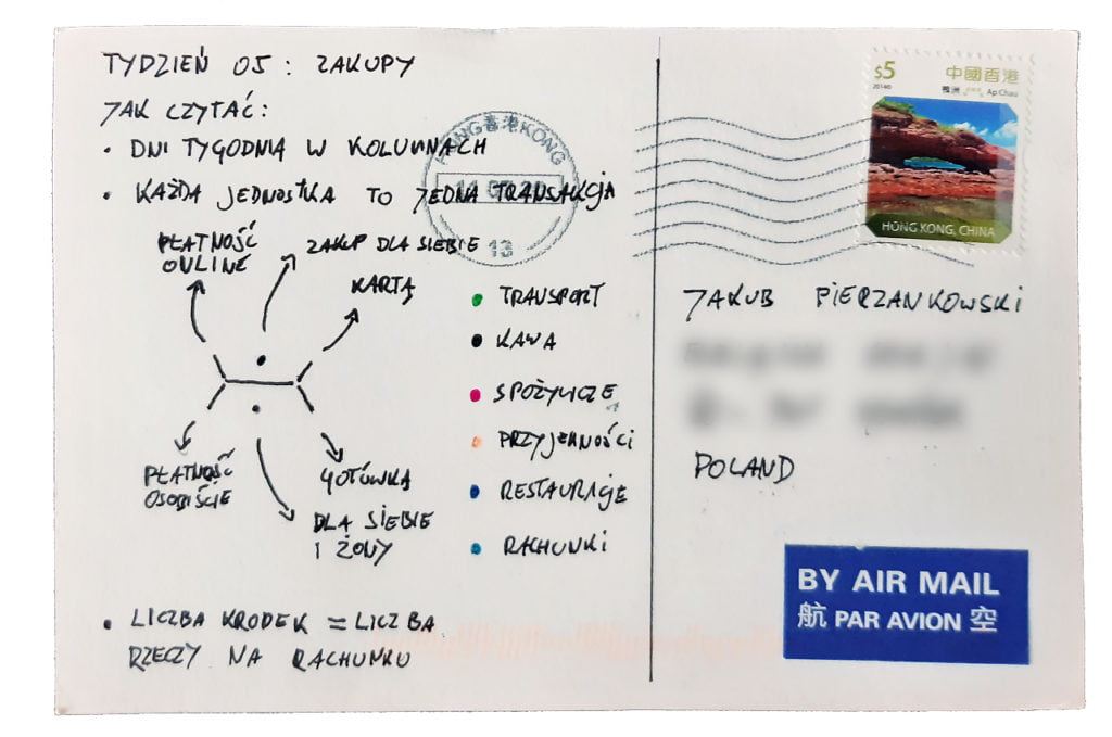
For my personal budget record-keeping, I only collect two data points: the expense category and the amount. But for Dear Data I’ve made a few additions. I was taking note of the number of items on each receipt, payment type, and the person for whom the purchase was intended.
Data drawing:
I’m quite satisfied with how my postcard turned out this week — especially with the “depth” of the data that I managed to capture in the chart.
You can see there are 2 levels of the way I chose to pay (card vs. cash) X 2 levels of the payment method (online vs. in-person) X 2 levels of the person for whom the purchase was intended (me vs. me and my wife) X 6 levels of expense categories. Plus, add the number of items on each receipt and you have loads of information in there. And still, everything remains readable!
The process:
