Jakub
Topic:
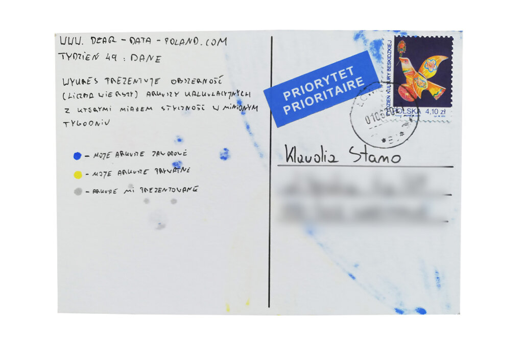
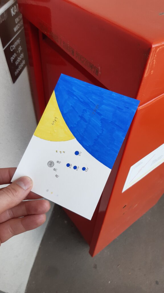
A book-size topic, it was difficult to decide what to focus on. Fortunately, this week I was inspired by a fairly big excel file that I was working on. I decided to write down all the spreadsheets I had contact with and their size.
Data gathering:
It was not difficult. I use spreadsheets both at work and at home. Most often it is Excel or Google Sheets.
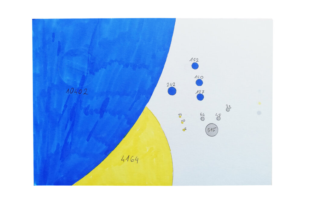
I was writing down the details of various spreadsheets on an ongoing basis: the number of rows and whether they were my private, professional or shared sheets. I was wondering what the average complexity of these sheets would be. My observations showed that most often they were simple files. Except for the biggest one that inspired me in the first place.
Data drawing:
I couldn’t resist using my favorite technique: presenting data with circles. I think the chart shows well what I planned to convey.
Klaudia’s postcard:
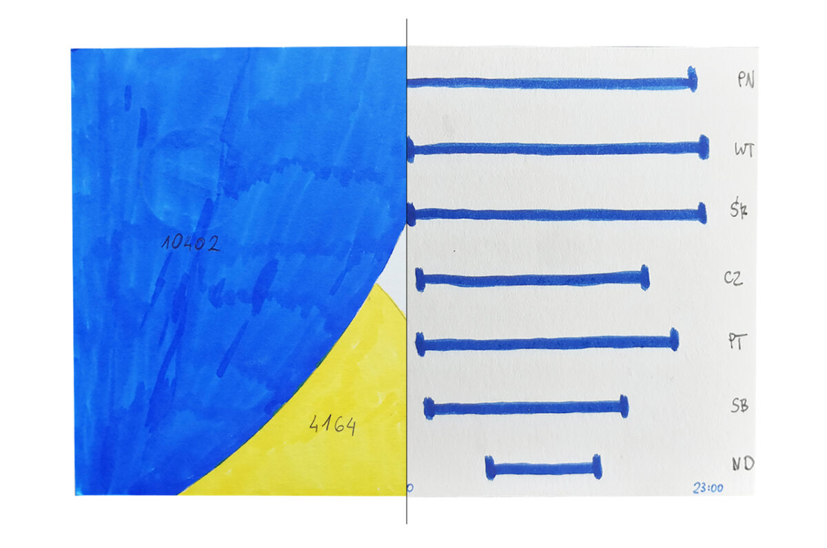
A very interesting idea. It encouraged me to check how many pages I visit on average (a similar number). I am glad that your weekends are calm and partially offline 🙂 I like the combination of graphs very much. I would only change the position of the weekday axis labels from right to left;)
The process:
Klaudia
Topic:
This week‘s topic was so broad that I was tempted to quantify every aspect of my life. I was trying to write down every number that showed up in my daily activities, e.g. the number of calories in a yogurt. However, I felt overwhelmed after only a few hours.
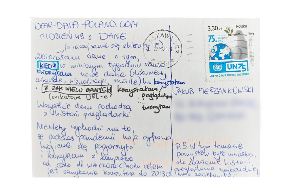
Thus, I focused on my digital footprint. How much data do I create? From how many sources do I get data? It came as no surprise to me that the number of pages, documents and sheets that I use every day reaches several hundreds.
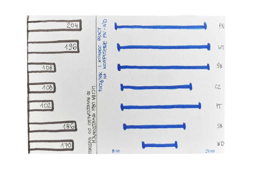
Unfortunately during the pandemic I neglected my digital hygiene and, as you can see on the postcard, my computer was in use from morning till evening.
Data gathering:
At the end of the week, I exported usage data from a web browser. It shows all my activity, because I use almost exclusively online programs, both at work and in private projects.
Data drawing:
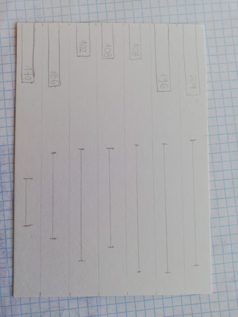
I really like “duration charts” (at least I call them this way). I used them to show when I was online last week, and probably working.
The bar chart shows how many data sources I have used or created. I was surprised that there is so much of it!
All in all, nothing special has come out of this postcard. Sometimes it happens… 🙂
Jakub’s postcard:
Another card resembling the Solar System 🙂 I like the use of circles and the clear proportions.
It is interesting that with such a general topic we decided to perform a similar analysis.
The process:
